How partisan are your state’s legislators?
Since the release of the Open States project, we’ve seen a lot of interesting analyses of its data. But we think that only the surface of what’s possible has been scratched. Using voting records from the Open States project, I calculated how liberal or conservative (almost) every state lawmaker is, then wrangled the scores into a d3.js visualization along with several other variables.
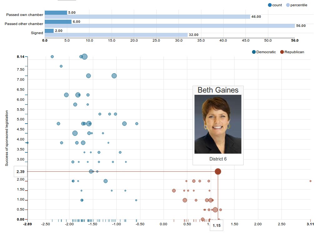
The methodology is explained in more detail below (and all my source code is on GitHub), but the chart is a scatter plot that positions each legislator on a liberal-conservative spectrum relative to their peers. It also plots the success of their proposed legislation relative to their peers and shows the extent to which other legislators agree to cosponsor their legislation. Go ahead and mouse over some of the bubbles to see each legislator’s picture and effectiveness scores, then read on to learn about the methodology behind the numbers. You can view a different jurisdiction or legislative session by choosing it from the drop-down menu above the chart.
Legislator ideology
The particular method I used to estimate each legislator’s ideology score (the x-axis of the chart) is called ideal point estimation. Ideal point estimation is a standard technique for political scientists and powers a lot of analysis about the differences between the parties. The algorithm analyzes the voting history of a group of people and yields a set of values that locate each person on two axes, with the distance between each unique pair of people proportionate in some way to the frequency with which they vote together relative to others in their chamber. There’s still some controversy about whether spatial models of voting really reflect ideological differences, but a quick look at the results confirms that they’re in the ballpark for most legislators.
These numbers were calculated using pscl, an R package by Stanford political science professor Simon Jackman, which provides functions for computing ideal points based on legislator voting records, among other things. There’s another R package, wnominate, that does similar things using different methods but uses some of the same data structures used in pscl. To calculate these numbers, I created an open source Python package for invoking these R libraries called pypscl. If the technical aspects of that process interest you, see below for copious discussion and code snippets for trying it out. For more detail, see the sources cited in the pages 37-38 of the pscl documentation describing ideal point estimation.
Success of sponsored legislation
The y-axis estimates each legislator’s effectiveness in terms of the success of their primary-sponsored legislation. If you mouse over an individual legislator, a bar chart will appear above the scatter plot. The bar chart shows how many of the legislator’s primary-sponsored bills were signed into law, how many passed the legislator’s own chamber and how many passed the other chamber. The values on the y-axis are calculated based on the following heuristic: bills that pass the legislator’s own chamber are worth one point; bills that pass the other chamber are worth two points; bills that are signed into law are worth 20 points.
The general philosophy here was to suppress the scores of legislators who pass reams of theatrical legislation through their own chamber, which their own party controls, but fail to effect real change by proposing policy the other chamber and the governor are willing to accept. This choice has already drawn some skepticism from various legislative staffers across the country that I showed this visualization to, but I feel pretty strongly that this data point shouldn’t equate a dominant party’s PR efforts with actual effectiveness. I concede it’s a complicated issue though. Finally, the numerical effectiveness scores on the y-axis of the scatter plot are normalized, so they don’t reflect the actual sum of the figures used in the heuristic described above. In addition, numbers for “signed” will be be zero for states where Open States couldn’t determine whether a bill was signed (i.e., because it’s not available on the state legislature’s website) and numbers for “passed other” will be zero for Nebraska, which has a unicameral legislature.
UPDATE (7/2/2014): I recently discovered that in at least one state, Indiana, resolutions were unintentionally included in the effectiveness scores. I meant to exclude them because passed resolutions probably provide little to no valuable information about real impact on policy. Another problem with the methodology has arisen that is specific to Indiana bills: Rule 108.2 of the Rules of the Indiana House of Representatives prevents members from introducing more than five bills per session. Because the effectiveness score used in this chart focus on differences in the numbers of each legislator’s passed measures, taken together, these two factors entirely confound the effectiveness scores for members of the Indiana House and effectively render them meaningless.
Cosponsorship scores
Last but not least: The radius of each legislator’s bubble is determined by the extent to which other legislators are willing to sign on as cosponsors to the legislator’s proposed measures. These numbers were calculated using the outstanding networkx Python package to create a directed cosponsorship graph in which each legislator is a graph node and each cosponsorship is a directed edge pointing from the cosponsor to the primary sponsor. Once the graph is complete, networkx supplies a PageRank implementation that spits out a floating point number between zero and one for each legislator; the higher it is, the more clout that legislator deserves. In states where the Open States project doesn’t currently import cosponsorship data (i.e., because it isn’t available on the state legislature’s website), the bubble radii are all the same.
Quirks
There are a few weird things you might notice in this visualization. First, for states like Massachusetts that pass very few bills, the legislator effectiveness scores will be similar for most legislators and all the bubbles will be clustered on a small number of horizontal lines. It looks dumb, but doesn’t necessarily indicate a problem with the data. Second, in at least one state (Rhode Island), my code for guessing and correcting the polarity of the ideology scores just didn’t work, so the Republicans are clustered on the left and the Democrats are clustered on the right. Fie upon’t! Finally, some states and sessions may not be available in the drop-down menu; if so, that’s probably because the session at issue didn’t have enough floor votes to reliably calculate the ideal points.
Other work in this area
Some interesting related work is being done by political scientists Keith T. Poole and Howard Rosenthal, the authors of NOMINATE, a multidimensional scaling application that analyzes preferential and choice data. Their work is available at http://voteview.com/. Similarly, political scientists Boris Shor and Nolan McCarty are using ideal point estimation in combination with other data to compare the polarization of state legislatures across states.
UPDATE (6/12/2014): Boris Shor advises that his project also calculates individual level ideal points from 1993 to 2011, with data through 2013 in progress. The scores they’re generating are comparable across time and states because they are all rescaled into a common scale based on Project Vote Smart’s NPAT survey. They also have aggregate data based on the individual level scores, such as party medians, polarization measured as the distance between party medians, and so forth. All their data is publicly available on their web site, http://americanlegislatures.com.
Other interesting visualizations
There are several other visualizations that use similar techniques to demonstrate legislator ideology, effectiveness and cosponsorship PageRank scores. For example, there is an informational site on Pennsylvania state legislation, StateRep.me, that uses the R pscl package to generate area curves depicting the ideology distribution of the Pennsylvania house and senate, with a line indicating each legislator’s position on his or her profile page. To give credit where credit is due, I learned about the existence of the R pscl package and the basics of how to use it by perusing this excellent project’s source code.
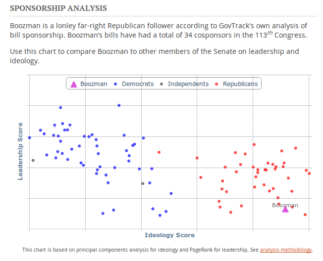
Another interesting visualization of federal legislator ideology is available at Govtrack.us. GovTrack currently uses principal component analysis to produce some pretty interesting scatterplots based on ideology and legislator effectiveness (shown below).
If you’re interested in playing with pypscl, you’ll need to get R version 3, install pscl, clone the pypscl repo, install it’s requirements, and optionally sign up for a Sunlight API key and use the Open States API to start calculating these values for state legislators. If the previous sentence gives you a headache but you’re still interested, feel free to activate the Bat Signal on the Sunlight Labs google group.
Here’s an example that calculates ideal points and wnominate scores for the Alabama House from 2011-2014:


