Honorable Mention: Time Machine
Another honorable mention in Apps for America 2 is Time Machine, a simple Flash-based map of various data around unemployment and earnings, and how they’ve changed over time.
[Disclaimer: I was not a judge for Apps for America. This review is my personal opinion, and doesn’t reflect why the entry placed how it did in the contest.]
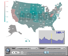
Time Machine is a visualization, and an extremely simple one. Pick a statistic, and see how it played out from 1976 until 2009. The ticks on the slider are spaced a year apart, but if you use the “Play” button or drag it yourself, you’ll see that the data is there for each month. Importantly, data is also there at the state level, so you can see how unemployment affected different parts of the country for each recession. You can even click on a state to see an accompanying chart that shows how the statistic for that state tracks against the national numbers. As a starting point, try placing the slider at October of different election years is an easy, if oversimplified, way to gauge the mood of the country at the time.
I have a few nits – the “Data” and “Subset” dropdowns spill below the window and you can’t see all of the options (I think one could also find more user-friendly labels for those than “Data” and “Subset”). It’s also not explained or apparent you can get that state-specific chart unless you stumble on it by mousing around. 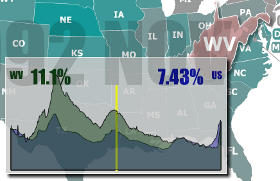 Finally, the state chart itself describes two numbers, but involves three colors without an obvious explanation of why. You can figure out that the chart is a histogram, not just a line chart, and that the third color is where the two histograms intersect, but I think it could be more clear.
These are minor gripes; the aesthetics of it all are very pleasing and straightforward, and I think Joe Internet User would have a relatively easy time understanding what he’s seeing. Thanks to Eugene Polyakov for his hard work and contribution to our contest!