Redesigning the Government: FCC
Over the last few weeks there’s been a lot of discussion concerning the redesign of the FCC website. We’ve discussed problems and potential solutions, with many of you helping us to identify a usable navigation structure through our card sorting tool. Now it’s time to move onto the design.
Redesigning the FCC site was not unlike a lot of other Redesigning the Government mock-ups that we’ve done. What’s been missing on other government sites, and what the FCC site seems to struggle with, is the creation of a positive user experience. In many discussions that we’ve had with people who develop these sites, they’ve told us that they feel the need to cater to all possible audiences. Although an understandable impulse, this becomes problematic when they try to cater to all audiences equally.
When they don’t sufficiently prioritize their different audiences, they fall into the same old traps: including as many links as possible on the home page. The resulting design makes us, and most of the American public, react negatively. The kitchen sink approach makes it exceedingly hard for users to find what they need. We started the Redesigning the Government series to show that these kinds of issues do have design solutions, and also to offer examples of techniques and methods for breaking free from the chains of stereotypical design.
What made the FCC redesign different was the content. Most visitors find it difficult to understand the vast majority of the content for good reason: it can be highly-technical, and the FCC’s operations are foreign to most people. Not only that, but information tends to be scattered throughout the existing site, making for a significant challenge for us simply to find it. While we didn’t create the perfect organizational system – if such a thing exists – we did focus on making the content more approachable to the average user, while still allowing for experts to find what they need.
One caveat: no one can be expected to be an expert on everything that the FCC does. Our mock-ups do not perfectly reflect every nuance of FCC policy. Rather, they are intended to provide useful examples of how information in this context can be organized.
We also wish to note that the FCC has been incredibly supportive of our efforts to identify possible improvements for their website. Many members of the policy community have also contributed their time and expertise, which we greatly appreciate.
Home Page
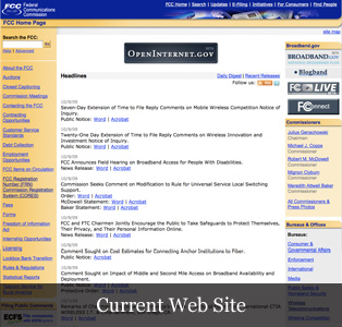

The home page of any website should be the place that welcomes you. It is the place that allows any user to see what your site is about and what they can do with it. The current FCC site throws everything at the user right away, leading to decision paralysis. It’s tough for users to understand their choices as to where to go next, and coming to a decision about what to do next is even harder. In our mock-up, we’ve pulled out some of the most important elements on the FCC site: alerts, news, meetings and events, and proceedings where the FCC is seeking public comments.
Logged In Home Page
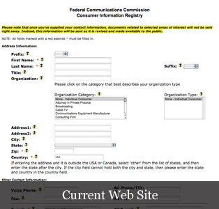

One of the pages on the current FCC site allows users, after entering an email address and password, the ability to identify FCC-related topics they’re interested in. The FCC then sends the user updates according to these topics. What we’ve suggested below is the ability for the user to log into the site rather than this particular page and, in addition to getting updates via email, the content on the home page would be tailored to these interests.
Proceedings Page
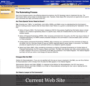

One thing the FCC site doesn’t seem to have is a single hub that provides user-friendly information about their rulemakings, and a gateway to finding the results of those proceedings. On our comp you might recognize some of the elements on this page from our earlier Supreme Court website redesign. We felt that the proceedings page from that project did a good job of describing this kind of process, and it was a pattern that we could continue to use with the FCC in much the same way.
Docket Page
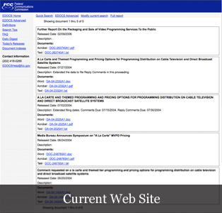

This is another example of where we created a page to pull together content found in far-flung areas of the existing FCC site. From what we could see, basic information about a rulemaking docket is found in one area, while comments and discussion about it is found elsewhere. Again, borrowing some elements from the Supreme Court mock-up, we structured the page so that the user can quickly learn about the docket, where a proposed rule fits within the rulemaking process, and provide an overview of what else has happened with regard to that particular docket.
Conclusion
It’s clear that the FCC site has been developed piecemeal since the last redesign eight years ago, and the changes that have happened in telecommunications have surely made this a daunting task. Because of the FCC’s important role in our government, their website must convey their vast content in a clear and organized way. In this case, the organization of information is the key to making the site as useful as it can be.
While it’s clear that the current FCC site could use some graphic design help, we encourage the FCC to look beyond the simple challenge of making the site look great and significantly focus on making it feel just as great. While our work simply skims the surface, we hope that the FCC will see in our redesign the potential for a cohesive and useful experience.