New Wireframes from the FCC
As some of you might recall, we took a stab at redesigning the FCC site a little over a year ago. Since then the FCC has been reconsidering their online presence. A few days ago they released some interesting wireframes of a reimagined FCC.gov site. Looking through those wireframes, it seems like quite a good attempt at organizing their content and really trying and make it more understandable to the general public.
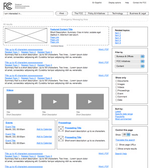
There are a few small things here and there that I can nitpick. For example on the “Search Results” wireframe it would be nice to have a title at the top to say what the user had just searched for. I’m also a bit perplexed as to why on a search results page there would be a section for videos that breaks up the main results. If they want to have results by category they should group them as such and then have links to see full results in each category. Also, please FCC, we’re begging you: make things like press releases available in formats other than word and pdf.
My only big overarching suggestion is not to be scared of content. Tabs can be a great way to organize but aren’t always the solution. The more tabs you have the more a user has to click and the more of your content they can’t see at first glance. There is never too much information — it’s just a question of how you present it.
But I would like to applaud the FCC for making some great progress and for putting this online so that the public can comment and participate in the design process. So please take them up on their offer! Your feedback will encourage them and other government sites to do more and better things online.