Let the Redesigning Continue
As some of you might have seen we’re undergoing a major redesign here at the Sunlight Foundation. We started off with the building blocks, a new logo and mood board, to lay out the concept of our new look. Now, with last year’s projects behind us, we’re ready to share the wireframes and comps for the new site.
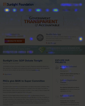
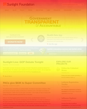
Before beginning a project as big as this redesign we wanted to make sure we had some evidence to back up our suspicions regarding the current Sunlight site. Our first step was to install heat map software to get a sense of where users were clicking the most and how they were navigating. As you can see from the darker-colored image, users are clicking most on certain navigation items and projects but not so much on the blog content that lives on the homepage. The rainbow colored image is what’s called a scroll map, it shows how much of a particular page a user views before navigating away from it. The white color is what is viewed the most and then it goes down from yellow, orange, red, green and finally blue indicates the fewest views. For us, this shows that as soon as users hit that blog content they start navigating away from this page.
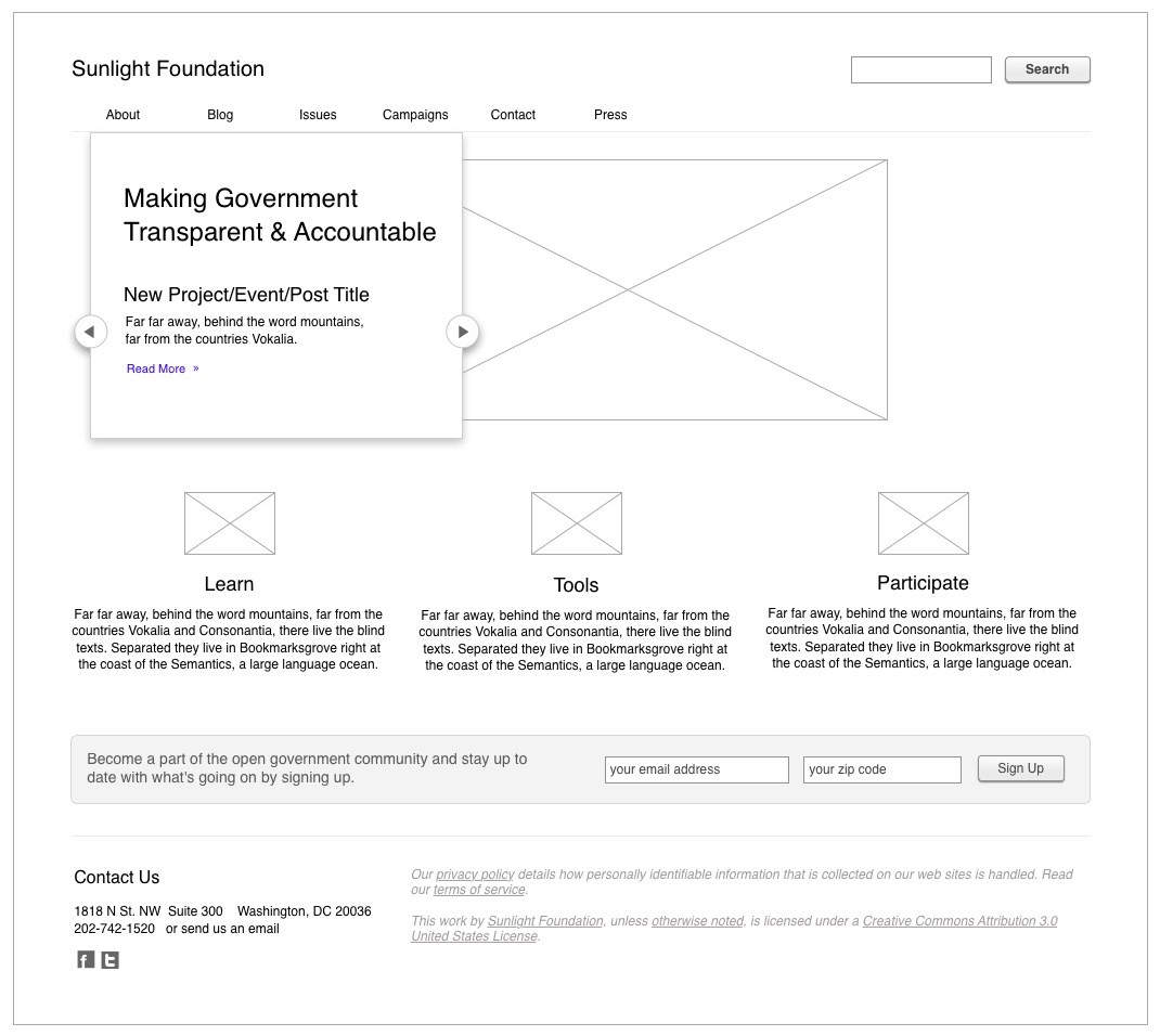
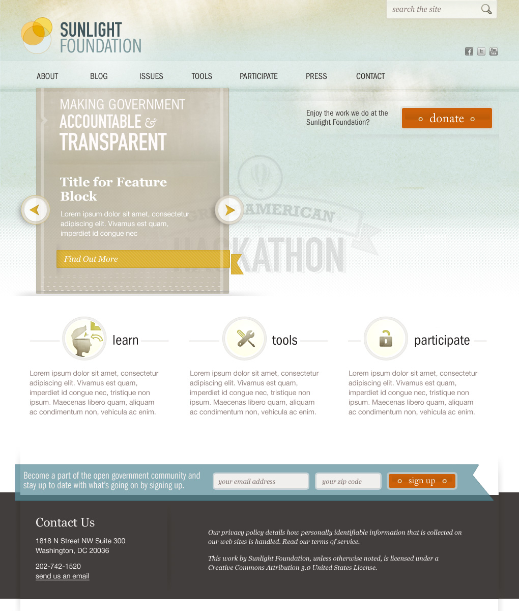
Armed with this new information, we moved onto the wireframes. We decided to only make wireframes for the pages that would change significantly: the homepage, the main blog view, and a blog detail page. For the new homepage we decided to focus on simplicity since the scroll map showed us that most users didn’t dig into the more in-depth content that was there. Search engines like Google mean that not all users enter a site from the home page, so it doesn’t need to contain everything for everyone. The new goal was to be able to give an overview of what we do, feature new projects and have a structure that was interesting and understandable enough that users would navigate on to different sections of the site.

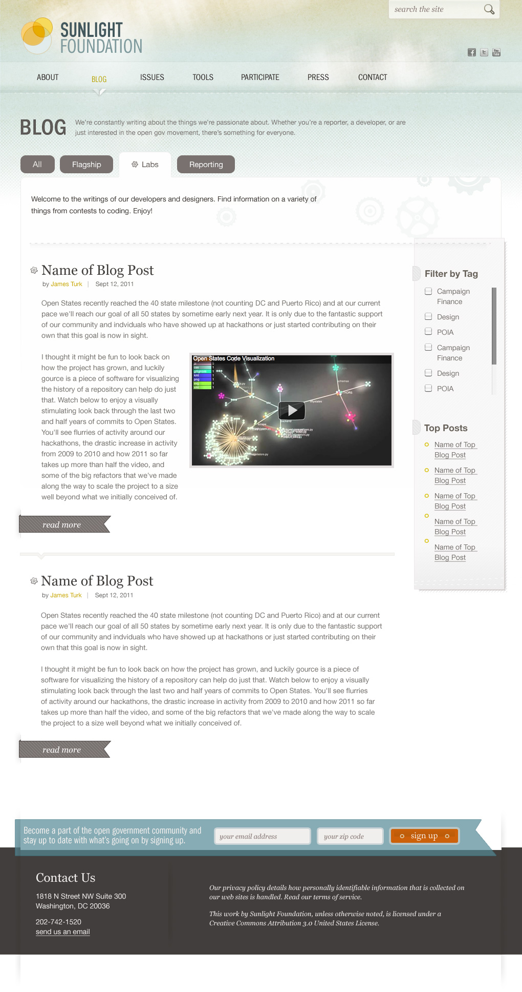
If you look at our current site you’ll see that we have three different blogs under three different sites: one for labs, another for reporting and the main blog on the foundation site. Through the years this has caused much confusion, which makes sense given the wildly different looks between them. These days with the way we’ve grown and how we now utilize all these sites it no longer makes sense to have these different silos. The labs blog has become just a blog, and the non-blog content on reporting would be better served living on a dedicated lobbying site. After the redesign launches, all three blogs will live together under sunlightfoundation.com/blog. That said, we will still have the breakdown of blogs, with the use of tabs, so that developers can easily access our posts on technology and reporters can see content that is more relevant to them.

Finally, throughout the site we want to make the experience for users a bit easier by leaving hints as to other things they might be interested in. We do so many different things here at Sunlight that sometimes it’s hard to link them all together. Being able to have suggestions for other content that relates to the page users are currently on will hopefully help visitors in their discovery and/or search.
The Design
And so the wireframes and the mood board finally meet. We hope you enjoy them and will let us know your thoughts. Keep an eye out for the new business cards and letterhead designs — those should be out in the next couple of weeks.