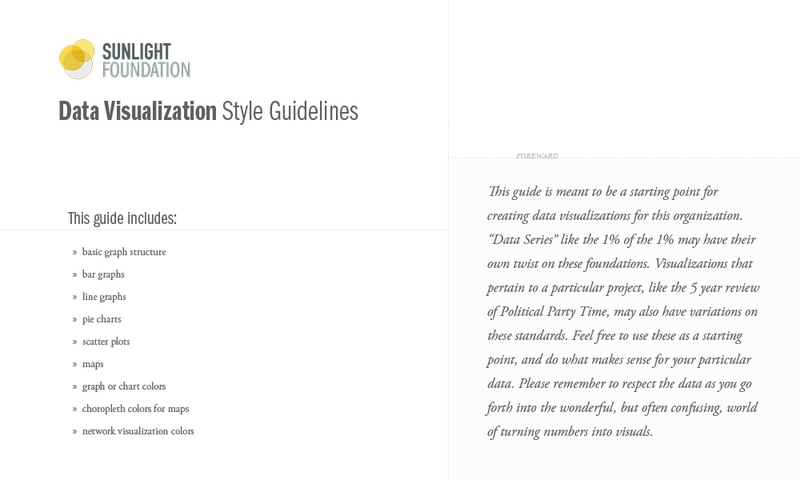
The Sunlight Foundation’s Data Visualization Style Guidelines
Over the past year at the Sunlight Foundation, we’ve worked hard to improve our data visualizations. We work with data a lot over here, so conveying insights in an accessible and accurate manner is important to us. Charts that are well designed and professional are taken more seriously because it conveys an attention to detail that implies that similar care was taken with the data. As we’ve created more visuals to compliment our data analysis, we’ve become better at it and more consistent. A significant step in this process was the recent creation of what we fondly refer to as: The Sunlight Foundation Data Visualization Style Guidelines
So why a guide at all?
In our guide I’ve included not just where to put the logo (top right across from the title), but how far apart things should be spaced, what kind of gridlines and tooltips to use, sizing, color, font and hierarchy guidance as well as a few bullet points on when each type of visualization is useful.
The guide covers the common applications and provides guidance on basic design and branding principles that all charts we make should meet. Now everything we make has a cohesive feel: it looks like it was made by us! The guideline has allowed others to create templates that applied our standards to meet their needs.
It also allows us to create visualizations more quickly. Instead of starting from scratch every time, there is a ready arsenal of colors and basic setup rules waiting to be applied. (Click the image below to see the full size color palette.) By having a starting point of restrictions, it gives our staff more freedom to create. They can produce something independently that meets our minimum design and branding standards.

Why not just create a template?
I created a guideline because it is not possible to pre-design every chart. Some insights and some data require special treatment. The guide is a starting point and includes standards for our basics chart types, but is also helpful when you have a non-standard data visualization, like a stadium map or a sinking percentage bar chart.
And from the guide, sprouted templates. For example, former Sunlighter Ben Chartoff created an R script that set the options of Hadley Whickam’s ggplot2 to closely mimic our style guidelines. This has drastically reduced the amount of work designers need to do to clean up R output for publication. Bob created a D3.js template. I created an Adobe Illustrator template for Rebecca to use. And I’m sure more templates will be created as we adopt new ways of visualizing data.
It also allows people to use our branding and style standards in a form they are comfortable with, rather than requiring all our staff to learn Javascript. Or only create flat graphics. It allows us to experiment with new technology and not be locked into just one way of creating data visualizations. I created a flexible system upon which others have built, instead of just one solution. (Click the image below to see the full size graphic.)

Is it working?
I’d say yes. By not forcing everyone to adopt the same technology, but allowing them to continue using what they are comfortable with, we’ve had more people accept this system. It’s easier to create things, so we’ve been doing it more often. And our branding is stronger and more recognizable.
Take a look at the full guide.