Tools for Transparency: NodeXL
This week’s Tools for Transparency post is part of a two-part mini-series by guest blogger Justin Grimes. Justin (@justgrimes) is a PhD candidate at the University of Maryland’s College of Information Studies, a research assistant at the Information Policy and Access Center (iPAC), and a member of the Human Computer Interaction Lab (HCIL). His research areas focus on information policy and information access. In general he geeks out at hacking transportation data and loves talking about all things data.
Visualizing the TransparencyCamp Community
I attended TransparencyCamp 2012 earlier this month and, like every other year that I have attended, there were lots of people and good conversations. This year I was particularly amazed at the sheer number and diversity of those in attendance. This got me thinking about the people drawn to this event and the relationships between them. I wondered, “wouldn’t it be neat to see what this community looks like?” So I decided to gather some Twitter data and do a little social network analysis on the #tcamp12 community.
Here are the results…
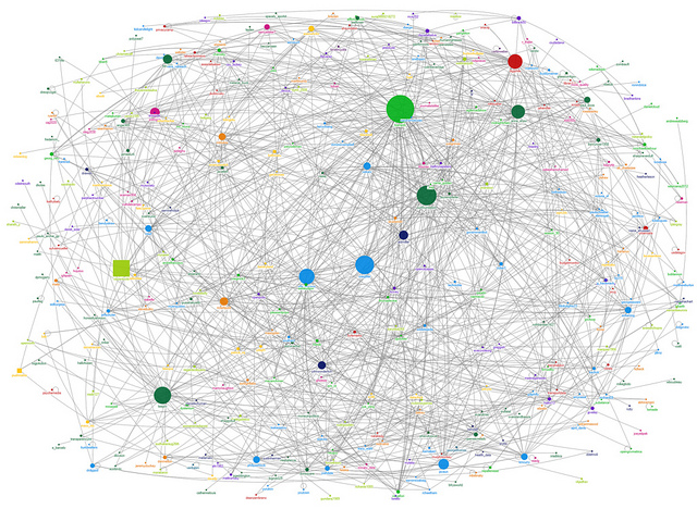
Click to see the full image at a a higher resolution.
What you are looking at is a graphical visualization of the community that tweeted with the hashtag #tcamp12 during TransparencyCamp 2012.
This graph was made using NodeXL and contains all Twitter users who sent tweets with the TCamp hashtag from April 28th to May 1st, 2012. In this graph you can basically see “who’s talking to whom” — meaning the “circles” are Twitter users and the “lines” signify a mention from one user to another user. In this graph there are 367 nodes (“Twitter users”) with 1107 unique edges (“mentions”).
The graph is laid out using a Fruchterman-Reingold algorithm. Twitter users are grouped by color automagically by the Clauset-Newman-Moore clustering algorithm. Twitter users are sized by “betweenness centrality” — a useful metric for evaluating nodes in a network besides just popularity (i.e. number of direct connections you have with other people). In technical terms, betweenness of centrality measures a “node’s centrality in the network equal to the number of shortest paths from all other vertices to all others that pass through that node”. In layman’s terms, this helps us identify the people (or “nodes”) who bridge different networks or communities within a network or community. In essence, the higher the value of “betweenness”, the more important you are to maintaining connections between groups. You are “the broker” between communities and have influence as such. Start removing nodes that have a high betweenness of centrality score and groups become disconnected and isolated.
The average betweenness centrality for the #TCamp12 community is 834.807. Keep this number in mind as you review the table below.
Top 10 #TCamp12 users ranked by betweenness of centrality:
@tcampdc 23502.981 @sunfoundation 16236.783 @craigfifer 15258.757 @tsagov 14022.989 @citizentools 13420.000 @elle_mccann 12504.825 @digiphile 11569.597 @_anna_shaw 10835.748 @javaun 8020.142 @joelogon 7213.984
Overall graph metrics:
Vertices: 367 Unique Edges: 1107 Self-Loops: 164
Maximum Geodesic Distance (Diameter): 8 Average Geodesic Distance: 3.540974 Graph Density: 0.007020443 Modularity: 0.447527
Below is another visualization of the same data but this time clustered groups are organized in boxes and the layout is done by using Harel-Koren Fast Multiscale algorithm. This graph is a little better in terms of clarity because it highlights different subnetworks.
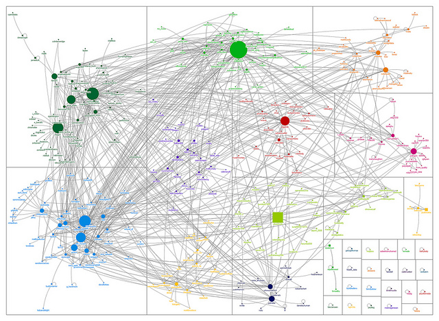
Click to see the full image at a a higher resolution.
DIY NodeXL
So how can you do this type of analysis to help understand your community members or the ways in which they interact? Easy! and I’m going to show you how to get started. To do this I will explain the basics of social network analysis and then, I will then walk you through the process of collecting, analyzing, and visualizing social network data using a tool called NodeXL.
So what is social network analysis (SNA)?
Social network analysis (SNA) is the methodological study of social networks. Social networks are social structures made up entities (i.e. individual people, organizations, etc) and their dyadic ties (i.e. relationship, connection, etc). In technical terms we call these entities “nodes” or “vertices” and we call these ties “edges” or “links” or “connections”. A social network graph visualizes the network of nodes and edges.
Besides being just generally interesting, social network analysis is one way of helping us make sense of the world around us. Networks are everywhere. Social network analysis is a good way to understand social structures in our society and can be particularly useful towards mapping and measuring the relationship between people.
To perform social network analysis you’ll need software to help you perform the analysis (and a question). There are lots of amazing software tools for performing social network analysis to choose from: NodeXL, Gelphi, Pajek, etc. For beginners, I always recommend using NodeXL. NodeXL itself is an open source plugin for Microsoft Excel. It is free, easy to use, requires no programming experience, little prior SNA knowledge, and has wonderful documentation and a solid community supporting it. One of the nicer features of NodeXL is that it can automagically import data straight from social network sites such as Twitter and Flickr. The only serious drawback or criticism I have for NodeXL is that it Windows only and requires Microsoft Office. [Disclaimer – although NodeXL was largely developed at Microsoft, I’m affiliated with the HCIL, which has several members who have contributed to this project; I was not one of them].
As I said earlier, you need two things to do social network analysis: software and a question. NodeXL will be our software. Our question for this example will be what does network of Twitter users at TransparencyCamp 2012 look like? To answer this question I’m going to analyze Twitter activity of Transparency Camp 2012 by capturing all tweets that contain the hashtag #tcamp12.
To get the answer to this question, stay tuned until next week when we’ll share Justin’s step-by-step NodeXL guide. In the meantime, if you have Windows and want to start playing with social network data on your own, click here to download the #TCamp12 data file Justin used to complete the analysis above.
UPDATE: For the second part of this series, click here!