The Political 1% of the 1% in 2012

In the 2012 election, 28 percent of all disclosed political contributions came from just 31,385 people. In a nation of 313.85 million, these donors represent the 1% of the 1%, an elite class that increasingly serves as the gatekeepers of public office in the United States.
More than a quarter of the nearly $6 billion in contributions from identifiable sources in the last campaign cycle came from just 31,385 individuals, a number equal to one ten-thousandth of the U.S. population.
In the first presidential election cycle since the Supreme Court’s decision in Citizens United v. FEC, candidates got more money from a smaller percentage of the population than any year for which we have data, a new analysis of 2012 campaign finance giving by the Sunlight Foundation shows. These donors contributed 28.1 percent of all individual contributions in the 2012 cycle, a record high.
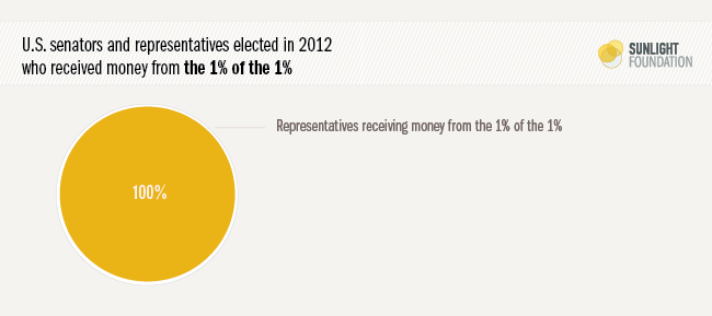
One sign of the reach of this elite “1% of the 1%”: Not a single member of the House or Senate elected last year won without financial assistance from this group. Money from the nation’s 31,385 biggest givers found its way into the coffers of every successful congressional candidate. And 84 percent of those elected in 2012 took more money from these 1% of the 1% donors than they did from all of their small donors (individuals who gave $200 or less) combined.
This elite 1% of the 1% dominated campaign giving even in a year when President Barack Obama reached new small donor frontiers (small donors are defined as individuals giving in increments of less than $200). In 2014, without a presidential race to attract small donors, all indicators are that the 1% of the 1% will occupy an even more central role in the money chase.
The nation’s biggest campaign donors have little in common with average Americans. They hail predominantly from big cities, such as New York and Washington. They work for blue-chip corporations, such as Goldman Sachs and Microsoft. One in five works in the finance, insurance and real estate sector. One in 10 works in law or lobbying. The median contribution from this group of elite donors? $26,584. That’s a little more than half the median family income in the United States.
Visualizing the inequalities
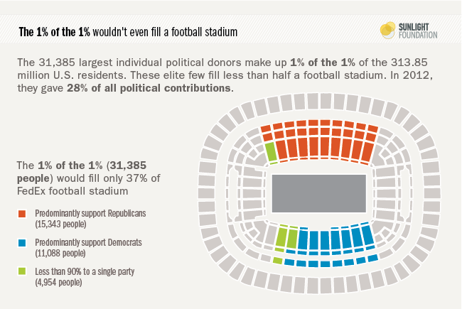
What does 31,385 people look like? This elite group of donors would occupy a little more than a third of the seats in Fedex Field, where the Washington Redskins play football (Figure 1). But they pay a much higher price of admission than ticket-holders there. The smallest contribution required to make it into the 1% of 1% of political donors last year? $12,950.
Figure 1.
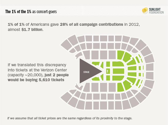
How unequal was political giving in 2012? If we let the Verizon Center (capacity of about 20,000) stand in for the entire U.S., it would be as if just two people bought out the best 5,610 seats. Figure 2 shows what that looks like.
Figure 2.
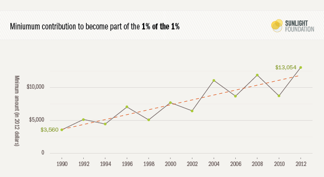
The price of entry to be in this elite group of donors has risen steadily over the years (Figure 3). In 1990, a single $2,000 contribution (about $3,700 in 2012 dollars) could put you in the 1% of the 1%. By 2000, the minimum contribution had risen to $5,700. It crossed the $10,000 mark for the first time in 2008, reaching $11,000.
Figure 3.
Why the increase? No doubt, the Citizens United and SpeechNow decisions, which paved the way for unlimited contributions to super PACs, are a key factor. Of the 1% of the 1%’s $1.68 billion in the 2012 cycle, $500.4 million entered the campaign through a super PAC (including almost $100 million from just one couple, Sheldon and Miriam Adelson). However, more money ($670.5 million) went directly to parties. The vast majority of 1% of the 1% donors – 87.5 percent – contributed absolutely nothing to super PACs, giving instead directly to candidates, parties and traditional PACs. Only 5.5 percent of the 1% of the 1% donors (1,635 individuals) contributed more than $10,000 to super PACs.
We should also note that this total does not include the at least $305 million in “dark money” in the 2012 election, since the donors behind that spending remain anonymous. But we can reasonably speculate that most of them are in the 1% of the 1%, and had we been able to include them, the share of 2012 money coming from the 1% of the 1% would almost certainly have been higher.
The rising tide of the 1% of the 1%
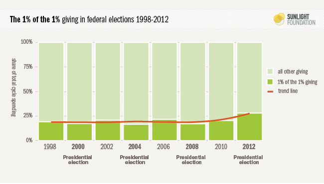
The 28.1 percent of total money from the 1% of the 1% marks a dubious new landmark in the history of modern elections – well above the previous high of 21.8 percent in 2006 (Figure 4). In 2010, 20.5 percent of the money going to federal candidates and campaign committees came from the most generous 0.01 percent of Americans.
It’s especially striking – and surprising – that the new record should have been set in a presidential election year. The race for the White House attracts more small donors than mid-term elections. In recent presidential election cycles (2000, 2004 and 2008), the slice of donations coming from the 1% of the 1% held solidly around 17 percent. This year’s 28.1 percent share marks a significant break with the past. It is a new level in political contribution inequality.
Figure 4.
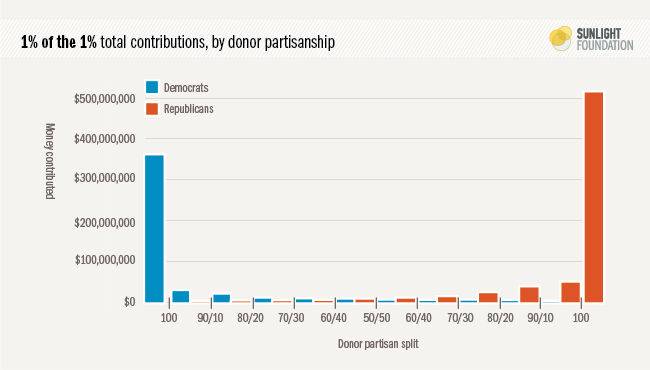
Our data also cast doubt on the stereotype about big money being politically pragmatic. Less than four percent of the most generous political donors spread their money close to evenly between the two parties (a 60-40 split or less). Four out of five 1% of the 1% donors were pure partisans, giving all of their money to one party or the other.
While both parties draw on the generosity of these elites, 40 percent more 1% of the 1% donors predominantly supported Republicans than predominantly supported Democrats. We also find that conservative Republican members of Congress depend more on 1% of the 1% donors than moderate Republicans do, suggesting a polarizing effect of big money, at least on the political right. There is no corresponding relationship among Democrats.
Why we should care
The 1% of the 1% are the political gatekeepers of American politics. Through countless independent phone calls and fundraising events, they set the boundaries of acceptable political topics and positions (i.e., what they care about and believe). They determine who is an acceptable candidate (i.e., those individuals whom they trust to represent their interests).
Their influence is very rarely found in simple favor trading. Rather, their influence arises from something subtler yet far more significant: shaping the limits of acceptable political discourse, one conversation at a time.
In the 2012 cycle, winning House members raised on average $1.64 million, or about $2,250 per day during the two-year cycle. The average winning senator raised even more: $10.3 million, or $14,125 per day.
That money has to come from somewhere. And while it could come from small donors, it’s much more time-efficient to host a $1,000-a-plate fundraiser, or spend an afternoon calling corporate executives, hedge fund managers, lawyers, lobbyists, political action committee managers and others in a position to give a few thousand dollars. Rare is the candidate with enough small donor appeal to bring in the kind of money needed to run a successful campaign.
This places limits on what is politically possible. As Sen. Chris Murphy, D-Conn., put it succinctly at a recent event at Yale University, recalling his time fundraising in his recent (2012) campaign: “I talked a lot more about carried interest inside of that call room than I did in the supermarket.” (“Carried interest” refers to profits that private equity and hedge fund managers earn on investments.)
Murphy knows it is much easier to raise the kind of money he needs if he remains sympathetic to the concerns of private equity and hedge fund managers – and much harder if he supports increasing the tax rate on carried interest. Murphy is not alone. Every member of Congress faces the same concern. They don’t want to upset the people most likely to fund their campaigns, and will try their best to avoid doing so. As costs of elections for office run higher and higher, candidates and parties have less freedom to cross a potential donor. It amounts to what Lawrence Lessig has called “dependence corruption” – the way in which political discourse must necessarily shift to reflect the demands and opinions of the most active donors.
These concerns are likely even more acute for the two parties. In 2012, the National Republican Senatorial Committee raised more than half (54.2 percent) of its $105.8 million from the 1% of the 1%, and the National Republican Congressional Committee raised one third (33.0 percent) of its $140.6 million from the 1% of the 1%. Democratic party committees depend less on the 1% of the 1%. The Democratic Senatorial Campaign Committee raised 12.9 percent of its $128.9 million from these top donors, and the Democratic Congressional Committee raised 20.1 percent of its $143.9 million from 1% of the 1% donors.
Party aside, what all these donors have in common is the personal wealth that allows them to contribute tens of thousands of dollars in an election cycle. And as political scientists Benjamin Page, Larry Bartels and Jason Seawright explain in a recent paper, the rich are not like the rest of us – and not just because they have more money. They also have very different political priorities, particularly on issues of economics and government spending. And as political scientist Marty Gilens has shown, when rich people and poor people disagree on policy, elected officials almost always side with rich people.
Where the money goes
Figure 5 breaks down all the sources of money in the 2012 election, comparing 1% of the 1% donors with other over-$200 donors, small donors and a few other sources of money. (PACs are not included separately in this total because they are conduits for individual donations). This figure also breaks down where the 1% of the 1% money went. In brief: $410 million went directly to candidates ($235 million to Republicans, $173 million to Democrats); $671 million went to party committees ($405 million to Republican committees, $265 to Democratic committees); $500 million went to super PACs; $89 million went to traditional PACs.
Figure 5.
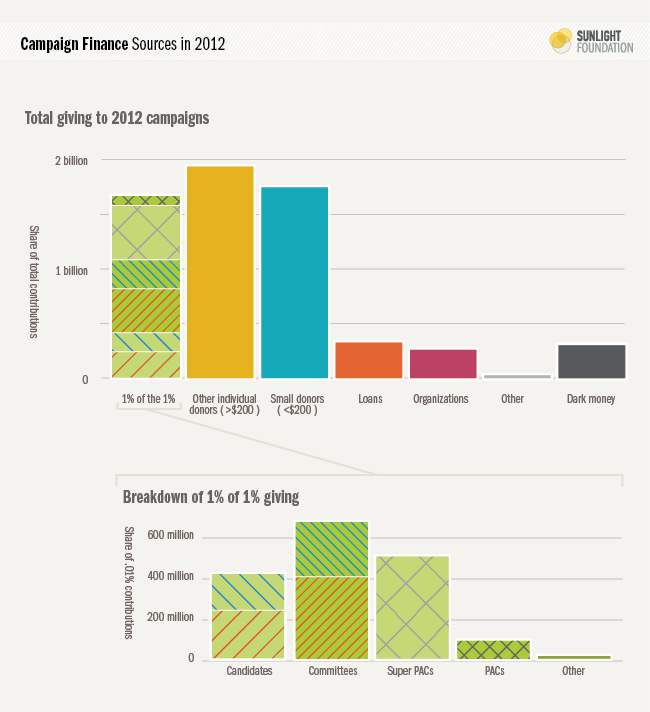
For those more interested on the inequality of giving within the 1% of the 1%, we have more detail here. The quick summary: Those in the top 10 percent of the 1% of the 1% (the top 3,139 givers in American politics) account for about half of the total spending by the 1% of the 1%. More than half of their contributions went to super PACs.
Congressional dependence
Every single member of Congress elected in 2012 received at least some money from the 1% of the 1% (Figure 6). Only Reps. Luis Gutierrez, D-Ill., ($4,750 from eight 1% of the 1% donors) and Jose Serrano, D-N.Y., ($7,000 from six 1% of the 1% donors) received less than $10,000 total. Both represent safe seats in poor, urban districts, and both get roughly 75 percent of their campaign money from PACs.
Figure 6.
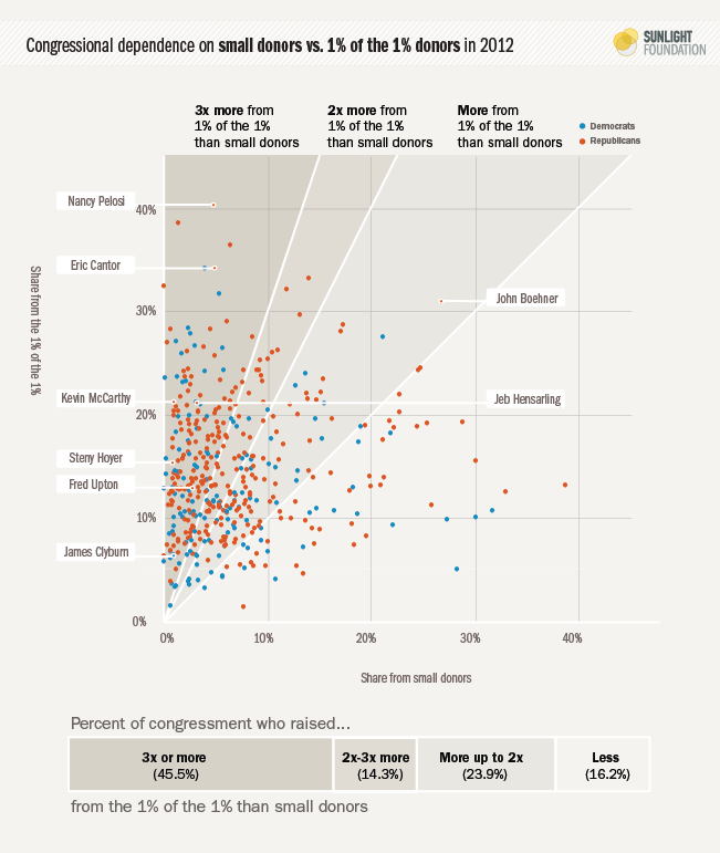
Of the 435 House members elected in last year, 372 (86 percent) received more from the 1% of the 1% than they did from every single small donor combined (Figure 7). And almost half (202, or 46.4 percent) received more than three times as much money from these large donors than they did from all small donors combined.
The 33 senators elected in 2012 were only slightly less dependent on the 1% of the 1%. The majority (20, 61 percent) got more money from the top donors than from all small donors combined. And one third (11) got three times as much money.
Figure 7.
Combined, winning House and Senate candidates in 2012 received 17.1 percent of their direct campaign contributions from the 1% of the 1%, as compared to 13.0 percent from all small (under $200) donors. Overall, the largest share of funding for Congress comes from PACs, which contributed 32.8 percent of the money congressional candidates received. If we combine PAC contributions and 1% of the 1% contributions, that’s exactly half of all winning Congressional candidate campaign contributions coming from either very wealthy individuals or political action committees. (Of course, some of the PAC money was originally 1% of the 1% money, since 1% of the 1% donors gave $89.4 million to PACs in 2012).
Overall, a total of 32 members of Congress (24 House members and eight senators) elected in 2012 got at least 25 percent of their total funds from 1% of the 1% donors. And 72 House members and 19 senators got at least 20 percent of their funds from these donors.
Table 1 (below) highlights the 20 members of Congress who depended on the 1% of the 1% for the biggest share of their contributions in 2012. House Minority Leader Nancy Pelosi, D-Calif., tops the list. Four out of every ten dollars contributed to her campaign came directly from 1% of the 1% donors (as compared to just five percent from small donors). House Speaker John Boehner, R-Ohio, is also in the top 10 with 31.8 percent of his contributions coming from 1% of the 1%, as is House Majority Leader Eric Cantor, R-Va., at 34.2 percent.
For more on key Congressional leaders, click here
Boehner also had the highest number of donors from the 1% of the 1% giving to his campaign (2,525 individuals), and accordingly received the most total money from them ($6.8 million). That puts him just ahead of Sen. Elizabeth Warren, D-Mass., for most 1% of the 1% donors (Warren had 2,361) and ahead of Sen. Tim Kaine, D-Va., for most money from 1% of the 1% donors (Kaine raised $5.1 million). However, since Warren and Kaine both ran in highly competitive Senate raises and raised remarkable sums (Warren at $42 million, Kaine at $18 million), they don’t show when we look at the top 20 by share of funds from the 1% of the 1%.
The top 20 list (ranked by share of contributions from the 1% of the 1%) includes slightly more Democrats (12) than Republicans (8). Even though 1% of the 1% donors concentrate in major cities, the geographic diversity of these top candidates is impressive. Only New York (3) and Florida (3) have more than one representative on the list.
Table 1.
Members of Congress with the highest share of donations from the 1% of the 1%, 2012
| Candidate | State | Chamber | Share from the 1% of the 1% | Share from small donors | Total raised |
|---|---|---|---|---|---|
| Nancy Pelosi (D) | CA | H | 40.4% | 4.8% | $2,298,844 |
| Roger Williams (R) | TX | H | 38.7% | 1.5% | $2,736,485 |
| Sheldon Whitehouse (D) | RI | S | 36.5% | 6.4% | $3,280,685 |
| Nita M. Lowey (D) | NY | H | 34.2% | 3.9% | $2,125,851 |
| Eric Cantor (R) | VA | H | 34.2% | 4.9% | $7,619,202 |
| Jeff Flake (R) | AZ | S | 33.3% | 13.9% | $8,967,955 |
| Joe Kennedy III (D) | MA | H | 32.6% | 0.0% | $4,193,094 |
| Bill Foster (D) | IL | H | 32.3% | 11.8% | $2,956,287 |
| John Sarbanes (D) | MD | H | 31.8% | 5.4% | $1,010,367 |
| John Boehner (R) | OH | H | 31.0% | 26.7% | $21,981,789 |
| Jon Tester (D) | MT | S | 29.7% | 13.1% | $11,881,646 |
| Ron DeSantis (R) | FL | H | 29.1% | 6.1% | $1,145,859 |
| Ted Cruz (R) | TX | S | 28.8% | 17.2% | $13,627,317 |
| Jerrold Nadler (D) | NY | H | 28.4% | 2.4% | $1,114,468 |
| Orrin G. Hatch (R) | UT | S | 28.3% | 0.6% | $8,829,902 |
| John A. Barrasso (R) | WY | S | 28.3% | 4.5% | $4,007,574 |
| Tim Kaine (D) | VA | S | 28.2% | 17.0% | $18,008,380 |
| Ted Deutch (D) | FL | H | 27.9% | 2.6% | $1,263,534 |
| Kirsten Gillibrand (D) | NY | S | 27.6% | 8.5% | $15,577,940 |
| Debbie Wasserman Schultz (D) | FL | H | 27.6% | 21.0% | $3,610,339 |
For complete data on all members elected in 2012, click here.
Partisanship
Republicans are about 40 percent more common than Democrats among the 1% of the 1%. While almost half (49.8 percent) of the 1% of 1% gave at least 90 percent of their money to Republicans, just over one third (35.5 percent) of these donors gave at least 90 percent to Democrats.
Figure 8 bins the donors by their level of partisanship based on how much they gave to parties and candidates. Since super PACs are technically independent, we do not include donations to these groups in our totals.
Figure 8.
Meet the 1% of the 1%
Who are the 31,385 individuals who contributed 28.1 percent of the traceable money in the 2012 election?
A few of them are well-known. Sheldon Adelson and his wife Miriam contributed a combined $97 million. Harold Simmons, who built a business empire around buying Superfund sites, contributed $25 million. Bob Perry, the late Texas real estate mogul, contributed $23.5 million. New York City Mayor Michael Bloomberg is the seventh largest donor, at $10.6 million. Many of the other names atop the list will be familiar to readers of our “Stealthy Wealthy” series.
But our analysis is not focused on specific individuals, many of whose campaign largesse and motivations already have been well-scrutinized. Rather, our interest is in examining the role of this elite group of donors as the collective gatekeepers of public office.
Mostly, these donors tend to come from top corporate positions, most commonly in the worlds of finance and law. They most frequently hail from New York and Washington. Of donors for whom we know the gender, 71.8 percent are male.
For a list of all 31,385 donors in the 2012 one percent of the one percent, click here
Top Professions
While the most common occupation listed among these donors is “Retired” (13.1%), the plurality with identifiable professions hail from top corporate jobs: 8.8 percent identify themselves as “president,” 8.7 percent as “attorney” or “lawyer” and 8.5 percent as “CEO.” While there is some overlap among the corporate jobs (for example, various individuals list themselves as “CEO and Chairman,” or “President/CEO,” etc.), a total of 5,639 top donors (17.0 percent) list themselves as at least one of the following: “CEO,” “President,” “Chairman,” “Executive” or “Owner.”
Looking purely at the monetary contributions, CEOs and chairmen (frequently the same person) account for the largest raw percentage of donations, which tells us that they contribute, on average, a bit more than the average member of the 1% of the 1%. By contrast, retirees give a little less on average, accounting for only 10.8 percent of the contributions as compared to 13.2 percent of donors.
It’s also worth highlighting that 7.7 percent of the 1% of the 1% list their occupation as “homemaker.” Since homemakers are rarely compensated for their work, we are left to assume that their ability to contribute tens of thousands of dollars is due to spousal or inherited wealth. “Homemaker” is the listed occupation for 27.4 percent of the female 1% of the 1% donors, while “Retired” is the listed occupation of 17.5 percent of the female 1% of the 1% donors. (As a basis of comparison, 11.5 percent of the male 1% of the 1% donors list their occupation as “retired.”)
Table 2.
Most common professions among the 1 percent of the 1 percent, 2012
| Occupation | Donors | Share of 1% of the 1% donors | Total donations | Share of 1% of the 1% donations |
|---|---|---|---|---|
| Retired | 4131 | 13.2% | $181,663,338 | 10.8% |
| President | 2764 | 8.8% | $137,886,277 | 8.2% |
| Attorney | 2738 | 8.7% | $104,658,811 | 6.2% |
| CEO | 2671 | 8.5% | $230,678,958 | 13.7% |
| Homemaker | 2432 | 7.7% | $117,901,507 | 7.0% |
| Chairman | 2428 | 7.7% | $223,832,610 | 13.3% |
| Executive | 1886 | 6.0% | $101,835,685 | 6.1% |
| Investor | 1638 | 5.2% | $106,385,270 | 6.3% |
| Owner | 1015 | 3.2% | $42,177,945 | 2.5% |
Top Employers
While thousands of different employers are represented among the 1% of the 1%, certain names pop up more frequently than others. At the top of the list (by far), is Goldman Sachs, with 85 employees contributing $4.67 million between them. Blackstone, the private equity firm, is next with 49 employees, and the major law firm, Kirkland & Ellis, is third on the list with 40 employees. Financial and legal/lobbying firms dominate the top 20.
Besides Goldman and Blackstone, financial firms Morgan Stanley (38 donors), Elliot Management (24), Citigroup (23), Credit Suisse (23), Fidelity (23) and Bain Capital (21) also make the top 20 list. That adds up to 248 major donors from top financial firms. Elliot donors contributed on average $184,830, the highest of any of the top employers. Bain Capital came in second, at $131,634.
The top legal and lobbying firms, after Kirkland and Ellis, are Akin Gump (36), Podesta Group (30), Skadden Arps (29), DLA Piper (21) and Brownstein Hyatt Farber Schreck (20). That adds up to 176 major donors from top law and lobbying firms.
Rounding out the list of organizations with the most employees in the 1% of the 1%: Harvard University at 33, Google at 33, Microsoft at 31 and Comcast at 26. One name that may not be familiar to Washington insiders is the Rothman Institute, a Philadelphia-area orthopedic group with 23 employees in 1% of the 1%. It is the only healthcare organization on this list. Its 1% of the 1% donors also gave the least on average: $25,668.
Table 3.
Most common employers among the 1% of the 1% percent, 2012
| Employer | 1% of the 1% Donors | Total donations | Average donations |
|---|---|---|---|
| Goldman Sachs | 85 | $4,670,207 | $54,944 |
| Blackstone | 49 | $2,236,050 | $45,634 |
| Kirkland and Ellis | 40 | $1,526,949 | $38,174 |
| Morgan Stanley | 38 | $1,241,241 | $32,664 |
| Comcast | 37 | $1,222,705 | $33,046 |
| Akin Gump | 36 | $1,643,941 | $45,665 |
| 33 | $1,352,312 | $40,979 | |
| Harvard | 33 | $1,236,391 | $37,466 |
| Microsoft | 31 | $1,049,667 | $33,860 |
| Podesta Group | 30 | $1,052,179 | $35,073 |
| Skadden Arps | 29 | $1,239,387 | $42,737 |
| Patton Boggs | 26 | $925,528 | $35,597 |
| Elliot Management | 24 | $4,435,923 | $184,830 |
| Credit Suisse | 23 | $705,788 | $30,686 |
| Rothman Institute | 23 | $590,366 | $25,668 |
| Citigroup | 23 | $746,650 | $32,463 |
| Fidelity | 23 | $726,414 | $31,583 |
| DLA Piper | 21 | $864,496 | $41,166 |
| Bain Capital | 21 | $2,764,306 | $131,634 |
| Brownstein Hyatt Farber Schreck | 20 | $627,016 | $31,351 |
Top Sectors
Looking more closely at the sectors shows that donors from the financial and legal world are indeed the most common donors in the 1% of the 1%. The Financial, Insurance and Real Estate (FIRE) donors are most prominent – giving one quarter of all 1% of the 1% donations, and accounting for 21.5 percent of the 1% of the 1% donors. Law and lobbying firm donors are second, accounting for roughly one in ten members of the 1% of the 1% and 7.4 percent of of the dollar contributions. Collectively, financial and legal sector donors make up almost a third of all donors and all donations from the 1% of the 1%. The third most common category are the single-issue or ideological donors, which means that they contribute primarily through groups such as Emily’s List or the Club for Growth, rather than directly. Notably, only nine donors affiliated with Labor (out of 31,385) make it onto this list. (The shares do not sum to 100 percent because this list does not include donors who did not name their employer or who fall into a motley category of “other.”)
Table 4.
The 1% of the 1% by sector
| Sector | Donors | Share of donors | Total given | Share of total |
|---|---|---|---|---|
| Finance/Insur/Real Estate | 6762 | 21.5% | $419,239,200 | 25.0% |
| Lawyers & Lobbyists | 3189 | 10.2% | $123,487,817 | 7.4% |
| Ideology/Single-Issue | 2584 | 8.2% | $112,832,223 | 6.7% |
| Communic/Electronics | 1833 | 5.8% | $127,047,146 | 7.6% |
| Health | 1485 | 4.7% | $112,942,024 | 6.7% |
| Energy/Nat Resource | 1330 | 4.2% | $69,083,469 | 4.1% |
| Construction | 1053 | 3.4% | $69,537,968 | 4.1% |
| Transportation | 873 | 2.8% | $34,239,262 | 2.0% |
| Agribusiness | 817 | 2.6% | $36,401,750 | 2.2% |
| Defense | 102 | 0.3% | $3,418,074 | 0.2% |
| Labor | 9 | 0.0% | $205,513 | 0.0% |
The Geography of the 1% of the 1%
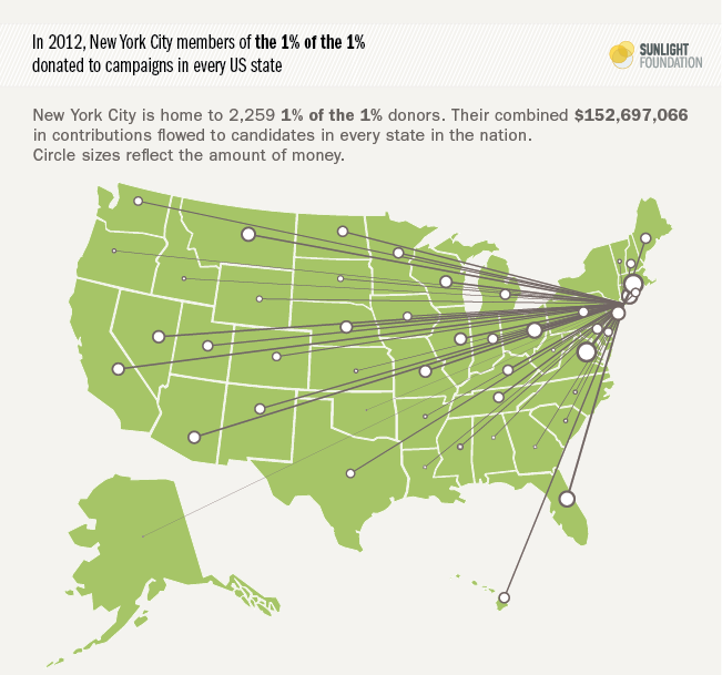
Though the 1% of the 1% hail from all over the country, they predictably most commonly inhabit the major metropolitan areas. New York, the biggest city in the U.S. and home of Wall Street, gives the most money and has the most donors. To understand the wide reach of this money, we’ve visualized the outflow of money from New York City 1% of the 1% donors (Figure 9). The money from just 2,259 New York City residents went to races in every single state of the U.S., though in varying amounts. That is truly remarkable reach.
Figure 9.
Washington has the second most 1% of the 1% donors, and a much higher rate per 10,000: 12.87 donors. If the 1% of the 1% were equally distributed across the country, by definition each city would have one such donor per 10,000 people. Among the cities with the ten most donors, Greenwich, Conn., has by far the highest rate of 1% of the 1% donors – 39.34 donors. Greenwich is a popular home for individuals who work in high finance.
Houston, Los Angeles and Chicago round out the top five. To see how many one percent of the one percent donors are in your city or town, click here for data on donors by location
Table 5.
Cities with the most 1% of the 1% donors
| City | Donors | Donors per 10,000 | Total given |
|---|---|---|---|
| NEW YORK, NY | 2,259 | 2.71 | $152,697,066 |
| WASHINGTON, DC | 814 | 12.87 | $30,820,906 |
| HOUSTON, TX | 664 | 3.07 | $68,272,330 |
| CHICAGO, IL | 603 | 2.22 | $45,865,679 |
| LOS ANGELES, CA | 598 | 1.55 | $40,424,728 |
| DALLAS, TX | 507 | 4.08 | $57,075,447 |
| SAN FRANCISCO, CA | 498 | 6.03 | $29,840,911 |
| BOSTON, MA | 266 | 4.18 | $17,199,606 |
| ATLANTA, GA | 262 | 5.9 | $14,270,899 |
| GREENWICH, CT | 240 | 39.34 | $13,751,384 |
The cities with the highest rate of individuals belonging to the 1% of the 1% are all wealthy suburbs. In Chevy Chase, Md., a wealthy suburb just outside of northwest Washington, 3.6 percent of the residents are members of the 1% of the 1%. In Bloomfield Hills, Mich., a wealthy suburb of Detroit, 2.2 percent of the residents belong to the 1% of the 1%. Looking at the cities with the highest rate of 1% of the 1% donors offers another insight into the elite nature of this group of donors.
Table 6.
Cities with the highest percentage of 1% of the 1% donors
| City | Donors | Donors per 10,000 | Total given |
|---|---|---|---|
| CHEVY CHASE, MD | 105 | 361.2 | $4,718,768 |
| BLOOMFIELD HILLS, MI | 89 | 226.41 | $4,073,003 |
| PALM BEACH, FL | 142 | 166.43 | $8,387,773 |
| ATHERTON, CA | 97 | 134.89 | $5,716,703 |
| WAYZATA, MN | 50 | 132.38 | $3,735,813 |
| WINDERMERE, FL | 31 | 120.16 | $950,060 |
| MEDINA, WA | 36 | 117.42 | $1,729,314 |
| PORTOLA VALLEY, CA | 44 | 98 | $4,176,231 |
| GATES MILLS, OH | 22 | 97.39 | $816,685 |
| NAPLES, FL | 183 | 90.98 | $7,908,364 |
To explore the 1% of the 1% by state, click here
Conclusions
The U.S. now has a campaign finance system where a tiny slice of individuals – 31,385 people, not even enough to fill half of a professional football stadium – collectively account for more than a quarter of all individual contributions (that we can trace), even though they represent just one in ten thousand Americans. Every single member of Congress elected in 2012 received a contribution from this group of individuals, and the vast majority of those elected (84 percent) received more money from the “1% of the 1%” than they did from all small donations (under $200).
A tiny sliver of Americans who can afford to give tens of thousands of dollars in a single election cycle have become the gatekeepers of public office in America. Through the growing congressional dependence on their contributions, they increasingly set the boundaries and limits of American political discourse – who can run for office, what their priorities should be and even what can be said in public. And in an era of unlimited campaign contributions, the power of the 1% of the 1% only stands to grow with each passing year.
Data sources: Influenceexplorer.com, Opensecrets.org, Fec.gov
Read the other 1% of the 1% posts:
Lobbyists in the 1% of the 1% 1% of the 1% Lobbyist Donations to Obama
Congressional Polarization and the 1% of the 1% What do 1% of the 1% Lobbyists Want?
Profile of a 1% of the 1% donor Lobbying Disclosure and the 1% of the 1%
Notes on Methodology
To conduct the analysis we reviewed disclosed donations for the 2012 cycle to federal candidates, party committees, congressional campaign committees PACs and super PACs. Our ability to aggregate campaign finance data by individual donor comes with a few caveats. To calculate totals, we relied on the bulk campaign finance records provided by the Center for Responsive Politics (CRP), and we summed the totals by a unique ID that CRP adds to the raw Federal Election Commission (FEC) data for each contributor. CRP, a respected nonpartisan nonprofit, creates these unique ids because the FEC, which regulates campaign finance in the United States, does not. And because donors – and the recipients of their funds – aren’t required to accurately and reliably identify themselves in FEC records, it’s left to CRP to take on the daunting task. In the 2012 election, there were about 1.26 million unique donors, many with multiple name permutations.
For a good understanding of the challenges of accurate individual counts, we recommend our recent post, “What Charles G. Koch can teach us about campaign finance data.” While we do list the individual members of the 1% of the 1%, we urge caution on the individual donor totals. However, while there may be some random error in individual totals, we are confident that the aggregate conclusions are solid, given the large number of cases that make up these aggregate totals.
We also note that our inability to include contributions to “dark money” groups in our individual donor totals also prevents an exact comparison with our 2010 analysis of the political 1% of the 1%. Back then, the dark money groups were a small part of the political universe, and 527s (which reveal their donors) were the bigger vehicle for independent expenditures. The reverse is now true. We also decided to do a true 1% of the 1% analysis this time around, taking the top 31,385 donors rather than cutting off at a particular giving threshold, which also mitigates against a perfect comparison (we used $10,000 as that threshold last time).