Rethinking usa.gov

With Obama in the President’s seat now, and many new people coming into the vast executive branch, they now have an opportunity to revisit their presence on the web and explore the possibilities of getting the American people more interested and more informed about what their government is doing. The hub for all this information is a site known as usa.gov.
So what would it be like if the new administration were to rethink their presence on the web and turn usa.gov into a more open facing site–a site where people could pick and choose the content that was relevant to them and display it all in a way that was organized and appealing. At the Sunlight Foundation we decided to spend a little time thinking about these challenges and came up with a short design exercise that will hopefully get people thinking in that direction.
The Old
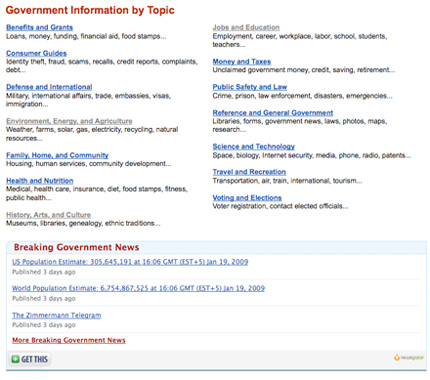
First of all, let’s visit the current usa.gov site to see what’s been done well and what misses the mark completely. Starting at the top of the page, the header is too cluttered. The logo doesn’t have enough space around it which makes it hard for a users eyes to focus there first, and the design itself is dated. I do agree with having the search box as the main source of navigation at the top of the page because there is so much content on usa.gov. However, I think the search options you are given–government web, images, news, maps, and usa.gov–could be eliminated by having a better search results page and a more prominent news section on the home page.

Next is the navigation below the header. It’s kind of nice to be able to navigate based on audience, but at the same time who really thinks of himself as an audience? With people changing all the time wouldn’t you want your government site to change with you instead of pigeon-holing you?

Finally, the main content of the site just seems generally random. To get to the content you’re after, it involves many clicks and there is little to draw the user’s eye to the most important content on a page.
The New
In thinking about a new structure and new design for usa.gov we had a few goals that we wanted to accomplish. They basically were: letting the user customize and personalize the content that was displayed on the site, having better structure and navigation, and just having a cleaner, more powerful overall look to the site.
I think a great way to make the government more accessible to the public is to ensure content is relevant to each person by allowing them to customize usa.gov. With a simple login, users could save information that was relevant to them instead of painfully sifting though links and then having to do it all over again when they might want the same content down the road.
Taking that idea a step further would be pulling content from other government websites. For example, if you have student loans and what to see your balance, or if you just need to know where you’re currently registered to vote, wouldn’t it be nice to see all of that content in one place? There is lots of data out there like this–medicare, social security, where your local post office is or even what kind of expenditures have been made by the federal government–that when opened up, would allow the Government to serve the public better and give the user a better experience.
For navigation, I again placed the search box front and center, and then decided on three small tabs: my government (which would have your personal government information), my community (just want it sounds like: federal community events, school data and where federal money is being spent in your area), and my elected officials (who your federal elected officials are, how to contact them, where they get their money, etc.). I think breaking things out this way makes the user feel a sense of ownership (their cognitive ownership bias coming into play) which will encourage them to come back more frequently and invest time customizing their window into the government.
Finally, I needed to organize and declutter the interface. I went with a clean look using neutral colors and pulled cues from change.gov for some continuity between government sites. This was accomplished by adding more white space, using the more primary colors (blue and red) when I needed to call attention to the content, and visualizing data so that users would be able to better understand it.
The Reveal
Click on the smaller images below to view the full comps.


Conclusion
Of course there were many challenges in doing this. For example, any personalization of a site would clearly have security and privacy concerns, especially with the government law concerning persistent cookies. But would leaving vital information like account numbers, social security numbers, addresses and full names help mitigate this concern? And technically all this data could be pulled instantly, so the combination of this data would only exist inside of a session. So with that in mind this isn’t necessarily something that the government should immediately take and implement, but will hopefully be a conversation starter about the possibilities that are out there for an overall better face to the government.