Redesigning The Government: The U.S. Supreme Court
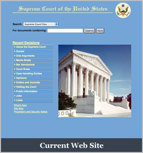
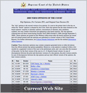
 President Obama’s nomination of Judge Sotomayor has brought increased attention to the U.S. Supreme Court. It also has led us to reexamine the Court’s web site, which is long overdue for an overhaul. In its current form, its web design is suggestive of the 1990s, and its functionality is similarly dated.
The Justices appear to agree. They’ve recently ask Congress for money to move control of the site in-house, taking over responsibility from the GPO. This move would allow them, in their words, to “better control and manage the web site and to be able to expand the data and services provided by the site more efficiently.”
The current web site has many shortcomings. It doesn’t contain briefs by the parties and omits all but a few relatively recent Court opinions. Its navigation is a nightmare and its design fails to incorporate modern techniques such as RSS feeds and XML. Much information is unnecessarily locked in PDFs. And yet, in January 2009 the nine-year-old site received 18 million hits.
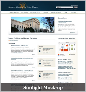
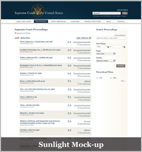
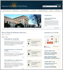
To help the Court update its web presence, the Sunlight Foundation has put together the following mock-up.
The most important aspect of the mock-up is that it takes into account the web site’s diverse users. It accommodates the general public and students, legal researchers, court researchers, and litigants. Accordingly, we believe the redesigned web site must be simple, straightforward, and robust. It must strive to make the Court’s proceedings transparent, incorporate modern design principles, and meet the higher expectations of today’s web user.
This post is the next in a series of government web site mock-ups that suggests how parts of the government should transform their online presence. Previous iterations have included: USA.gov, FEC.gov, EPA.gov, and Data.gov.
Under the fold, we have the mock-up and detailed descriptions of how the Supreme Court web site should be redesigned.
Home Page
The home page must be accessible to everyone. It should allow for quick and easy searches, identify the Justices, and include content that quickly and readily engages someone’s interest. The current site, by contrast, is simply a picture and a list of links.
We’ve added search box at the top of the page to serve as the main source of navigation. Also at the top of the page is recent news, which allows users to get a quick glimpse of anything new.
In addition to the search box, we’ve included a small graphic and link to the Supreme Court’s calendar. This way, viewers can get a quick glance at the schedule of upcoming argument while being able to click on links for more information.
Another feature is the recent decision section. It contains links to the full decision, the details of the case, and any time another law is referred to. This allows users to dig as deep as they’d like so as to get the full picture of what happened.
One small but important detail include adding an RSS feed to the recent decisions. The RSS feed would permit users to access the information that they want through an RSS reader without having to come back to the site everyday.
At the bottom of the page is basic information about the Justices, which also serves as a gateway for more information about the Court.
Click on the images for a larger view.
About the Court
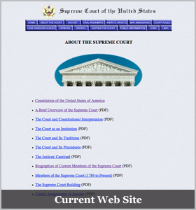
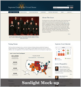
The “About the Court” page should provide a good overview for people who aren’t that familiar with the Supreme Court. Much of this information is already available, but is very difficult to find or view. Often, the data can only be found in a PDF.
By adding visuals to a page, users immediately grasp what’s happening even if they’re simply scanning the page. We also are again showing snippets of content to allow users to be able to scan the various content and choose to click through if they want more information.
This is exemplified by brief snippets of information about each of the Justices (including all former Justices), and a graphic representation of where cases originate by circuit.
Proceedings: Landing Page
The mock-up gives users the ability to search through all proceedings by term, by name, by justice, by topic, and so on, all of which is unavailable on the current web site. By giving users this tool, they can both browse through cases and immediately identify the specific case they need.
We also break out the proceedings so that users have all the holdings front and center, with links to the full decision and the details of the case. There is an RSS feed so that users can be notified the moment a new decision is released.
We’ve also added a database that contains how the Justices voted in each case. The underlying voting pattern data are exportable for scholarly analysis.
Proceedings: Case by Case
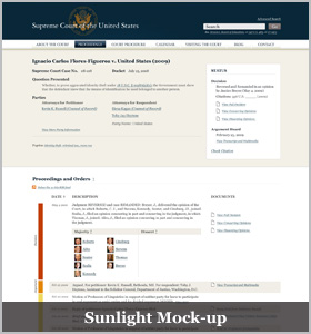
The top of the page contains basic information about the case — its docket number, the question presented, the parties, and its subject matter. In addition, there’s a handy status box containing information on how the case was decided, when it is scheduled for argument (and a link to a transcript and audio/video), its citation, and the ability to check to see whether the decision is still good law.
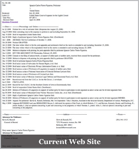
The bulk of the page is occupied by the case’s proceedings and orders. Organized chronologically — from petition for a writ of certiorari to final decision — each action is cataloged and summarized. We suggest that the Court adopt the practice of uploading the briefs from each party, and add links to each filing or order as they occur. In addition, we’ve added an RSS feed, so that users can monitor the case without having to view the page.
The bottom of the page contains the case’s procedural posture. It includes links to documents containing lower court filings and a description of the disposition of the case. This information is omitted from the current Supreme Court web site, but is very useful in helping understand the background underlying the Court’s decision.
We suggest that there be several URLs for each case page. Both the docket number (e.g. http://www.supremecourtus.gov/case/2008-108) and Supreme Court Reporter citation (http://www.supremecourtus.gov/case/556US103) should link to the same page. This way, people can build hyperlinks to cases using readily available public information.
Court Procedure
We did not mock-up the court procedure web page (or the following pages), but we envision the court procedure page’s contents as focusing on parties before the Court. It should contain the Courts’ Rules of Procedure, a guide for counsel arguing before the Court, how to deliver documents to the Clerk (including a way to e-file), bar admissions applications, and a list of all counsel who have argued before the Court.
Calendar
Each year the Supreme Court makes available a calendar of its argument and conference schedule. We suggest translating this calendar from PDF to html/XML, and placing it online. In other words, users will be able to see on the web page the Court’s argument calendar, and by hovering their mouse over (or click on) a particular date, to see what cases are scheduled for that day. All previous calendars should be available here as well.
Visiting the Court
This page contains basic information about visiting the court. It should include a map, hours of operation, tour information, argument schedules, etc. It could also include a virtual tour of the building as well.
Blog
The Supreme Court is the only branch of government that does not have a blog, which is ironic since so much of what the Court does lends itself to written form. Indeed, because the Court communicates in writing, the best way for the public to understand what the Court is doing is to read its orders and opinions. The blog can serve as a gateway to this information.
At a minimum, the Court’s blog should include contemporaneous summaries of and links to decisions, highlight and link to speeches given by the Justices, promote press releases and media advisories, and identify other major reports (such as the year-end report on the federal judiciary).
A more ambitious goal would be to hire a reporter to cover the Court from the inside out. For example, the reporter could provide information about the history of the Court, the people who make it function, coverage of oral arguments (or even audio or video), etc. Having a reporter on the inside would help demystify what the Court does and provide additional context for its actions.
Contact
This page would contain basic information on how to contact the Court, and would link to information about visiting the Court.
Conclusion
Of course, this is just our view on how the Supreme Court web site should look. Tell us yours in the comments. Ultimately, we will present these finding to the Supreme Court for its use. If you have any questions, don’t hesitate to contact us directly.
Ali Felski (Sunlight Senior Labs Designer)
Daniel Schuman (Policy Counsel)
One final note: this pages are intended as mock-ups, and don’t necessarily reflect how the Court has ruled in any particular case.
