The Supreme Court Website: An Updated Redesign
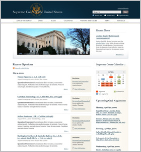 In June, the Sunlight Foundation released a mock-up redesign of the Supreme Court’s website. Our intent was to provoke discussion about the kinds of information the Court should publish on its site, and how that information should be organized. We succeeded beyond our expectations, hearing from professional court watchers, legal practitioners, programmers, and the general public.
Today, we are releasing an updated redesign, narrowing its focus to steps the Court can take right now. The timing could not be better, because the Court is currently considering how to redesign its website. Hopefully the suggestions below can serve as a guide. (Our June blogpost set forth the key ideas we followed when building the redesign.)
Website Tour
We focused our efforts on designing four webpages, but the site’s navigation includes eight different kinds of pages. Those eight pages are: the Homepage, About the Court, Cases, Rules, Calendar, Visiting the Court, News, and Contact. We mocked-up the Homepage, About the Court page, Cases age, and a page containing details about an individual case docket.
Homepage
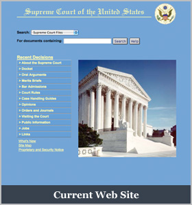
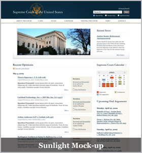
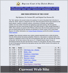
This page has changed slightly from our original design. It contains the Court’s argument calendar, recent opinions, upcoming arguments, and recent news. On this page, as on all of them, there’s also basic information on how to contact the Court. Our vision of the Court’s homepage contrasts significantly with the Court’s current static homepage.
Since our earlier draft, we have added additional explanatory language. However, the most significant update is the adoption of the Court’s exact phrasing for the issue before the Court, and removing the “box score” for the Court’s opinions. The purpose of the change was to simplify the Court’s task regarding making this information available. Perhaps in the future, however, information adapted from the Court’s syllabus (i.e., the summary of the case) or by the Public Information Office could be used here.
About the Court
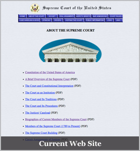
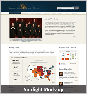
The About the Court page provides a good overview of the Supreme Court. It identifies the Justices and links to their biographies – including information about all former Justices. It also provides a snapshot of the Term’s statistics (cases granted, etc.), and contains information about the building, how the Court hears cases, and other general information about the Court. This page hasn’t changed much from our earlier draft, with the exception of cleaning up the text around the term statistics. By contrast, the Supreme Court’s website provides only a small percentage of this information, and it’s locked away in difficult-to-browse PDF files.
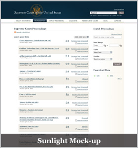
Cases
The Cases page has changed significantly from our earlier draft. The page’s name itself has been changed from “Court Proceedings” to “Cases” so that it is more intuitive. Users are able to view all the proceedings during any period of the Court’s history. We’ve upgraded the search function to allow users to refine their search by “filing stage.” In addition, we’ve made it easy for users to download multiple opinions at once, in PDF or XML format. (The advanced search feature should allow bulk downloads of court filings as well.) The current Supreme Court website only goes back 5 years, doesn’t allow searching by case stage, doesn’t permit bulk downloads, and doesn’t make opinions available in XML format.
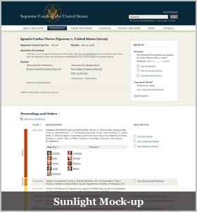
Individual Case Docket
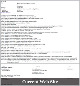
Our Individual Case Docket page, which contains all of the information about a particular case, has been somewhat reorganized. Just as before, it contains the question presented and case status at the top of the page. Just as before, it contains proceedings and orders of the Court, in chronological order, with links to each of the filings. We’ve kept the lower court opinions at the bottom of the page, and moved the list of counsel who are filing before the Court to the bottom of the page as well.
This contrasts significantly with what the Supreme Court currently makes available. Although its most recent opinions are available online, its website doesn’t contain any of the merit or certiorari briefs by the parties. It also does not include opinions by lower courts. The information that it does make available is hard to read and navigate.
Remaining Pages
We did not build mock-ups for the following pages, but their descriptions can be found in the June blogpost. Here’s a quick summary, with explanation for when we have made changes.
- Rules. We renamed our “Court Procedure” page “Rules” because we thought it would be more easily grasped by users. This page focuses on how the parties before the Court interact with the Court.
- Calendar. Provides detailed information about when Court proceedings and other relevant events will take place.
- Visiting the Court. Contains basic information about visiting the court.
- News. This would be where the Court aggregates all of its internally-generated information so that it is easily accessible to readers in one place. The page should include syllabi and links to decisions, speeches given by the Justices, press releases and media advisories, and other Court events.
- Contact: Basic information on how to contact the Court
A Few Closing Points
We’ve heard from you on a wide range of issues that we haven’t discussed above. They include how the Court should write and publish its syllabi, making contemporaneous video available from its proceedings, and how the opinions themselves should appear (including using hyperlinks). Those issues were not addressed in this mock-up, but we want to acknowledge them here.
We also were pleasantly surprised that a number of technologists expressed a willingness to assist the Court in redesigning its site. The Court has said it will develop its new website in house, but hopefully technologists can take the information that the Court will hopefully be making available online and put it to interesting new uses.
We hope that the Supreme Court will consider our mock-up as it redesigns its website. We also welcome the opportunity to discuss our redesign, and all of your feedback, with them.
As always, if you have any questions or comments, please post them online or contact us directly.
Daniel Schuman, Policy Counsel
Ali Felski, Senior Labs Designer
