FCC Finds Web Modernity

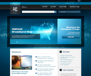
In August of 2009 we over at Sunlight started the challenging task of rethinking FCC.gov as part of our Redesigning the Government series. We made mock-ups, gave suggestions and since that time we’ve been fortunate enough to have had a number of back and forth conversations with the people over at the FCC. We’ve talked about the problems with their current site, the challenges and possible solutions. Since that time the team put in charge of rebuilding the site at the FCC has made great leaps. They started by launching reboot, which served as a good brochure site while the team tackled the more difficult content. This last November they pushed out some decent wireframes and Tuesday they excitingly released beta.fcc.gov. Through this whole process they’ve been incredibly transparent, and have consistently asked for feedback from the public, which should be applauded.
So after all this time, how did they do? Through spending a good amount of time clicking around and comparing it to old sites and mocks we think overall they did a great number of things well. Of course, there’s always room for improvement: they’re not always using the technology they’ve added to the site correctly, are occasionally falling back to just adding lists of links instead of giving context to their content and there are some small usability tweaks that if made would go a long way to helping their users.
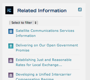
The team in charge of beta.fcc.gov really had some hurdles to overcome. We feel lucky to have only had to do some overarching mock-ups and not to have had to dig into the spiderweb of content that are the interior pages of the old FCC site. So for the agency to have come out the other side of the redesign process with a much more friendly site that has an understandable navigation and structure is a huge accomplishment. We’re very happy to see that they’ve gotten away from the logo that looks like rippling water — we love the floating header and how the logo transitions into it as you scroll down the page. With the myriad amount of content on the FCC site it was great for them to have added lists of related topics and content on interior pages to help users in their search for the right information. Finally, the beta site is clean, beautiful and has an up-to-date, modern, tech feeling about it, which is just what you’d want for the FCC.

The FCC seems to have made a good effort into putting new technology on their site but in some instances they’re misusing it or are using the technology in a way that is unnecessary. For example, they’re putting RSS feeds on the wrong kind of content. Feeds are available on things like related guides and help, but no RSS feeds are exposed for the newsroom or the blog. We were also a bit disappointed by the pages with a topic browser blocks, which can be found on each secondary page within the _Our Work_ section. The browser blocks and their scrolling secondary navigation columns are fun and interesting, but they take up a ton of space and aren’t particularly intuitive. Having three dropdown menus could easily solve the same problem without taking up as much real estate, and would require less effort from the user.

Failing to give enough context to their content — a trap that many government web sites fall into — is something the FCC should avoid. Context helps the user make the right decision on what to click on next, so the more descriptive your content can be the better, as long as it’s laid out well. You can see the new FCC site start to fall into this trap on the home and secondary pages. Despite all the content that the FCC pushes out these pages are quite sparse, which in the end just adds to the clicks a user has to make before they get to the content they’re after. It’s also important to remember that users are selfish. They’re on your site to accomplish something quickly that will benefit them. So to make such broad asks like complain, comment, and discuss without giving them a topic to do those actions around is counterproductive and a mistake. Engaging users in your content first will lead them to want to do those things on your site automatically.

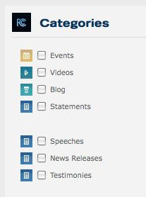
Finally, there are just a few small things that could be improved upon to add to the usability of the site. To distinguish each newsroom category there are different icons next to each. For example, they have a document icon for statements, speeches, news releases and testimonies and a small calendar icon for events. This is a great idea but its execution needs a little help. Some icons don’t clearly represent their category and some can be challenging to make out given their size and color. Having something as simple as a tool tip on each icon might be a quick and easy answer to help identify them. Another small thing the FCC can do to make their site more usable is to make their secondary titles links. The title is one of the main areas where users will click to get more information since it’s much bigger than the more link at the bottom of the content.
All in all the site is a vast improvement from everything that has been previously done on FCC.gov. There are things that could be improved, but it’s a beta site — we’re hopeful that a few additional tweaks and experimentation will make the site even better. The FCC is also continuing their excellent track record of transparency and are asking for your comments regarding beta.fcc.gov. Go help them build an even better site by giving them your thoughts and feedback.

