Redesigning Sunlight Foundation
Around this time last year, after taking over the look and feel of the Foundation instead of just the Labs, I decided to do a small refresh of the main Foundation site. The goal of this refresh was to make sure we were displaying our content in a consistent way and to make the front-end code not only cleaner but updated to use HTML5. Since that time I’ve settled into the position of Creative Director, we’ve built a small but great design team, and we’ve been able to start building interest around the Foundation to do a greater redesign of our brand and other main sites. The time has finally come…
Over the next few months we will be rebranding ourselves, combining sites, and giving you a stronger, cleaner, bolder Sunlight Foundation. Along this journey I’d like to keep all of you up to date and get your thoughts and feedback. But for now, let’s get into Sunlight’s goals for the redesign, the new logo and the mood board that will dictate the new look and feel.
I think of this organization as being one that is taken seriously but also one that’s not afraid of being a little quirky every now and again in order to make government information — a topic which is often overwhelming and stuffy — more interesting. At Sunlight we don’t just point out the mistakes that government is making. We also make suggestions and talk through things with government where we can. Taking all this into account, we wanted something that was bold but playful, something that had structural elements to suggest that we were helping build something. This is the description we came up with:
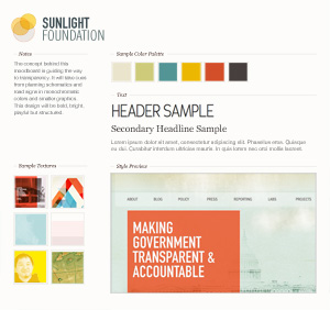
The concept behind this design is guiding the way to transparency. It will take cues from planning schematics and road signs in monochromatic colors and smaller graphics. This design will be bold, bright, playful but structured.

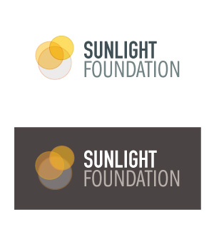
For the new logo the goal was to create something that wasn’t too much of a stretch from our current logo and which reflected what we do as an organization. We also felt the need to have a logo that was a bit cleaner and easier to work with, and which was bold and modern. After many many many sketches we arrived at this option. The idea behind it is that of spotlights: us shining lights on different issues inside government. We also liked how it resembled a lens flare, evoking the sun.
Many of you are probably asking, “What in the world is a mood board?” Here is how wikipedia describes it:
Mood boards are often used by graphic designers to enable a person to illustrate visually the direction of style which they are pursuing.
Mood boards are great because they allow us to give upper levels of management a sneak peak into what we’re thinking for the design before we spend hours upon hours building out a full comp. It’s a visual representation of the concept I stated above, a sample of possible colors, textures, and fonts that might make up the final design. In this case, having it on hand is also ideal because now we can show all of you what we’ve been thinking up.
So that’s what the design team has been up to lately! We’d love to hear your thoughts. Be on the lookout for updates as we move forward. Next steps will be comps, a branding guide and wireframes.


