Rethinking OpenCongress: design update
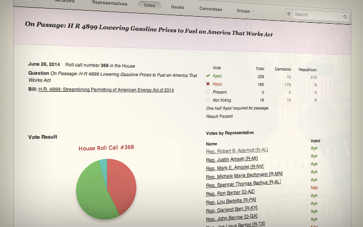
Over the last couple of months, OpenCongress has quietly been going through some substantial changes. While our developers have been busy building Email Congress (one of our users’ most requested features), debugging an old and complex system and diligently replying to emails from our users, Sunlight’s design team has been synthesizing the results of our research and working to develop a system that will be clear, informative, and modular. We’ve been putting our human centered design research to work building wireframes, element collages and redesigning the OpenCongress logo.
As OpenCongress has evolved, it’s become cluttered with more content, widgets and features than it can support. All of those pieces are nested in a design system that wasn’t built with them in mind and lacks the tools to display them in any sort of reasonable hierarchy.
Our efforts so far have mostly focused on usability. We’ve addressed confusing layouts, cleaned up information to make it less overwhelming, added clarifying context to confusing processes and focused on user actions, paving the path for a site that encourages community input and communication.
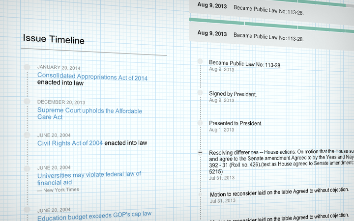
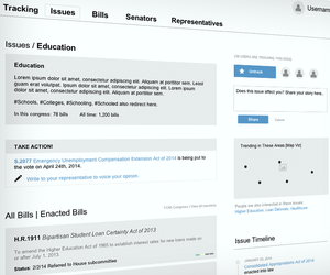
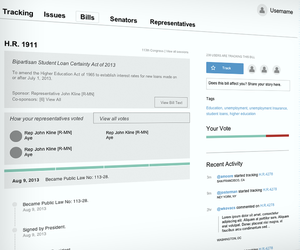
We began the wireframing process by thinking of each element as self-contained units and processes that make sense within their own context. From there, we combined elements to describe what the entire experience on a page would look like.
In rethinking the basic structure of OpenCongress, we’re designing a modular system that can start out simple and concise, delivering an explicit set of expected content. As we launch and test the system, we’ll be able to add elements to the tool in an integrated and fluid manner.
These full wireframes iron out the simplified navigation system. They define where different types of information will live and how various use cases might affect page elements. The general structure of the page has been defined—navigable content and information is displayed on the left side of the page, while user interactions (bill tracking, voting, user trends) are shown on the right.
Traditionally, Sunlight’s design process has included wireframes that describe the structure of pages, mood boards that convey the brand and feel of a site and photoshopped comps that combine wireframes and mood boards to give us a pixel perfect baseline of what we want our site pages to look like.
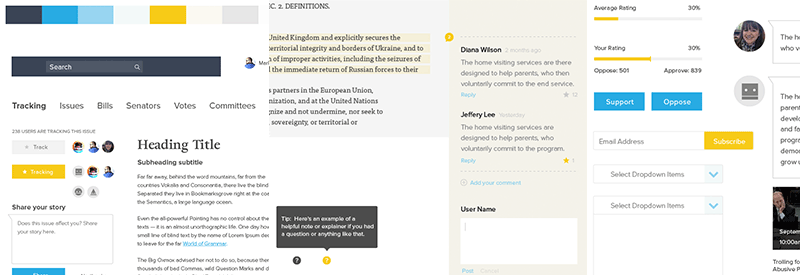
Designing in photoshop is still an important part of our process, but with OpenCongress we’re testing out the idea of relying pretty heavily on an element collage instead of mood boards and comps. An element collage gives us a good idea of what each of the pieces will look and feel like, but doesn’t pretend to guess how they will be rendered on any number of device widths. We think this is a pretty solid way to avoid setting unrealistic expectations for a responsive site.

And finally, the logo. Our research said nothing about the logo, but we think it’s time to give OpenCongress a fresh start all around, so we’ve redesigned the OpenCongress logo with these considerations:
- An emphasis on stronger shapes and cleaner lines
- Utilizing modern yet friendly typography
- Constructing a recognizable and meaningful logomark
- Including a throwback to the original logo
We’re starting with a simple baseline of information that we want to display and building a robust design system around it. This will allow us to build an OpenCongress that will reflect the results of our research and will be able to grow based on future feedback and observed user patterns. Overhauling OpenCongress has been a work in progress for a while now and will continue to be so for the foreseeable future, but we’re making progress!

