Lessons from DotGov Design Conference: How to merge government and good design

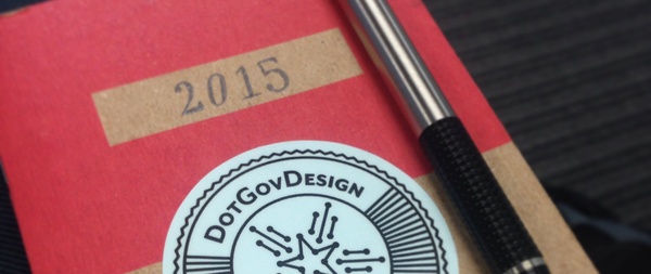
Scout book swag and note taking. Shout out to former Sunlighter Amy Cesal for her stellar conference design work.
Last Friday, the Sunlight design team played hooky and spent the day around the corner at AIGA DC’s first DotGov Design Conference. In a city where more than one in three workers are employed by the government, it seems only appropriate that the design community would find itself focusing on design for governmental and political purposes. While the work that many D.C. designers do is heavily weighted in this direction, it hasn’t necessarily been a focus of design community events and trainings until recently.

The DotGov Design Conference was organized to support government designers, but it also welcomed anyone from other groups who work closely with government agencies. This was to our design team’s advantage, since we all share the goal of making government data more accessible. Moreover, whether or not you’re a designer working in government, topics like usability testing and managing a design team are relatable across all fronts.
Government and good design may sound like oil and water, but there’s evidence that agencies like 18F, USDS and CFPB are beginning to change the game. This event offered a dedicated space for government designers to build a community and share ideas for innovation in the limiting environment commonly imposed on government projects. From our perspectives, some of the more obvious constraints for government designers include:
- Difficulty in navigating the waters of internal bureaucracy and getting buy-in at large agencies and departments;
- Designing for massive audiences (aka the American public) that have a wide range of different needs and concerns;
- Strict, time-consuming adherence to 508 compliance standards;
- Seemingly arbitrary constraints on the procurement of technical resources;
- Scattered and disconnected resources among different agencies despite solving very similar problems — resulting in reinventing the wheel instead of innovation. (Although @DotGovDesign may be on its way to solving this one by building a community around government designers to improve standards.)


Often, the end result of projects that face these issues are government websites or services that don’t pay enough attention to user needs, ultimately failing in usability and accessibility of information. At DotGov Design, it sounds like these issues are at least being recognized now, if not resolved just yet: One session considered the idea of having a living style guide for government properties, while another one led by IDEO discussed human-centered design.
Our design work at Sunlight is treated quite differently. We have fewer constraints and more room to play, to be creative and to experiment with new technology. We have much more support across the organization, which allows for design to be a priority in our tools and products. And while our tools as a whole may have value to citizens and the general public, in reality, the data we deliver are most often used to enhance and inform the work of a smaller audience made up of advocates, journalists and beltway insiders. Nonetheless, we were still able to walk away with some valuable ideas.
- The spectrum of issues discussed at the conference offered some interesting insights. We especially appreciated the tips given in the “Usability Testing” session with Whitney Quesenbery from the Center for Civic Design. It was particularly timely advice as we’re currently learning to incorporate more research into our design processes at Sunlight.
- An engaging presentation was given by Jason Schupbach, the director of design programs from the National Endowment for the Arts. His overview of that organization’s history took us through several fascinating decades of federally supported art and design. The poignant and inspirational talk delivered a simple reminder: Design matters, particularly so in government works.
- CFPB shared some of its process for handling project management and collaborative critique for a largely remote design team. The bureau’s use of Github to document and catalogue the impact of design added to our team’s ongoing conversation about open source design. We also gained some insight from a few project managers on how we might work more collaboratively as a team on larger design projects.
- One breakout session offered an interesting open forum to discuss office politics. In spite of creating some uncomfortable and controversial moments, it did provide a space for people to discuss problems and receive support from their peers.
At the end of the day, we left with new ideas that sparked great dialogue and challenges for our design team; for instance, how to make our design process more open like our code, and how to better work together on large projects. We definitely have our work cut out for us, but when a conference leads to a post-event brainstorm about optimal corndog ingredients, you know it was a success. (The winner, if you were wondering, was five-spice chicken and basil.)

