Introducing the Wild West of Federal Government Websites
The diffuse and disorganized nature of the federal government web allows broken links and outdated content to abound, while doing little to prevent politically motivated changes to content.

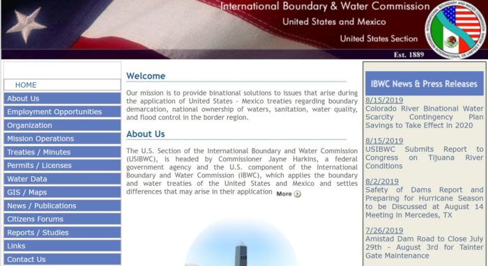
A screenshot of the International Boundary and Water Commission website homepage.
In 2019, millions of people will use federal government websites to sign up for healthcare coverage, file their taxes, and interact with the government in a myriad of ways. Many interactions Americans have with their federal government today begin and end online. It has been that way for years, and it will only become more true in the future.
But what most Americans may not know is just how diffuse and disorganized the federal web is as a whole. Agencies have wide autonomy in the management of websites and guard that autonomy with a vigor reminiscent of that with which town marshals guarded their Wild West towns. The federal web does resemble, to some extent, the organization of the Wild West: well-organized fiefdoms within agencies, but little standardization or harmonization across the wider landscape (the tireless efforts of 18F and United States Digital Service notwithstanding). To the extent that people think of the federal web as a single system at all, they probably don’t think much past the .gov extension that marks government sites. And as it turns out, that .gov is about the only thing that ties federal government websites all together.
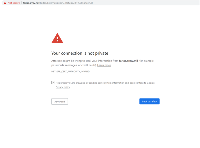
All one needs to do is click around on some federal websites to see that they have no unifying design. For example, compare the Department of Education’s website against the State Department’s. Some federal websites, like PACER, the engine of the federal court system, and the International Boundary and Water Commission website, feel like portals to the 1990s, all text links and clunky drop down menus. Others, like FEMA.gov, are impossibly disorganized, with a navigation menu that is sure to frustrate. Others have expired security certificates that prompt hacker warnings when you visit them, likely a consequence of simple mismanagement.

This technological backwardness isn’t confined to public-facing websites used by everyday people. In 2016, a congressional oversight hearing revealed that underlying infrastructure used by the federal government employed 70 different “legacy” coding languages, some dating to the 1960s. Some government systems still rely on floppy disks! (For the young folk, this page on computer history explains what a “floppy disk” was. You’ll notice that it’s what the “save” icon is based on.)
Replacing those legacy systems would involve huge costs and complications. And in some instances, older systems are actually a benefit. The U.S. Nuclear arsenal is controlled by hulking mainframe computers that are so obsolete — not connected to the internet, for one thing — they may actually be more secure from intrusion than a high-tech system.
But there is no reason for public-facing websites — the ones Americans rely on for a vast range of services and information — to be as haphazardly designed and managed as they currently are.
Case in point: in 2016, the Office of Management and Budget tried to institute what would be considered a pretty basic part of any website: user analytics. They posted some code, and wrote a memo directing federal agencies to add that code to the websites they manage.

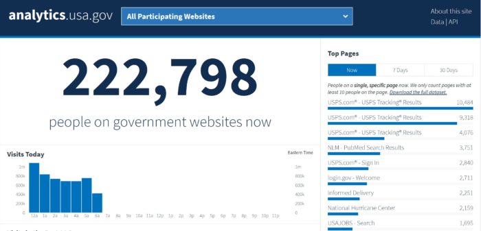
A screenshot of analytics.usa.gov, the site that aggregates user analytics for 5,700 federal websites.
Three years later, only about 5,700 sites have that code installed. The rest have simply ignored the directive. That leaves hundreds, or perhaps thousands, of sites simply not contributing to the most fundamental kind of information a website can track.
I say hundreds, and perhaps thousands, because the number of users on government sites isn’t the only thing don’t know about the federal web. We also don’t know how many websites are run by federal agencies. That bears repeating: no one knows how many federal websites there are. You can’t properly manage what you don’t know exists.
When it comes to the websites we do know about, there are pervasive governance issues. Much of the Web Integrity Project’s work is devoted to tracking the often poorly documented, sometimes politically motivated, and occasionally baffling management of content on the federal web. Our Gov404 tracker documents dozens of significant removals of everything from climate-related information to resources for the LGBT community.
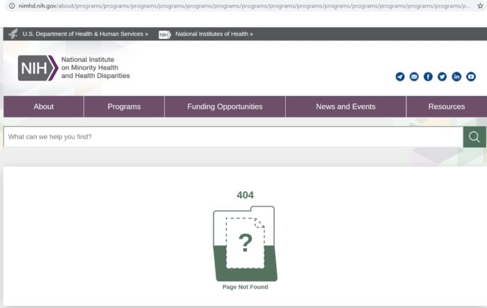
Vastly exceeding the significant changes and elisions documented on Gov404 are the more mundane problems, like broken links or outdated content, of which we have found thousands of examples. A basic lack of maintenance can make navigating federal websites a frustrating game of dead-ends. (An illustrative note: you may have noticed that the link to the transcript of the hearing I mentioned earlier leads to a 404 error. That’s because the outdated practices used by the House of Representatives’ Committee on Oversight and Government Reform mean that all links on their site are severed every time the committee changes party hands. Luckily, the transcript was preserved in the Wayback Machine, a third-party archive.) And that’s not to mention URLs like this, which our web monitoring software indicates was briefly brought into existence on the National Institute on Minority Health and Health Disparities website:

All of this is in stark contrast to the state of online government in some other places. In 2012, the United Kingdom embarked on an ambitious program to modernize their government’s web presence, called Gov.uk. While the U.S. system is quintessentially American — a decentralized Wild West where management authority is vested in individual agencies and offices — the U.K.’s web presence is highly uniform and centrally managed. It shares a single design and common navigation features that make it simple and intuitive to interact with. Managed by a common content production team, information is produced to high standards, with orderly updates and removals.
The U.K.’s innovations were the inspiration for similar reforms in Australia and Canada. There’s no reason America can’t do the same, and put the Wild West behind us.

