Open data can help you even if you know nothing about data, because it can power tools and resources that are usable by anyone.
Continue readingOpenGov Voices: Telling open data stories about military history with data.mil
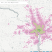
Earlier this month, the Department of Defense launched a new open government data platform, data.mil. Above, you can see a... View Article
Continue readingData USA sets a new bar for informing the public through data visualizations
Data USA enables users to instantly visualize open data from government agencies, instantly drilling down into locations, industries or occupations with a click.
Continue readingThe Political One Percent of the One Percent: Megadonors fuel rising cost of elections in 2014
In the 2014 elections, 31,976 donors — equal to roughly one percent of one percent of the total population of the United States — accounted for an astounding $1.18 billion in disclosed political contributions at the federal level.
Continue readingOne group dominates the second round of net neutrality comments
A letter-writing campaign that appears to have been organized by a shadowy organization with ties to the Koch Brothers inundated the Federal Communications Commission with missives opposed to net neutrality, an analysis by the Sunlight Foundation reveals.
Continue readingWhat can we learn from 800,000 public comments on the FCC’s net neutrality plan?
FCC Chairman Tom Wheeler’s proposed rules regarding net neutrality resulted in the commission’s largest-ever public comment collection. Use this visualization to browse the hundreds of thousands of documents in a simple and manageable way.
Continue readingHow partisan are your state’s legislators?
We've used statistical models to visualize how partisan (almost) every state legislator in America is. Find out where your reps stand!
Continue readingThe Sunlight Foundation’s Data Visualization Style Guidelines
A look at our Data Viz Guide, why we created it and how well it's working.
Continue readingPolitical influence by county: A new way to look at campaign finance data
Over the summer, the Sunlight Foundation partnered with Azavea, a Philadelphia-based firm that specializes in mapping and geo-spatial analysis, to create location-based analyses of the federal campaign finance data we display on InfluenceExplorer.com. The partnership produced new and more accurate ways to identify trends in political spending according to location that were previously hard to complete because of complications in the mapping process. Many of the findings were mapped.
Continue readingHow to know the Senate better through data visualization
The shutdown has been averted. The debt ceiling has been raised. For now. In the process, Congress’ public approval has fallen to around 10 percent – and as low as 5 percent in one poll. But how much do you know about who actually serves in Congress? How do you know who to even disapprove of? Today, we unveil a new interactive tool that will allow you to get to know the U.S. Senate a little better. While it’s easy to focus on prominent Senate leaders like Harry Reid (D-Nev.) or Mitch McConnell (R-Ky.) or prominent grandstanders like Ted Cruz (R-Tex.), we think it matters who our 100 senators are: What are their backgrounds? What is their education? What did they do before coming to the Senate? Who do they depend on most to support their campaigns? All of these factors shape how they collectively make decisions. For this reason, we’ve created an interactive tool that allows you to explore the U.S. Senate. You can see how Senators break down across a wide variety of dimensions.
Continue reading
![]() 59063
59063
![]()