18 New Ways of Visualizing A City
The way we visualize and compare cities says much about our understanding of how they work. As part of our ongoing exploration of what makes a city, we wanted to survey how people are using data to describe the political, geographical and social realities cities face. Below, we’ve compiled some unique visualizations. Some of these center around cities in the common sense of the word, focusing on large urban areas, but we think these images as a group help expand the understanding of the diversity of all kinds of municipalities.
We aren’t demographers, but we aren’t working in a vacuum, either. As we continue to engage in open data work, we hope to contribute to the kind of information that powers these visuals and help create the resources for the next wave of municipal understanding.
POPULATION DENSITY
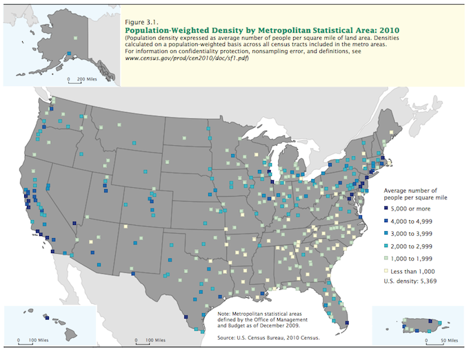
1 — This 2010 U.S. Census map, from a report about population change, shows population-weighted density by metropolitan statistical area. That’s a complicated way of essentially saying the map shows how tightly packed people are on average in metropolitan areas, as defined by the U.S. Census Bureau. The map shows how people generally are more condensed in metropolitan areas along the East and West coasts than they are in metropolitan areas in the middle of the country.
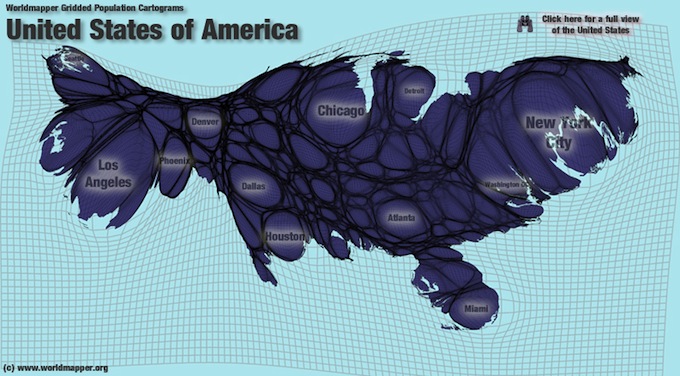
2 — This cartogram from Worldmapper shows population density in a different way. It morphs a map of the country based on the population of certain areas. The East Coast, which has a high population condensed onto a relatively small amount of land, morphs into a much larger area than the middle of the country, which has fewer people spread across a vast amount land. Despite the middle of the country shrinking in relation to the East Coast, this cartogram also makes it clear there are significantly sized cities across the country.
POPULATION CHANGE
3 — Population can also be visualized by how it is changing. Where are people moving to and from? Looking at U.S. population growth rings in this map from Data Pointed reveals a few trends: the rise of the suburbs contrasted with the repopulation of some urban centers. Taking a closer look at some of the urban areas reveals that while many people are moving out of cities in favor of the suburban life, some people are also choosing to move into the heart of cities.
POPULATION
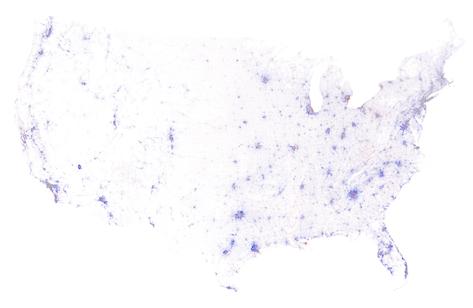
4 — This Census Dotmap by Brandon Martin-Anderson represents each person counted in the 2010 U.S. Census and the 2011 Canadian Census with one dot. That’s 341,817,095 dots. (The U.S. population in 2010, according to the Census, was more than 308 million.) The Dotmap is an interesting way of visualizing where people live — and where they don’t. The map shows some of the major urban centers of the country, and the lack of people in other areas highlights the boundaries of natural features like deserts, lakes, and mountains.
MIGRATION
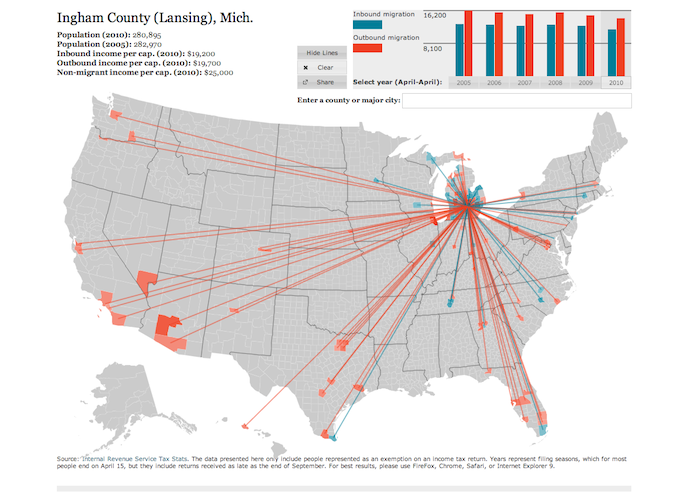
5 — We can also understand places by tracking how people move between them. Forbes created an interactive visualization that tracks inbound and outbound migration by county and year using IRS tax stats. It gives some clues about what areas of the country are becoming more (or less) popular destinations for living.
UNEMPLOYMENT
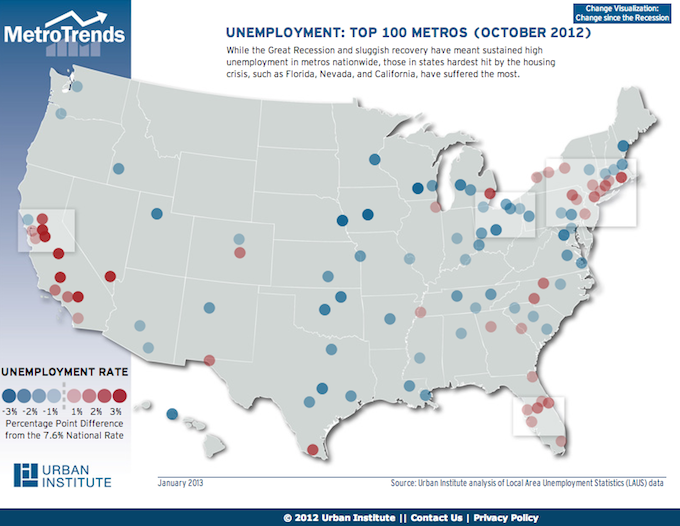
6 — Other visualizations help us understand the features of places. This interactive map from MetroTrends shows the unemployment rate in the top 100 metros as of October 2012, measured by how much they differed from the national unemployment rate. It helps show which metros were recovering from the recession and which were still struggling at that point.
HOUSING
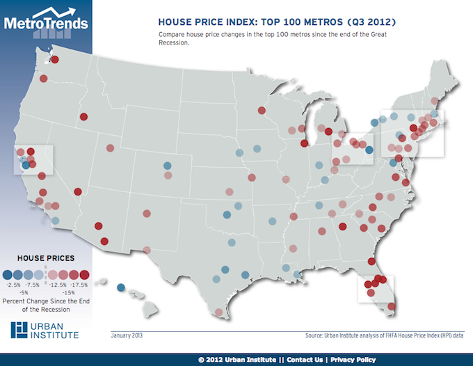
7 — The recession that started in the late 2000’s impacted the makeup of many metropolitan areas. MetroTrends has an interactive visualization of how house prices changed since the end of the recession. Comparing this with the unemployment map shows that while some areas may be doing better than the national average in the jobs sector, many of them still feel the negative impacts of the burst housing bubble.
8 — Want to compare the rise and fall of housing in metros in another way? The New York Times has an interactive graph that layers the housing price roller coaster for different cities by charting Standard & Poor’s Case-Shiller Home Price Index.
INCOME DISPARITY
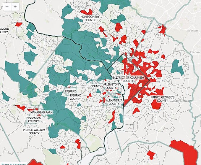
9 — There are lots of socioeconomic factors we can use to help understand the complexity and diversity of places. Pew Social Trends created an interactive map showing income disparity in the top 10 most populated metro areas. The Pew Research Center found an increasing number of metropolitan areas are segregated by income. The District of Columbia and the surrounding states provide one stark example. The blue shows upper income, tan shows middle or mixed income, and red shows lower income.
RACE
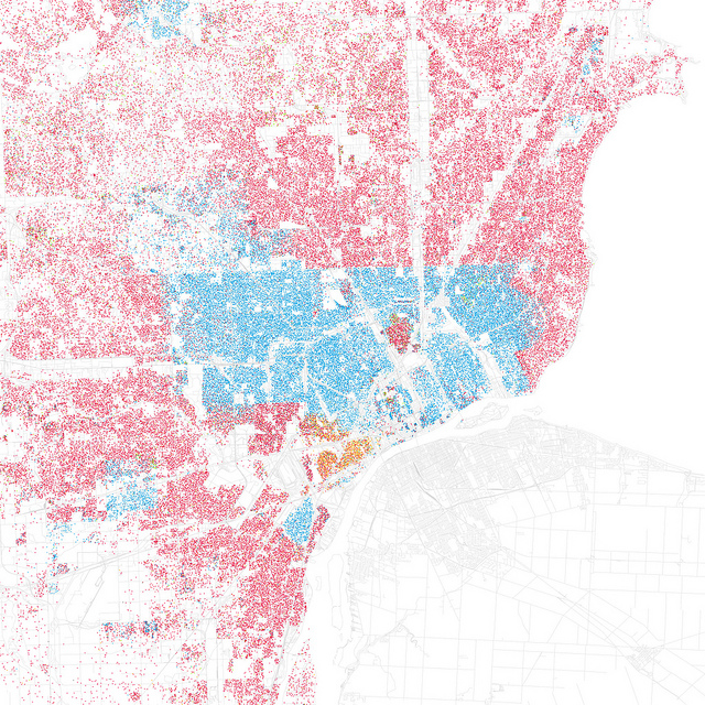
10 — Segregation isn’t limited to factors like income. Eric Fischer used data from the 2000 Census to create a series of maps showing the racial makeup of various cities. The city of Detroit and its suburbs have clear lines of segregation when we look at them with the overlay of race.
11 — The New York Times has an interactive visualization showing race across the entire country based on American Community Survey samples from 2005 to 2009. This wider look at race shows the patchwork makeup of our nation and how segregation extends beyond urban areas.
EVEN MORE VISUALIZATIONS There are many more visualizations we found helpful in expanding our understanding of the different features of places and the people who live in them. Here are a few:
12 — Flowing Data charts food spending in different cities
13 — Flowing data also visualizes commuting distances and costs
14 — Atlantic Cities breaks down some of the stats for airport cities
15 — The LA Times maps fire department response times
16 — Trulia compares crime rates in select cities
17 — MetroTrends looks at the rise of artists in some cities
18 — MetroTrends displays attendance at library’s children’s programs
Research Fellow Zander Furnas contributed to this post.