We came across Rep. Tom Reynolds‘ (NY-26) google map of his earmarks a little while ago, and it appears that someone really went above and beyond in showing info about the district. Frankly, I’m completely unfamiliar with the issues or politics of this district, and I don’t even know if this is a comprehensive list of directed spending or just a few of their favorites, but this is pretty compelling stuff (keep going, though. it gets better.) :
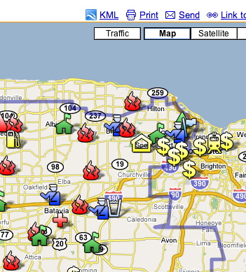
A map with spending information overlay on a district map is a great start. Since this information was put into a google map (whose functionality has been recently upgraded), the data gets automatically translated into an available “kml” file. (see the upper right portion of the above screenshot.)
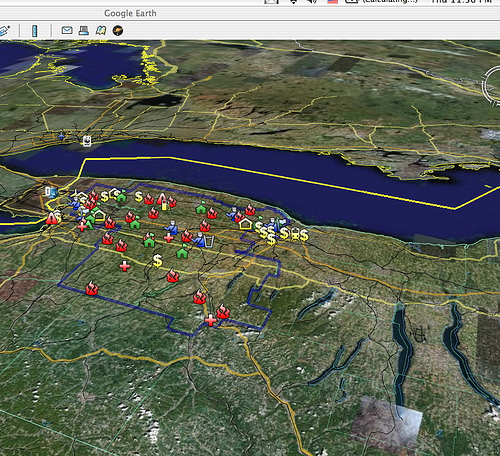
This kml file lets you open the information in Google Earth, which really turns things up considerably, especially given how easy it is to enter this kind of information into Google maps. Here’s the whole district (note the finger lakes in the foreground):
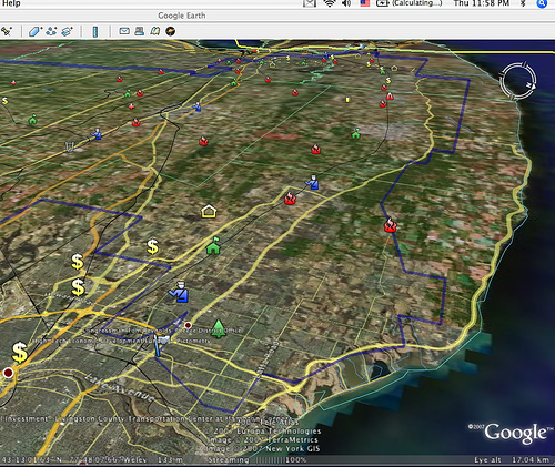
Here’s a view across the top of the district:
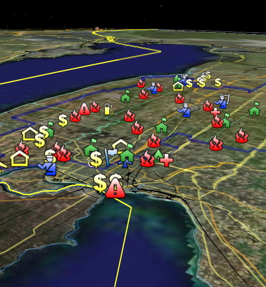
And this is a view from over lake Erie looking towards Buffalo, NY:
As information sources build on each other, will politically desirable information be something integrated and expected, like traffic signs? Or maybe annoyingly present and self promotional, like consumer product packaging? Who knows. At a minimum though, government’s relevance will become more obvious, and verification will be an easier task, more likely to function as the basis for measured debate and reasonable discourse.
Since we’re already at the point of being able to produce detailed maps with customized content, viewable from any angle, or 35 miles in the air, or hovering over lake michigan, (or even flying in an f-16 flight simulator)–we must be taking some steps in that direction.