Redesigning the Government: FEC
![]()
We got a lot of great comments and discussions happening from our redesign of USA.gov, so we thought we’d continue the series and call it “Redesigning the Government.” At Sunlight, we deal a lot with FEC information, both internally and through one of our grantees, OpenSecrets.org so we thought we’d take a look at prototyping some ways that the FEC could better disclose campaign finance information through the Web.
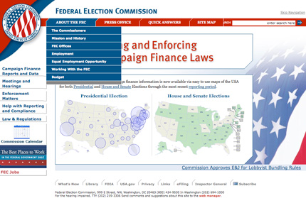
The Old
So lets visit fec.gov as a starting point to see what needs to be improved on the site. The first thing users will notice is that there is a very large headline that states: “Administering and Enforcing Federal Campaign Finance Laws”, which is fine for lawyers who come to visit the site but I think it scares away a lot of the regular public. In fact, the FEC’s primary goal according to its charter is disclosure, not administration or enforcement. We think the design and functionality of the FEC website should reflect that primary mandate. Looking at this current site I don’t see a lot that would suggest that right away.

The second thing most users will notice, if they happen to come to the the site on a day when there is an alert, is that there is scrolling text on the bottom of the webpage. It certainly does grab your attention, but because it’s scrolling across the screen, it’s more difficult to read and very distracting when you’re trying to read something else on the page.
Next, we move on to the navigation. There are too many menus! There are menus on 3 sides of the site and when you rollover buttons on 2 of the sides, drop down menus appear. This creates too much confusion for the user when they are trying to find information and navigate the site. Then there is a skip navigation button that appears above the top menu that shouldn’t even be visible to the regular user. This is simply used for screen readers so that when a person with a disability is using the site the screen reader won’t list off every single button in menus (thanks to Jeremy for this explanation). Finally, when you resize the browser window, the layout breaks and the search box disappears behind the menu. Considering that search is a primary means of navigation for people these days, this deserves fixing.
The New
So I started attacking the site by pay attention to the needs of the normal user. I surfaced and focused on what they would generally be interested in: campaign funds and candidate profiles. I placed some of this information on the home page but most importantly I placed radio buttons with these options below the search box to provide a faceted search allowing users to more quickly access the content they’re seeking. The rest of the home page feels more accessible and open to the public by adding the seminar schedule (if a user wanted more information and wanted to attend a conference), and the commission calendar.
Another important part of the home page is the feature section. By adding this, there is now a place for the FEC to place current information without distracting from all other content on the page and a great space to feature new and interesting visuals.
As for the navigation, I did a quick inventory of the information that is currently on fec.gov. In doing this I found that there were a lot of things that could be paired down. For example, instead of having a search for each individual database why not just have one search but give the user more options up front so that they can narrow their search. I also placed the search box in a more prominent place so that users would use this as the main way to navigate the site.
On the interior pages I just organized and structured the data by adding striping to the charts and adding graphics for more interest where they made sense.
Finally, we also spent some time considering the backend. I’m no developer, but I’m told that the current system doesn’t allow for data to be exported particularly well. We’re recommending that the data be provided in open and exportable formats like XML, JSON, and CSV, which you would be able to get from any page with data on it. The developer-types have more details about this, so they might chime in with comments.
The Reveal
Click on the images below to see the full comps.


Conclusion
The FEC obviously has a lot of data to think through on their site to see what is relevant and what isn’t before getting to this point. But when they do, I think some of these elements could work for them or hopefully at the very least get them thinking about structure and design.