Redesigning the Government: EPA
Continuing with our redesigning the government project, we have moved on to the EPA. Many of you might ask why we would want to redesign the EPA – it looks like it’s been redesigned recently and seems to have a lot of new and up-to-date features. I think what happens with a lot of redesigns is that people start thinking of all the fun things they can add to a site, rather than thinking of the underlying problems and finding good solutions to fit those problems. Good design and good websites aren’t just made up of pretty pictures and Web 2.0 features like gradients and podcasts. A good site has structure and organization, and is easy for users to navigate. I think the EPA has started down a good path, and I want to show them that by emphasizing the right things on a page, it makes the content much more accessible and would take their good site and make it a great site.
EPA Applause
First of all, I have to say that the EPA did a really good job visually redesigning their site. I think they used great colors, the graphic elements are very fitting and pretty, and I think that their first couple levels of navigation are well thought out. I like that on their home page they have a feature box at the top of the page for their important information and also think that having the search box at the top as well was a great decision. Finally, they weren’t afraid of using new technology, which is a step in the right direction.
Let the Rethinking Begin
The goal was not to redesign the graphics for this site but instead to rethink the user experience. So starting off, when you have a huge site like this which is relaying news and information to the public, take cues from people who do it well already: news organizations like MSNBC. On their site, they have many structured sections where you can quickly and easily see the news that is most important to the user. The EPA looks as if they started down this road with their blue section bars, but they fall short by not showing enough of their content below those bars. With news stories, usually the headlines are good, short gripping snippets that will grab attention, and are usually pretty explanatory. The EPA needs that same hook, but since their content isn’t as extreme as many news stories, they need to show more information to draw the user in and make him want to learn more.
Along the same lines, another thing that MSNBC does well is relevant grouping of data. The mistake a lot of governments sites make is sectioning out data too much. For example, on the EPA’s home page they have an entire section dedicated to multimedia. Instead, like on news websites, take those multimedia segments and place them into the context of the stories that they fit into. If it’s a news story put it alongside other news stories with video icon, or if it’s a story about teaching children about acid rain then put it into the educational section so that the particular users that piece was meant for can quickly find it. People primarily look for content about something they’re interested in, not the form it takes.
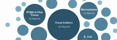
Finally, so many of the links and buttons on the EPA’s newly-redesigned site actually take you back to their old site, which can really leave users confused. On this old site, they seem to have a lot of great information and data, but it seems a bit scattered, with lists of links that take you to more links before you get to the relevant content. Adding good maps, graphic visualizations, adding more content below links, and fitting this content into their newly designed template would really go a long way on these pages to help users find the content and to avoid confusion. The EPA holds vast amounts of data about local communities– that data needs to come forward and be visualized for end users for it to truly have an impact on their lives. Hopefully the EPA is currently working on these deeper sections of their site.
The Reveal
Click on the images below to see the full comps.


Conclusion
So when thinking about redesigning your site, like the EPA has, don’t just think about making it more modern looking, but think about structure, and the experience you are creating for your end user. Some other small tips are:
- White space can go a long way. It helps break up the content and allows for a users eyes to breathe instead of getting overwhelmed. Just like music without rests is just noise and notes, design without white space is just cluttered pictures and text.
- Try to use the same color for links and actions. Many users scan a page before deciding what to click on, having all links be the same color helps them find where to click when they find their relevant section.
- Putting a box around important content doesn’t always make it stand out more. When so much of the page’s content is contained in boxes, more boxes just serve to clutter and confuse. Explore other ways of calling content out – even subtle changes can go a long way.
- If you have a mobile site, don’t place the link at the bottom of the page. People will have to wait for the whole page to load before they find it. Place it at the top so that your users can find it quickly and easily, but remember that it doesn’t need to be huge for mobile users to find it.