Checking Out the New USASpending.gov
 USASpending.gov got a face-lift on Wednesday evening, and it brought with it a raft of new features. Some of these are great; others are either not very useful, or an actual step backward. Let’s run through them — not only to highlight the features and shortcomings, but to examine what they can tell us about how government should be opening its data.
The Good
There’s downloadable data! Tons of downloadable data! The old USASpending site offered an API — and it’s still available — but it was geared toward making aggregate queries. That’s good, but not really sufficient for researchers intent on performing their own analyses. Now you can specify your search parameters, leave your email address, and be notified when your source data is ready to download. There can be substantial delay: it took over a day for me to get back my request for 2009 grants data. But that particular dataset clocks in at over a gigabyte, so some delay is reasonable. I’d love to see well-cached, pre-assembled and complete versions of each of the expenditure type data sets for each year, but the current system isn’t bad at all, and it would be easy enough for someone else to provide those ready-to-download snapshots.
But how can we be sure that the data contains everything it’s supposed to? Sunlight is in a uniquely good position to answer this question. We’ve been working with the vendor responsible for USASpending.gov over the past year or so, shipping hard drives full of MySQL binary files back and forth in order to get the transactional data that the site’s API fails to expose. Our last shipment came in April, and my CSV download arrived on Saturday, so over the weekend I was able to run some numbers on the 2009 slice of the grants data set. A few fields have been renamed, but nearly everything is there. The exceptions:
- recipient_state_name is missing, but was redundant (zip code and state code are available)
- the business_identifier field isn’t present, but was blank in the data delivered to us, anyway
- mod_name, a field that stores modifications to the business name, is missing, but wasn’t particularly valuable
- recip_id and lookup_parent_rec_id are both missing, but are presumably just foreign key fields computed from the DUNS and Parent DUNS fields — users of the data could recreate them, in other words. DUNS is available, but there are licensing issues keeping Parent DUNS information from being released (the MySQL database we have has this field set to blanks). OMB is negotiating a way through those licensing problems, at which point this data will presumably start containing Parent DUNS information.
- record_id, the primary key of the table, is not included. This makes some sense, since it’s only present for the site’s internal use. However, it’s the one missing field I would have liked to have received: the federal award ID field is meant to be the data set’s primary key, but in practice I’ve found it preferable to work with something a little “closer to the metal”.
So field coverage is good. How about the totals? Well, the CSV I downloaded contains 1,228,404 records; the MySQL table contains 1,162,973. That’s not bad, considering that 2009 records will still be trickling in for a while, and my MySQL comparison data is over a month old. The totals match up pretty well, too: my table shows $1,875,293,941,003 in 2009 spending, or 98.2% of the $1,907,753,879,933 reflected in the CSV.
I could split some hairs about including insurance expenditures in the grants data set, but let’s not nitpick. This is an excellent effort at putting source data online. The USASpending team deserves a big hand for this part of the site.
The Bad
The first thing that will probably jump out to the Labs community is how Flash-heavy the new site is. The new USASpending uses the Flex toolkit to display everything graphically, even when Javascript or CSS or a computed image could have easily done the job. Fortunately, there are always HTML tables that you can get to, complete with good export options that are oriented toward open formats.
The site’s homepage makes it clear that search is a focus for the new USASpending — I’ve heard OMB officials say they want the site to be “Google for government spending.” That’s a nice way of framing the task of making this data accessible to the public. But I think there’s still work to be done. The search inexplicably chokes on quoted phrases — that’s a bug that ought to be squashed. More fundamentally, it’s important to realize that, unlike Google’s web search tool, the data here is highly structured. This is obvious as soon as you click through to the “Advanced Search” page. There are tons of options — and I’m glad to see this many facets of the data set exposed — but basically no explanation of what any of the options mean. This is a tough problem: these record attributes are relatively arcane, and explaining them isn’t easy. But it’s a problem that the site needs to at least try to engage with.
The summary views on USASpending continue to be as confusing as the old site’s, and fail to do much to teach users about the difference between grants and contracts. This is partly the fault of the legislation that created the site, which specifically called for putting these very different types of spending side by side. Still, this redesign does little to help the situation, and seems to consistently steer users toward the contract half of the puzzle. This can be misleading. For example, given that the vast majority of the Department of Transportation’s spending takes the form of grants, it’s a little confusing that the most prominent graph on the agency’s summary page is about how it bids out its contracts. The “complete details” page is even more inscrutable — I have no idea what I’m reading complete details about, except that whatever it is seems to imply that Amtrak operates primarily in Afghanistan.
The new site makes an important break with the old in the way it deals with loans and loan guarantees (loan guarantees are promises by the government to pay off a loan made by someone else if the loan defaults — this reduces the risk to the lender, letting them offer better rates to borrowers). To explain this, I have to back up for a moment: how do you measure the cost of a loan to the government? If it gets paid back, was there a cost? If it was paid back with interest, was there a negative cost? Do we break out the loans that go into default, or only count them, or just estimate the rate at which they default and multiply that by the total face value of the loans?
Well, the answer is: none of the above. But there is a way to figure this out! You can get a number that reflects the cost to the government of entering the deal — the so-called subsidy cost — which is supposed to reflect the risk of default and the money left on the table by the government charging interest rates lower than borrowers could get on the private market (if they didn’t charge lower rates, nobody would borrow from them). The old USASpending site used the face value of the loans and loan guarantees that it tracked; the new site ignores the face value in favor of the subsidy cost.
This is theoretically defensible. In some ways, it makes a lot more sense than the old approach. But in practice, it’s a bit of a disaster. That’s because only about 20% of the loan entries in the USASpending database have a subsidy cost associated with them. This leads to some pretty weird results. For instance: did you know that the Department of Education gave out zero dollars in loans and loan guarantees over the past decade? You probably didn’t; the folks at the Dept. of Ed don’t seem to, either: they’re convinced they helped provide $96 billion in student loans in 2009 (PDF).
The Pretty, But Stupid
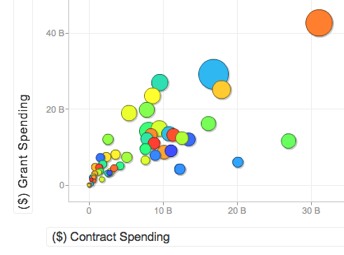
Finally, there’s the visualization tool. Wisely, the designers did not make this the default view under the “trends” tab. In its eagerness to ape GapMinder, it produces a bit of a mess. There are dollars on both axes, but then dollar magnitude is re-expressed by the size of the plotted point. And what are the points, anyway? States, I guess, but I had to mouse over them to see. And then when I tried to manipulate the parameters to get a simple year-over-year graph of spending, everything collapsed into a single column, and I had to hit the “play” button (!?) to see what I wanted. Which could then be turned into a line graph for some reason.
If you’re going to make a graph, you should label it. But first, consider: should you be making a graph? Do you understand what question you’re illustrating, and why it’s worth illustrating? On this score I think the new USASpending trend tool fails — it may impress some people with its pretty pictures and animations, but very few of those people will have any idea what they’re being shown. When you’re dealing with a complex topic, the temptation to throw more choices at the user can be dangerous.
The Elephant In The Room
The new USASpending does a great job of providing data for analysis, and a substantially less great job of facilitating analysis directly. This isn’t much of a surprise: the people who design these sorts of systems are rarely the ones who use them most heavily; worse, they’re often constrained by technical decisions made years ago. This is why Sunlight wants government to be in the data wholesaling business rather than the data retailing business: because the incentives and skills that are necessary to do data-retailing well rarely align within government.
But there’s something else that has to be acknowledged in any discussion of USASpending.gov: the data’s bad. Really bad. Some agencies do a good job of reporting, and others don’t. Unfortunately, you really can’t trust any of the numbers that you get out of the site — not without verifying them against another source (you’ll be hearing more from us about this in the coming weeks).
This is a huge problem for citizens, for watchdogs and even for the government, which relies on these systems for generating reports like the CFFR. The good news is that OMB is getting serious about the problem, and making a real push to fix it. The bad news is that the public is largely unaware that this problem exists — and USASpending’s new coat of paint isn’t going to do anything to educate them on this score.