Grading the new USA.gov
USA.gov, the site that conveys official information and services about the U.S. government, just launched the new design of their website. Since we took a stab at redesigning it ourselves back in January of ’09, we thought we’d see if they took any of our advice.
Here were some of the things we suggested:
- Unclutter the header so that users can clearly see the page and what their options are
- Reconsider the navigation since it was only based around audiences
- Organize the main content and add some descriptive text to give it more context
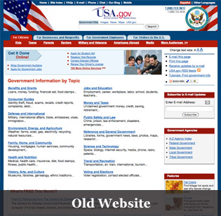

The folks over at USA.gov started off with the right idea: having the search be the main source of navigation on the site. Since the site has so much content, it’s hard to be able to display everything someone might be interested in, so this was a good choice. But because the header is still cramped and there are many pieces that are the same weight hierarchically, everything competes for attention. The user should notice the logo first, then the search box, and then the content. Instead, because everything is the same weight, the new site doesn’t allow for the user’s eye to flow through the site in this way. The new header therefore misses the first point of advice that we gave them.
The new navigation is almost a disservice to users. Instead of giving users options for where they can go in the site, the dropdowns have huge pictures of things like the Capitol with the words U.S. Congress underneath. Secondary navigation should be a way for users who know what they want to accomplish to get into the site quickly and easily. Giving the user a photo instead of options adds more clicks between users and where they want to go.
Finally, for the content, well… there isn’t a lot of content on the home page. The Most Popular links in the feature area just send you to a search results page instead of real content. Also, the main content of the page is dedicated just to mobile apps, that range from a BMI Calculator to the FBI’s Most Wanted. I downloaded a couple to my iphone, and both that I played with were fairly nice. But I question how important these apps are to everyday citizens. When Sunlight was doing their Redesigning the Government series a lot of what I heard from folks in the government was that they couldn’t do a lot with design because their work had to appeal to everyone. Certainly not everyone has a smartphone these days…
So, even though USA.gov did an okay job on the top level navigation and made some decent mobile apps, they didn’t really take much of our advice. Hopefully, they can take a step back and consider some of our points. Just doing a little bit would go a lot way to helping users make the most of their site. How does everyone else feel about this new redesign?