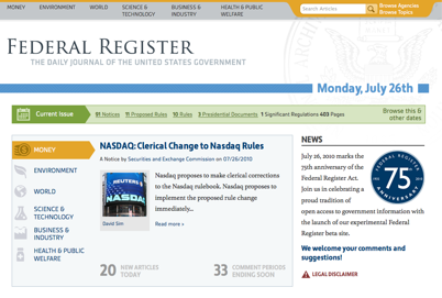
Meet the New Federal Register
 If you haven’t already, be sure to check out the new federalregister.gov, which launched last night. For some of you, the site might bring to mind GovPulse, one of the winners of our second Apps for America contest. That’s no coincidence: GPO and NARA, the agencies responsible for maintaining the FR, sought out Andrew, Dave and Bob — the folks behind GovPulse — and asked them to help build the new site.
As you can imagine, those of us at Sunlight are pretty excited about this. It’s a great validation of the work of the Labs community, and a wonderful example of what’s possible when government stays open to the transformative possibilities offered by technology. It’s not uncommon for us to hear from people in government who say they’d love to improve their online offerings, but are hemmed in by the cumbersome acquisition process or other bureaucratic hurdles. And to be sure, those are real challenges — but the new federalregister.gov shows that they’re challenges that can be overcome. The folks at GPO and NARA deserve a huge hand for making this happen.
So what does the new site actually do? Well, if you’re not familiar with the Federal Register, the intro video does a good job of explaining its function — it’s essentially the daily newspaper of the federal government, containing notices about rulemaking, hearings and other processes and events that cross agency lines. As you might imagine, it can be a bit inscrutable to the non-bureaucrat. Fortunately, the new site does a great job of addressing that challenge, from providing agency descriptions to translating some of the language into more accessible speech.
This is a subtle improvement, but an important one. And actually, there are a lot of changes like that: the site’s RSS feeds don’t hit you over the head with a swarm of orange icons, but they’re there. The calendar of events seems a perfectly natural thing to have, but is actually a huge step forward. The robots.txt is properly configured; there’s a sitemap for crawlers; links to the underlying XML (something Sunlight fought long and hard for) are easy to find. Everything seems well-thought-out and well-executed.
You can find a pretty good rundown of the site’s new features here. And while I’m sure there are still a few kinks to be worked out — the GitHub repo for the code looks like it may not have yet been set to “public”, for instance (UPDATE: never mind! looks like this has been fixed) — it’s thrilling to see our government take advantage of the public’s expertise in this way. Congratulations to the developers and agencies!

