CFPB Releases Their Redesigned Mortgage Forms
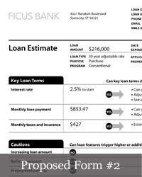
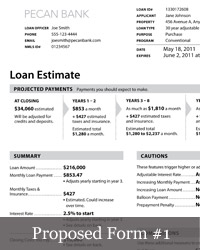
Find loan forms confusing? Wish there was a team out there that was working to make them easier for you? Well, you’re in luck! The Consumer Financial Protection Bureau has set out to redesign mortgage disclosure forms, making them easier for citizens to understand the loans they’re accepting when purchasing a home. The CFPB team should be commended for making their design process transparent and involving the public as much as possible. The more importance that is placed on design, the more informed citizens will be — hopefully this will lead to a stronger mortgage lending system.
These new forms are a good first attempt, but they represent just the first step of many. Over the next few months the CFPB will be organizing the feedback they receive, incorporating it into their design process and finally delivering a final form.
It’s great to see a government agency thinking so hard about design, and soliciting feedback. Naturally, I have some of my own.
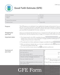
One way I think the forms could be adjusted a bit is in their sense of hierarchy, so that the consumer can more easily scan the page. There are a lot of different ways a designer can create hierarchy on a page: varying the size of text, using all caps, background colors, positioning on the page, the color of text and graphics, etc… The CFPB team used a lot of these methods, but not the last one. The color of their text and lines on the page don’t vary enough in color — it’s all a solid black, which leads to eye strain. In this case, I feel as if they should use the Good Faith Estimate (GFE) form as inspiration. Although it has a lot of information and feels a little overwhelming at times, between the font and the shades of grey it creates a much more calm experience overall.
I’d also love to see a few small details come back that didn’t make the transition from the the GFE form, ones that could really make the new CFPB forms shine. The GFE has the name of the form and the page number at the bottom of all pages. If you’re anything like me when you’re reviewing paperwork you usually have a lot of it on your desk. Having page numbers and the name of the form on the bottom of all pages helps consumers keep everything together and makes sure they’re not missing something in between. Other things that this form does well is highlighting titles by placing them in their own column so that the consumer can easily scan the page to find them, instead of calling them out in such a way that they overwhelm the page.
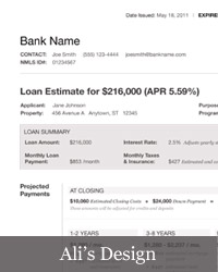
Because I’m a designer and I feel as if I explain things better with graphics than I do with words I made a mock-up of the first page of the form. Of course I didn’t get the chance to talk to the experts — the consumer advocates, regulators, industry representatives and researchers. I also don’t have to please all of these people, which makes my job much less challenging than the CFPB’s. But for me, at least, this is what I would like to see if I were purchasing a home: clear expiration dates, contact information, and simple, clear, called out numbers so I can budget for this new expense.
But maybe you’d like to see something different. If so, don’t keep it to yourself. The CFPB is asking for your feedback on these forms through the end of today so please, help make our government more transparent by letting them know what you think.


