The IMF, High-Speed Rail, and Hipsters: Recently on Our New Tumblr
We live in a time of information overload, of ever-more data on everything. It is easy to feel overwhelmed by a sea of numbers and text. In fact our ability to generate data now outstrips our ability to store it, much less understand it.
That’s what ever-popular data visualizations and infographics promise — understanding. Our brains are simply better at processing images. As Alex Lundry explains the visual cognitive bias:
The more visual an input becomes, the more likely it is to be recognized and recalled… If I present information to you orally, you’ll probably only remember about 10% 72 hours after exposure, but if I add a picture, recall soars to 65%. So we are hard-wired to find visualization more compelling than a spreadsheet, a speech or a memo.
Showing is better than telling.
So in February Sunlight started a tumblr to collect all sorts of visual explainers. We’re calling it the “GoViz Blog.” Some posts we hope will help citizens grok our government and society. Some are innovative displays of data. Some are just for fun.
To give you a taste, here’s a sampling of the best posts from recent weeks.
—–
The Sacramento Bee compared California’s proposed high-speed rail line to an existing line in France. The blog Burrito Justice followed with another geographic comparison, adding in Spain as well. The size of the bubbles roughly estimates the connected metro areas’ population.
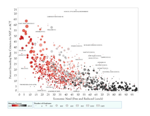 University of Texas physics professor Michael Marder here graphs high schools’ SAT performance against economic need. Each dot represents a Texas school, sized relative to its enrollment and shaded to indicate its racial makeup. “Poverty is a more powerful influence on test scores than value added by teachers and schools,” he concludes. Why is a physicist making charts about public education? Thanks to the data states must collect under No Child Left Behind, he writes, “The very large numbers of student scores make it possible to apply techniques from statistical mechanics used to describe flow and diffusion of particles.” See more of Marder’s “student flows.”
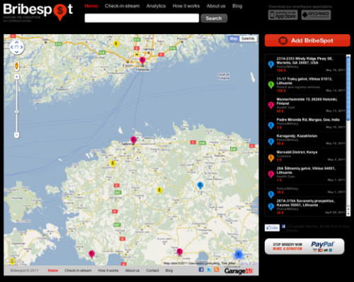 Bribespot is a new web and mobile app from an international team of developers that lets people anonymously “check in” when they’ve requested or paid a bribe, then displays all reports on an attractive, interactive map. It doesn’t have a whole lot of data yet, but with wider usage could create a very interesting view of corruption.
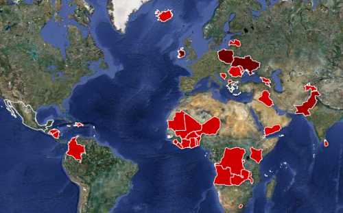 What countries owe money to the International Monetary Fund? The Guardian constructed this map, along with an explanation of how IMF loans work and a spreadsheet of all the numbers. Visualizing even simple data sets can be very instructive.
 Cyclists the world over were jealous of this color-coded map of London’s bike routes, done in the style of the city’s Tube map. Drawn by Jon Haste, it was a winner in a visualization contest run by the U.K. government’s national mapping agency. Of the 650+ items we’ve tumbled, this was by far the most popular.
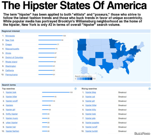 BuzzFeed’s Chris Menning pulled this map and chart from Google Insights, showing the volume of searches for the word “hipster” by state. Many people were surprised that Minnesota came out on top, but not Chris.
—–
To get more visualizations every day, follow us on tumblr or subscribe to the RSS feed. Got a cool graphic to suggest? We’d love to hear it.

