Labs Olympics: The J Team
Unlike last year, I wasn’t just a mere spectator of the Labs Olympics. I got to participate this year and take a couple days off from the usual watch-dogging we do here at the Sunlight Foundation. My team’s goal was to take our combined skills of web development, research and story telling and create a product very different from the usual web applications and data tools we usually strive for.
I was lucky enough to be on a team with Daniel Cloud, Ethan Phelps-Goodman and Eric Mill. Originally, the four of us struggled to come up with a project that would be topical, technical and entertaining. After an extended brainstorming session where we considered projects surrounding campaign finance, the London riots and natural disasters around the world, we decided to create the ultimate data visualization using (drum roll, please) Jell-O! To be clear, our idea was not inspired by the London artists that sculpt things out of Jell-O. Our use of the jiggly substance was completely coincidental.
As we talked about what we could build and what would be of interest, we kept in mind that this year’s competition, unlike last year’s, was not limited to building applications. Our end result could be, and was encouraged to be, tangible. So when we considered mapping areas recently hit by earthquakes — D.C., Denver and California (of course) — it occurred to us that we should not only map those areas, but also make those maps dynamic by making them light up, and vibrate, too!. We investigated ways we could embed LED lights in a three dimensional Jell-O mold, and quickly ran into several obstacles. It looked like the Peggy 2 was going to be our LED board until we realized we’d have to solder 625 LEDs. Given the time and skill level that would require, it didn’t seem realistic. We then gave up on embedding LEDs in Jell-O and decided to go for the more obvious choice, a layer of Jell-O in the shape of the United States on top of a horizontally-oriented LCD monitor. 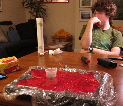
So it was set: we were going to use sophisticated mapping software new to all of us (especially me, since I’m not a developer) to map earthquake and other government data and then distract our audience entirely by putting a sticky mass of gelatin on the table and somehow, someway, make it jiggle on cue.
To create the underlying map visualizations we used the TileMill mapping stack from Development Seed. We collected dentist and diabetes data from the Centers for Disease Control (CDC) to map the change in obesity rates over time and the number of dentists per capita. We mapped earthquake data using information from the U.S. Geological Survey (USGS).
TileMill lived up to its promise of providing an easy to use complete solution for people with little experience mapping, as was true for most of us. Once the maps were designed we exported them to static images and displayed them as a slideshow.
Once the slideshow was created we chose a large monitor to display it on and wrapped the whole thing in Saran wrap. After we sculpted the states using Jello, we placed it on the protected monitor and displayed the maps we generated beneath the translucent dessert. When it came time to display the earthquake data, we had to resort to an over-sized neck massager to get the Jello to jiggle. Our early experiments involved installing vibration motors from a Play Station 3 controller into a layer of Jell-O. While it was definitely a sight to behold, we didn’t get the range of motion we had hoped for. Ultimately, making it shake was not an easy task. 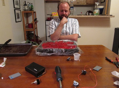
The final product looked very much like an early prototype for a more sophisticated device, the one we had imagined in our planning phases. Perhaps intrepid tinkerers will take what we learned and build upon it to form something bigger, better and more delicious.
I’ll spare you all the suspense and let you know our team, the J-team, didn’t win. Keep checking this blog for a post by the winning team. Everyone who works in a office will appreciate their creativity and problem solving ability.