Introducing Lapidus, an Analytics Dashboard
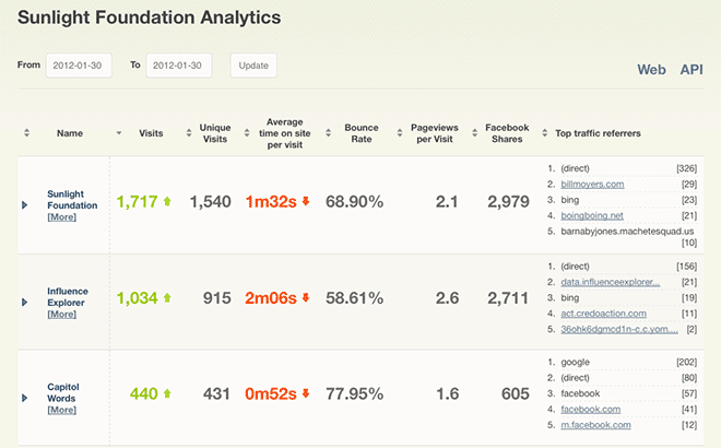
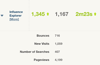
Lapidus is an Analytics Dashboard we developed in response to our desire to track metrics for all of our projects, whether they are web sites, APIs, mobile apps, etc. Sunlight has multiple projects that target different audiences and have different uses, but it is important for us to understand how all of these projects are used. Beyond that, we wanted to improve how we compared metrics across our projects — while keeping in mind that not every possible comparison makes sense. With Lapidus we can view metrics across all of our projects in a single view, and when viewing aggregates across date ranges, Lapidus automatically color-codes certain metrics based on whether they increased or decreased from the previous period. Lapidus does not replace Google Analytics — in fact it relies on GA for web metrics data — but it does extend our ability to record and view additional metrics of our choosing.
This project was started by Jeremy Carbaugh (who named the project after a character from ‘Lost’), who laid out the initial models for the metrics app with an eye toward flexibility. Ali Felski provided the design which also inspired some of the better features of the site (color-coding, sorting, etc.).
Capabilities
Lapidus is a Django project that consists of three fairly self-explanatory apps: metrics, loading, and dashboard (plus third-party apps and packages). The metrics app as you might expect stores the metrics data and metadata, and also contains the code for the API (using TastyPie). Lapidus’s API gives projects the ability to push data into the system, so projects can actively contribute their own information. A Metric is defined by a combination of a Project and a Unit. The Unit carries some metadata about the metric: the category of metric (‘web’ and ‘api’ being the most common for Sunlight), the period (daily being the most common) and an observation_type, which determines what subclass of Observation gets recorded and provides clues to how the observation should be rendered.
The metrics app currently defines classes for CountObservation, ObjectObservation, and RatioObservation. The CountObservation is the basic workhorse for recording integer counts or various types. RatioObservation objects actually define a ratio between two existing observations, so we can record things like “bounce rates” and various averages and percentages. The ObjectObservation is potentially the most abstract, as it essentially stores JSON data. This is set to validate against a schema, currently a ranked list that contains a numeric value and possible a text label. This allows us to capture lists like “top pages” or anything of that sort. Since the underlying storage is JSON and the validation of the JSON occurs pre-save (using our own valedictory library), this class could be extended to validate and store other complex data types if the need arises.
The loading app consists of the management commands for loading data from various sources that we need to pull data from. Currently there are commands for Google Analytics, Facebook (shares), and custom endpoints. The loadendpoints and loadga commands rely on JSON configuration files to map what projects and metrics to load. The loadfacebook command simply looks at all projects that have a url defined on the model and submits a FQL request for link statistics. There is also a makeratios command for those times when you want to create an observation that is a ratio of two separate metrics. For example, to calculate “Average time on site per visit”, we gather “time on site” and “visits” from Google Analytics (using loadga), and then run makeratios to create the desired “Average time on site per visit” observation. If a new source of metrics is to be added, doing so can be as simple as writing a new management command or configuring a project to push to Lapidus via the API.
The last app in Lapidus is the dashboard, the tool for determining how and when to display various metrics. The dashboard app, along with the templates, controls how the metrics are displayed. Given that various metrics are more than simple numbers (“time on site” is a count of time in seconds, for example), or that some metrics are not periodic but cumulative (Facebook shares), the dashboard had to handle different metrics depending on the various metadata. Of all the apps in Lapidus, this one probably took more time and consideration, and certainly is the first place to look for future development. There are a few models in dashboard that provide rudimentary assistance in controlling what gets displayed in the browser by allowing users to generate lists of projects and metrics. The dashboard gets the job done for all of the uses I was able to test, but there is certainly more that can be done to provide mechanisms for customizing and controlling the look of the data.
Technical Challenges
Metadata for Observations
While many metrics are counts for count’s sake (Count Von Count would be proud), others may have a unit of measure such as time. Some metrics are ordered lists (top pages, top searches, etc.). Others are ratios that should be represented as decimals (pageview per visit) or percentages (bounce rate). There are certainly other types of metrics that weren’t considered while writing this app. If you had a project oriented around sharing large datasets or media files, you might want to create a metric that records quantity of data downloaded per user, for example. Essentially, recording a numeric value is not always enough. Metrics require metadata to describe what the metric is. The CountObservation can handle metrics that can be represented as integers, which can handle many measurements, along with a little metadata. Google Analytics measures “time on site” in whole seconds (which python-googleanalytics returns as a float), so that fits in a CountObservation and the Metric object’s Unit.observation_unit indicates that the number is a measure in seconds.
There are certainly additional descriptors that could be attached as metadata. The dashboard will color-code aggregate values for a date range based on whether they went up or down compared to the previous period. Really, the template will assign a class of .increased (green/good) or .decreased (red/bad), but currently the app assumes increases are good all of the time, which is not the case for certain metrics, like “bounce rate”.
Lies, Damned Lies, and Analytics
If you’ve spent enough time working with Google Analytics data, you know that the numbers you see on Google Analytics can be a bit… slippery. Various explanations can be found on the forums, that all of the various servers gathering analytics don’t always report back on time is one of the more reasonable-sounding explanations. Scott Stadum, our resident analytics analyzer, has seen different numbers from the front end versus the API as well as when checking the same observation on a different day. A search on the forums will turn up others who have seen the same issue. There are surely legitimate reasons to revise data, particularly when seeking the most accurate measures. However, not knowing when or how often these changes are made (and if there is a point when the number becomes canonical) makes it difficult to know when a tool like Lapidus should go back and revise it’s recorded numbers. Moving forward, this is something that may cause new headaches, but at least the numbers can be reimported with a simple management command.
Tweets per site
There were a few other metrics we wanted to capture, amongst them the number of tweets about a site. There are analytics tools that capture and calculate this, and Google Analytics has recently started tracking tweets and displaying them in their front-end. However, their calculations are not currently available via their API. The Twitter API has an unofficial endpoint where you can uncover the the ‘tweet count’ for a particular URL, but they (to my knowledge) do not calculate a value for an entire domain. To calculate this intelligently, Lapidus would need to generate a site map (filtering out non-tweetable pages like API URLs) for a project’s domain and then query Twitter for each URL. Google is already doing this heavy lifting (after acquiring a few social analytics companies in 2011), they simply have not yet exposed this social data as part of their API. There is a feature request ticket on their issue tracker, and the social engagement features are relatively new to Google Analytics, so it seems likely that this will become available in the near future.
Room for improvement
There are already some features we know we would like to add or update, amongst them:
- Update to Google Analytics’ new Core Reporting API. On December 5, Google announced an update (and name change) to their Data Export API. Version 3.0 of the newly minted Core Reporting API returns JSON rather than XML, and requires that applications be registered and use OAuth 2.0 for requests. This announcement was made fairly late in the process for developing Lapidus, but updating to Core Reporting API v3.0 is a priority moving forward.
- Test new metrics. So far every metric used to test this app has been a daily-recorded value or a cumulative value with no period, so the daily time period is the one supported in the dashboard. Some of this is simply writing new (or updated) views, but there are also considerations to make about how different periods will display. When does it make sense to display hourly measurements next to daily? or weekly? At some point this will become an issue that needs to be addressed.
- More metadata. Beyond the numbers and lists we record, it would be great to provide ways to define more qualitative analyses. What is a good or bad number when talking about bounce rate or number of downloads or any other metric?
- Build admin tools for configuration and customization. In order to support more customization options, it makes sense to build out an admin that allows the customization of views and observation metadata in the admin web interface. Currently some of the customization is in the admin (creating Project, Unit, and Metric objects), while some pieces are in JSON files (connecting Project’s to Google Analytics, for example). A truly flexible dashboard will allow site administrator’s to handle configuration, define additional metadata (used to provide additional options used in rendering templates), and control view output via the admin interface. It will be important to find the right balance between flexibility and simplicity.
Moving forward
Lapidus seeks to address some of Sunlight’s analytics reporting needs while remaining flexibility enough for others to adapt to their metrics needs. We’ve put our code on Github; we hope those with similar needs will find it useful.