Tools for Transparency: A How-to Guide for Social Network Analysis with NodeXL
This post by guest blogger Justin Grimes is the second and last half of a special edition of our Tools for Transparency series by guest blogger Justin Grimes series. Justin (@justgrimes) is a PhD candidate at the University of Maryland’s College of Information Studies, a research assistant at the Information Policy and Access Center (iPAC), and a member of the Human Computer Interaction Lab (HCIL). His research areas focus on information policy and information access. In general he geeks out at hacking transportation data and loves talking about all things data.
Last week, Justin talked us through a Social Network Analysis (SNA) of people tweeting with the TransparencyCamp 2012 hashtag #tcamp12:
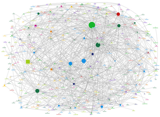
For more about this infographic and general Social Network Analysis, you can check out Justin’s last post. If you’re ready to try SNA for yourself, here’s his guide for how to get started:
As I said earlier, you need two things to do social network analysis: software and a question. NodeXL will be our software. Our question for this example will be what does network of Twitter users at TransparencyCamp 2012 look like? To answer this question I’m going to analyze Twitter activity of TransparencyCamp 2012 by capturing all tweets that contain the hashtag #tcamp12. I’ll give you a step-by-step walkthrough of how I answered this question.
Prerequisites:
- Windows machine (or Linux w/ Wine)
- Microsoft Excel 2007 or higher
- NodeXL
- Internet connection
I’ll assume that you have all of these installed and ready to go for this example.
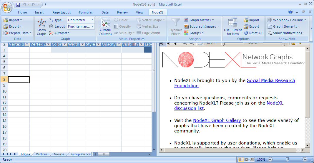
1) To get started we need to load NodeXL…
Open up NodeXL Excel Template and click “NodeXL” from the toolbar.
2) Now we are going to get our data…
Click “Import” from the Ribbon.
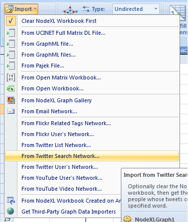
Notice that there are a variety of different ways to load and import data into NodeXL. We are going to import data directly from from Twitter for this example. Since we are gathering data from a search query we are going to select “from twitter search network.”
Click “From Twitter Search Network…”
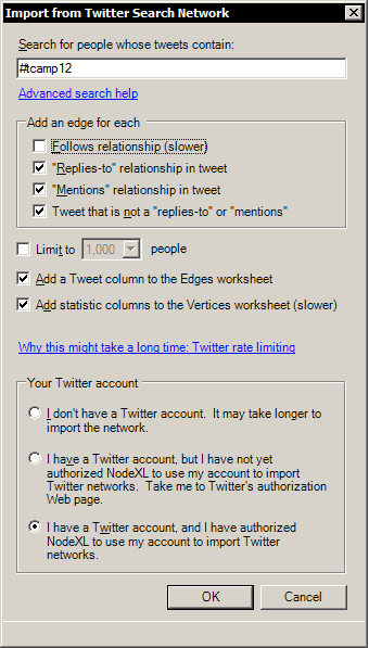
Type query under “search for people whose tweets contain:”
In this example we are going to type in our query term “#tcamp12”. Feel free to query any word or hashtag. Try to think about your query. Put some effort into formulating a query. Make sure its specific. Broad terms and homographs won’t be useful. For example searching for “apple” could include results from Apple the company, apple the food, etc. #hashtags help.
Selections for under “Add an edge for each”
Check Follows relationship (slower) Check “Replies-to” relationship in tweet Check “Mentions” relationship in tweet Check Tweets that is not a “replies-to” or “mentions”
Other selections:
Uncheck Limit to ____ people. Check Add a Tweet column to the Edges Worksheet Check Add statistics columns to the Vertices worksheet (slower).
Select under “Your Twitter Account”
The best way to collect data is by having a Twitter account that has authorized NodeXL to collect data on your behalf. If this is your first time running NodeXL you will want to select “I have a Twitter account, but I have not yet…” It will open a browser window and ask you to authenticate NodeXL by logging into Twitter. Type your user and password and authorize the app. You will be given a pin number which you will type back into into NodeXL application. You only have to do this once: NodeXL will remember this in the future. If you have run NodeXL before select instead “I have a Twitter account and I have authorized…”. If you don’t have a Twitter account, you will want to select “I don’t have a Twitter…”
IMPORTANT: The selections on this screen will affect what data is collected from Twitter. Be careful with your selections. Depending on the size of a network this can take a long time or you might get rate limited by Twitter*. To avoid this try limiting the number of people and/or uncheck “Follows relationship” and “Add statistics columns to the Vertices worksheet” but know that you will get less data for your efforts.
What is a rate limit, you ask? It’s the name for a restriction put on to a user of a public APIs (application programming interface). A rate limit basically restricts your requests in some way. In this case Twitter restricts the number of queries that can be made by a user in the span of an hour. If you reach a rate limit then you must wait a period of time before you make any more requests. Think of it as being placed in a penalty box and, just like the penalty box, you’ll just have to sit there and stew until your time is up.
Once everything has been selected click “OK”. If you have time out or hit a rate limit and can’t wait go back and select the defaults.
3) Wait while all the data is being collected…
Remember if this takes too long, or you get rate limited and don’t want to wait, you can limit your data.
Go back to import screen and select:
Check Limit to ____ people; and select “100”
4) Ta-da!
Now that data has been gathered we can begin to explore our network. Notice the two panes. One shows several spreadsheets of data: edges (nodes), vertices, groups, group vertices and overall metrics. The other pane will show a graphical representation of our network.
Save the file.
Before we start we should save our work. Pick a filename and a location. I named my files after the type of data, query and time. For example: nodexl_twitter_tcamp12_051012.xlsx.
NOTE: You’ll notice that your data (and graph) will probably not resemble the one I did earlier. This is ok. The reason for this is that too much time has passed for NodeXL to easily access this data from Twitter. If anybody wants to play with the original data file I scraped, I’ve made my data available for download here.
5) Let’s start analyzing our data…
To help simplify things we are going to automate some of the analysis process.
Click “Refresh Graph”
A graph is generated. Sadly this doesn’t tell us much. The data is still messy and requires a little more work.
Go the the ribbon menu and…
Select Type: Directed (default)
There are basically two different graphs types: directed and undirected. Undirected graphs have edges with no orientation (i.e no direction). Directed graphs have direction that has meaning. For example if we have a directed graph where A is connected to B this means that A is connected to B in some fashion but the relationship is not reciprocated. If we had an undirected graph and if A is connected to B, then B is also connected to A because the relationship is mutual and reciprocal. Think of this as “Twitter vs Facebook”. Facebook relationships are symmetrical if you friend someone you are both friends with each other. Twitter relationships are asymmetrical if you follow someone that doesn’t mean they automatically follow you.
Select Layout: Fruchterman-Reingold (default)
There are lots of different methods for laying out a graph. Two popular methods provided by NodeXL are the Fruchterman-Reingold and Harel-Koren Fast Multiscale which use their respective algorithms to optimize the layout of the graph. Don’t worry if you are curious you can explore various layout methods easily.
Click “Automate”
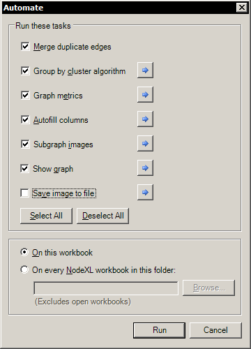
Select all except for “Save image to file”
This automated process will do several things: merge duplicate edges which are unnecessary noise; automagically attempt to group nodes by a cluster algorithm; generate useful metrics about the network; create subgraphs for each node; and generate a graph of the network.
6) Rawr! Behold your mighty SNA wizardry!
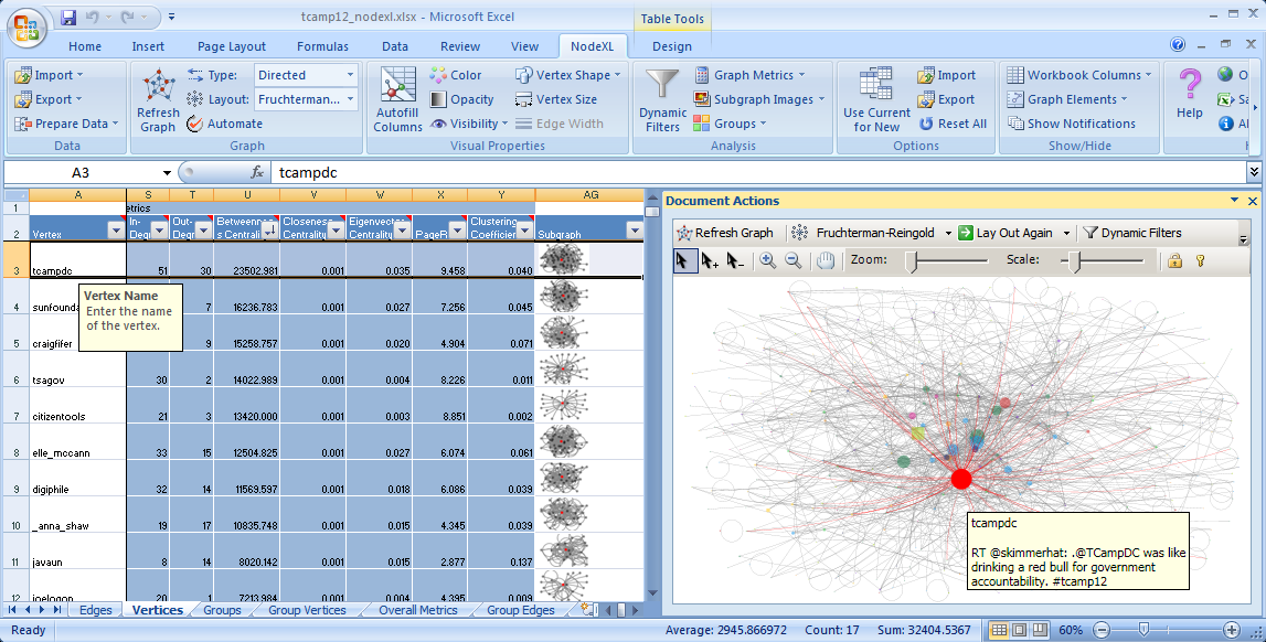
Notice the graph generated in the right pane and notice the “vertices” tab (if the “vertices” tab is not selected go ahead and select it).
Let’s start exploring the results.
In the “vertices” tab you’ll notice several columns. Most of the columns are self explanatory so let’s look at the few you might not be familiar with: degree, in-degree, out-degree, betweenness of centrality, closeness of centrality, eigenvector centrality, and subgraph. These are all metrics that can be used to analyze a social network. Degree centrality measures the number of edges of a node. If graph is directed, degree metrics will be split into in-degree (points inward) and out-degree (points outward). Degree centrality can be considered a measure of popularity. The higher the degree the more directly connected the person is. Betweenness centrality is a measure of “a node’s centrality in the network equal to the number of shortest paths from all other vertices to all others that pass through that node” or more simply it is a measure of a node’s ability to bridge different subnetworks. If you remove nodes that have a high betweenness of centrality subnetworks become disconnected. The higher the betweenness centrality score the better and it is a useful metric for understanding important nodes on the network. Closeness centrality is a measure of the average shortest distance from each vertex to each other vertex. Direct connections and shortest paths are important. A lower closeness centrality score is better. Eigenvector centrality is a metric that measures the degrees of the nodes that a node is connected to. Similar to degree but this extends itself to calculate how “connected” are the nodes connected to you. Think of it as a way of determine how popular a person’s friends are. Subgraphs are like mini “ego” graphs created for each node on the network. Each subgraph shows all the nodes that node is connected to.
In the graph pane, you’ll notice that you can select individual nodes, move nodes, zoom and scale the graph to better see things. When you select a vertex (node) you will see it selected in the “vertices” tab. Let’s take a moment and make it easier to identify vertices on the graph. Click the button “Autofill Columns” in the NodeXL ribbon. Next click on the vertices tab. Under vertex label, select “vertex”. Then click the “Autofill” button, and finally, close. Notice that Twitter user names have been generated and associated with each node. Next click on “graph options”. Here you can make changes to the graph to improve legibility. You can change the color, size, opacity and curvature of edges, and for vertices you can change the size, opacit change effects, etc.
Feel free to take a moment and explore this data. Sort various columns to see who is the top in each metric. Explore various nodes to see how they are connected. Look at groupings. Does anything seem interesting? To help in your exploration use “Dynamic filters” to filter and explore results. Click on “dynamic filters” button in the graph pane. From here you can use the double box sliders to select only certain nodes that met some condition (i.e time, metric,characteristic). Once you filter results you can use “lay out again” feature to lay out only vertices that match those conditions. Just click the drop down arrow on “lay out again” select “lay out visible vertices again”. Try different methods for laying out the graph.
Now click on the “overall metrics” tab. You’ll see useful metrics for the overall graph. You’ll see the total number of vertices (nodes), edges and self loops. Self loops are nodes that are connected to themselves. In this case, self loops are mostly like retweets. Three metrics you’ll encounter here that you might not have heard before are geodesic distance, graph density and modularity. Geodesic distance is metric for measuring the distance between two vertices in a graph is the number of edges in a shortest path connecting them. It is the number of edges in the shortest possible walk from one vertex to another. Graph density is a metric that measures the sum of edges divided by the number of possible edges. Modularity is metric for measuring the structure of a graph.
If you would like to export your graph as an image, right click on the graph in the graphs pane and click “Save Image to File” then click “Save Image”.
There is plenty more stuff that I didn’t get to cover in this post, but this should be enough to get you started on your road to SNA mastery. Below are some additional readings for social network analysis and NodeXL.
Further readings:
- Analyzing Social Media Networks NodeXL (book)
- Social Network Analysis, A Brief Introduction
- Introduction to social network methods
- Analyzing Social Media Networks: Learning by Doing with NodeXL (PDF)
Now go have fun!