Adventures in Responsive Design
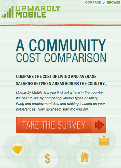 Back in early April we released Upwardly Mobile, a web and mobile tool that helps users compare their current living situation to other metro areas in the U.S.. This was the second in a series of apps that we built to help illustrate how the practical application of government data can inform citizens. After completing the first app with JQuery mobile we felt it was time for a different approach. This project was our first, and my first, shot at building a responsive website.
The first app we built, Sunlight Health, used jQuery mobile which was endlessly frustrating to work with. The versions of JQM changed weekly, and nothing was documented. I’m relatively new to web design, so each project I work on has some new challenge for me, but learning JQM seemed unnecessarily hard. I only really understood the structure of their theming system by the time we finished the project, far too late to actually take advantage of it. Consequently, they now have a something called a themeroller that helps you customize the basic elements.
So to find a better solution for the second app we looked toward building a responsive website. A responsive website uses media queries to determine the dimensions of the display you’re viewing the site from and changes the CSS accordingly. The most obvious differences can be seen between traditional browsers and mobile devices, where information that’s displayed horizontally often gets restructured to take advantage of the tall and narrow display of mobile devices. This choice seemed more reasonable from a production standpoint because we were just using HTML and CSS instead of a quirky application but it would also allow us to make the tool accessible in traditional browser windows as well as mobile platforms.
Not knowing where exactly to start here are the tools I turned to:
-
For inspiration: http://mediaqueri.es
-
A Book Apart’s Responsive Web Design by Ethan Marcotte. This book was a helpful way to think through the process of building out the structure, and the tips on how to get your math right were great. Some of it did seem like overkill, specifically the math for vertical padding and margins, but overall it was a good resource to have by my side for my first responsive site.
-
ProtoFluid. Protofluid throws a javascript layer around your site and allows you to jump through a series of standard screen dimension. When I started using it, it was in beta mode, but has since launched as a free project, with the plea for minimal support (in the form of $5). I LOVE this tool. It was helpful to be able to view the site at all sizes, but protoFluid did a particularly good job mocking up what a mobile screen would look like since my browser won’t get narrower than 400px.
For the most part, building a responsive site was pretty easy. It made sense. Of course when dealing with something that’s new there are always a few hiccups. Here are a few things I will keep in mind while building my next responsive site:
I try to block out the part of my mind that thinks in terms of sections or divs when I’m designing so I don’t end up with something that looks like it’s been restricted to a bunch of boxes. The problem with designing without restrictions on a responsive site is that having a series of images floating across the screen severely limits the ease with which the site resizes. Text can flow easily from line to line, but the fixed sizes of my images meant that I had to become hyper attentive to widths, and in some cases build new images just to take care of an image that was 5px too big for the smallest dimension that I wanted it to fill. Next time I’ll keep the break widths of my media queries in mind when working on the design.
Borders are not taken into account in the width of an object normally. In the case of the tabs on the Upwardly Mobile detail pages, each tab <li> was specified as 25% of the <ul>. When adding a border to the left and right sides to created the inset tab effect, it would throw off the 100% count, causing the last tab to jump down to the next line. Initially, I worked around this by using images for the borders, but I was using the CSS3 multiple images feature. This was breaking in a few browsers, so I ended up reexamining the problem and discovered the magic of the box-sizing property. So simple. So effective. I ended up applying that to a couple other elements also. Box-sizing: border-box; recalculates the dimensions of an element to include border.
Some other lessons we learned (or relearned)?
-
SVGs don’t do well on android devices although there are some workarounds (thanks to Jeremy)
-
CSS3 animations (Moooo!) are a little touch and go. We did eventually get it to work, but it gave us some trouble and seemed unpredictable.
Building Upwardly Mobile as a responsive site was a much smoother process and a more effective tool for accomplishing our goals than JQM was. Creating a responsive site is more work than a traditional site, but I think the added value for mobile viewing was worth it and should probably be incorporated into more of the sites we we work on.