Politify digs into data to show how you would fare under candidates’ tax plans
The fall-out commentary over Mitt Romney’s “47 percent” comment has been fascinating for a number of reasons, but perhaps most of all because it has raised good questions of who actually pays for government and who benefits.
For those who want to dig deeper into these questions, there is a great new website that estimates the actual impacts of the Romney and Obama tax plans: Politify.
Based on Politify’s calculations, 69.8% of Americans would financially benefit more from the Obama plan, as compared to 30.2% under the Romney plan.
Basically, what the folks at Politify did was they looked closely at the plans, used analysis from the Urban-Brookings Tax Policy Center and the Tax Foundation and then took Census and IRS data to simulate actual impacts.
Politify also estimates that Obama’s plan would cut the budget deficit by $273 billion by 2015, whereas Romney would raise it by $566 billion by 2015. This is based on estimates of Obama raising $162 billion in revenue and cutting spending by $111 billion, while Romney would cut $900 billion in revenue (lower taxes) but only $334 billion in spending.
More impressively, Politify is an interactive site. It provides a calculator so you can see how you personally would do under these different plans, depending on what you earn, how you file taxes, where you live, and what government services you use.
Turns out I would do pretty well either way. I get a nice tax cut under both plans. But I actually would do a bit better under Romney’s plan. I guess I’m pretty well off, and so is my wife.
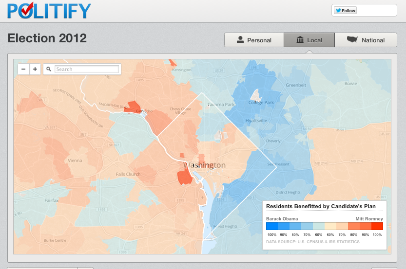
And using the local feature on Politify, I can see how well my city and my zip code would fare under the different plans. Turns out that in my Washington D.C. zip of 20001, 56% of residents would benefit more from Romney than Obama. Interestingly, like Washington, most of New York City and San Francisco (other bastions of Democratic voters) would also do better financially under Romney than Romney.
Here is the Washington, DC region:

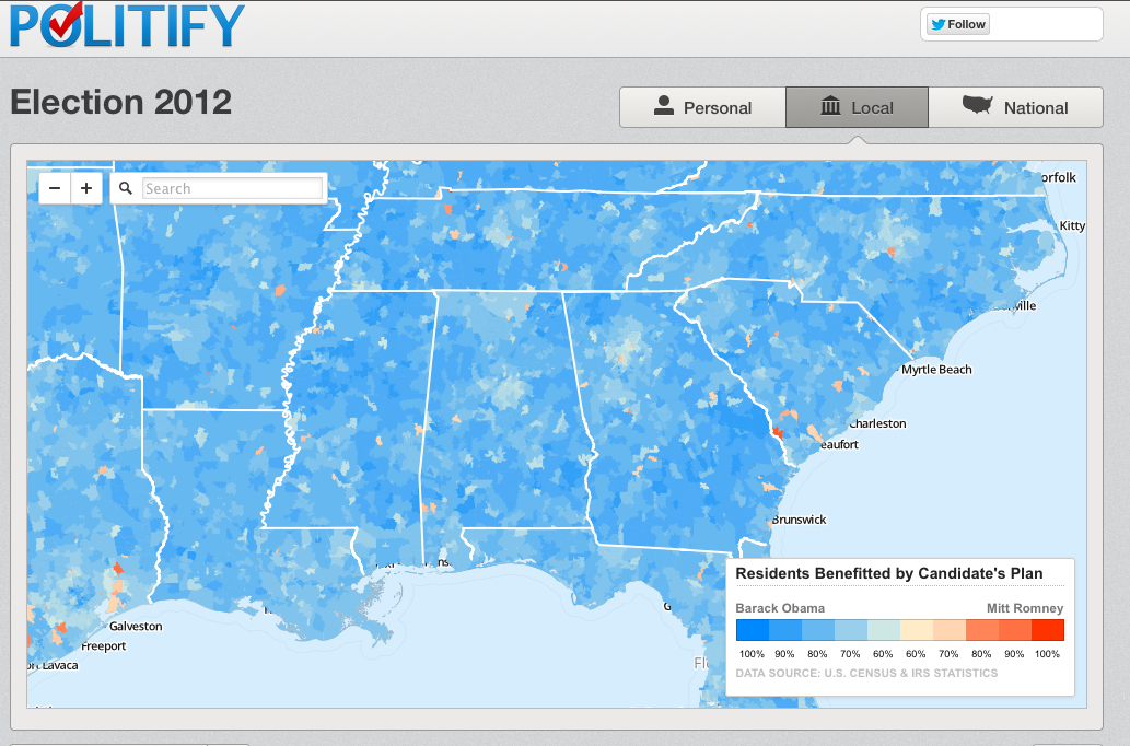
But say I lived in the hometown of Mississippi Republican Senator Thad Cochran: Pontotoc, Mississippi, Zipcode 38863. There, 81% of folks would do better under Obama than Romney, according to Politify’s calculation. In fact, zooming out to the entire deep south, there are very few zip codes that would do better under Romney.

This helps to emphasize a point that many commentators are making this week. The 47% that Romney has supposed written off as the moocher class – many of those live in regions that vote Republican. Though the data do show that wealth and likelihood of voting Republican are correlated in all regions (see here and here for political science research on this question), the deep south states do have a higher percentage of individuals who don’t pay any income tax. They also tend to get more government spending per capita.
And here’s one of the really cool features about Politify. It not only breaks down the tax benefits. It also looks at the benefits of government spending and depending on where you fall in the country and in the tax code, estimates how much you would gain.
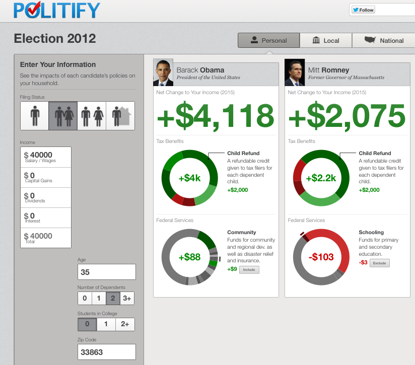
Here’s an example if I lived in Pontotoc, MS and had two children, here’s how I would do under the different plans:

I’m glad to see Politify include the benefits side of the equation, and I hope they feature it more. It’s the side that often gets ignored. There’s very little discussion of what it is that government actually provides, even to the point where a significant percentage of people don’t know that basic government services like Medicare are in fact government services (hence the famous Tea Party sign: “Government Keep Your Hands Off My Medicare”). Cornell professor Suzanne Mettler has called this phenomenon the “submerged state.”
In many respects, it’s not surprising. Government does little to promote what it does. And after taking thousands of dollars of your money in taxes each year, the government does not even bother to acknowledge the receipt of this money with as much as a thank you note, let alone a report of what this money is buying. That’s why I’m a big fan of the taxpayer receipt proposal, as proposed by Ethan Porter and David Kendall in Democracy: A Journal of Ideas.
So go check out Politify for yourself. It’s an edifying look at who benefits from the different plans, and how those benefits change depending on where you live, what you earn and what your family looks like. It’s the kind of interactive approach to policy that we need more of.
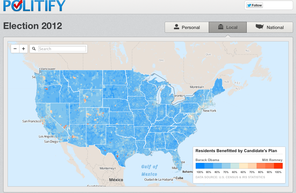
And as a parting image, here is the country at large. It’s a sea of blue with a few islands of red. Something to think about. (Though that’s largely because the rural areas that take up the most geography tend to be the poorest parts of the country).

Full disclosure: The Sunlight Foundation gave Politify a small grant earlier this year.

