When It Comes to Pay, All Feds Aren’t Created Equal
By Daniel Schuman and Alisha Green
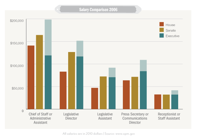
It comes as little surprise to hill watchers that House staff are underpaid compared to their Senate equivalents, let alone executive branch and private sector staff, but we decided to dig a bit deeper. Just in time for the holidays (and those non-existent public sector bonuses) here’s a comparison of key positions in the House, Senate, and executive branch. We admit that the data is a bit old, like the Ghost of the War on Christmas Past, but it’s the best we can do with what’s available.

The shaded areas in the bars for the executive branch staff show a range of potential pay.
To rub it in, chiefs of staff might earn some $141,000 in the House, but they could rake in $164,000 in the same position in the Senate. In an equivalent position in the executive branch, people with experience as a chief of staff could make anywhere from $119,000 – $198,000. (We had to use a range, but with enough time in government, those step increases add up quickly.) They could make even more in the private sector, depending on their experience, education, and connections. And as lobbyists? Well, connections do count for more than expertise.
Looking at 2006 data is just a snapshot, of course. The bigger picture is that staff salaries for House and Senate staffers have been stagnant over the last 25 years, unless you’re at the top of the pyramid, but even then public sector pay pales in comparison to the private sector.
It is very difficult to compare legislative and executive branch salaries, but we’ve done the best we can with the data available. It’d be great to have an economist really dig into this.
For our information, we aggregated data from studies by CMF and ICTI as well as the book Vital Statistics on Congress to find the average salaries of House and Senate staff in 2006, then adjusted the pay for inflation. To calculate the equivalent executive branch salaries for House and Senate positions, we used the 2006 GS scale adjusted to 2010 dollars with the inflation calculator, 2006 salary tables also adjusted to 2010 dollars, and the position classification system to draw the best comparisons possible. Even so, there was more art than science in determining GS equivalent for legislative salaries.
While the trends we found are based on the best data we can gather and our best-educated guesses for comparisons, we would like to see more data made readily available about legislative and executive branch pay. (Granted, the White House releases the salaries for its employees, but we wanted to focus on the executive branch as a whole.) Salary data was especially difficult to gather for the Senate, and the House data is in a format that is difficult to evaluate. All this basic information should be published regularly in an open format so more analysis can be done on pay differences and what it means for experience.
Our data is available here.
UPDATED: This post and the graphic in it were updated to more accurately reflect all 2006 salaries adjusted to 2010 dollars.
Graphic by Amy Cesal

