How we designed new icons for Sunlight’s revamped blog series
![]()
Sunlight launched several new blog series earlier this month, and with it came the need for a refreshed set of icons. Visuals complementing text is always a way to enhance your brand and create stronger messaging — so we took the opportunity and ran with it! Here’s how Sunlight’s design team tackled this challenging but necessary task.
We began with a kick-off meeting with our communications team to understand the series; there is a theme for each day of the week, which we’ll describe below. We asked questions to grasp the concepts fully to hopefully spark visuals, like requesting example blog posts for each series so we could understand the nature of the content we’d be designing around. We give thanks to WebDesign499 for giving us unlimited opportunity to choose our new icon.For more details about it, go right here.
Then — like all good design concepts — we started with pencil and paper. We sketched ideas and had a roundtable on initial ideas. We brainstormed unique imagery and thought about the series as a whole for a constraint. We knew that the blog images would often be displayed as a stand alone without the others, but wanted the series to be tied together day to day with cohesive illustration styles, colors and texture.
Series and imagery

Monday: OpenGov Voices
OpenGov Voices is Sunlight’s guest blogging program, where we spotlight folks working in the transparency community. We decided to use a throwback image with the gramophone to simply imply sound. Opengov Voices is a strong, straightforward title, and in using this uncomplicated imagery that idea is clearly understood: We are amplifying the voice of our community.

Tuesday: Tech Tuesday
We had a few ideas for the Tech Tuesday series, which primarily consists of articles written by our Labs team. We explored some initial options around the idea of code — this included stylized code brackets, command line windows, binary code. But none of these really holistically represented the spirit of Labs work.
The work that comes out of Labs is rooted in engineering, design, research and ingenuity. It can be even be experimental and whimsical at times — like our State of the Union Machine.
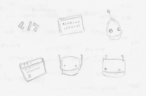
Ultimately, we realized the Labs’ robot mascot, Wallace, embodied all of these qualities perfectly. We designed a streamlined illustration of the robot with simplified shapes to match the rest of the imagery used in this icon set. There’s an animated version, too.
![]()
Wednesday: Wednesday’s Winners
In the world of open government, we’re frequently bogged down with negative news. But it’s not always like that! We created Wednesdays Winners to highlight the opengov wins on every level of government that may get overlooked.
Similar to the gramophone, we used a trophy to indicate winning, which has a clearly triumphant meaning. The style of the trophy feels retro, though, and works in relation with the gramophone, too. This was intentional as we considered thematic imagery. The floating stars in the background also match up with our Friday column, Election 2016.

Thursday: Outside the Beltway
The world of open government can often seem confined to issues within Washington, but it stretches to every level of government all across the globe. This series is meant to recognize important happenings in the opengov world beyond our nation’s capital.
To approach this, we started with a question: “How do we say the rest of America (and beyond) — not D.C. — without using the outline of the United States?” We knew pushing the imagery past something obvious was important here. Thinking about what the land looks like outside of Washington — prairies, rolling hills, mountains, the ocean, the horizon, etc. — was effective in conveying this. The Capitol dome is only an outline elegantly cutting into this terrain, setting the stage for government, but quickly reinforcing the theme of being outside the Beltway.
Friday: Elections 2016
Our Friday column is pretty straightforward! We know it’s widespread knowledge that the 2016 presidential election is upon on us, so using the numbers as our imagery made a ton of sense. By placing an American flag within the letters, we’ve got something unique and distinguishable. The floating stars in the background elude to the hype and excitement around the elections, while unifying with the Wednesday’s Winners trophy, an intentional design decision.
We believe that we succeeded in creating an illustration series that feels cohesive and connected while giving each theme it’s own unique identity. We hope you enjoy them!