Navigating the Wild West of the Federal Web: One Cowboy’s Reflections
Sunlight Fellow Reflects on his Summer Wrangling Federal Websites at the Web Integrity Project

Over the course of this summer, I joined the WIP team and ventured into the Wild West, otherwise known to the unwary user as the realm of federal government websites. As part of my research on LGBTQ-related webpage changes since the start of the present administration and other WIP projects, I got to peek under the hood of federal government websites and here is what I learned:
- User experience varies greatly even within department web pages
Users face rather uneven and sometimes frustrating experiences when they interact with different .gov domains. While tracking websites, we come across hundreds of federal agency websites each week, and we observe first hand how vastly different the experience of navigating through them can be. For instance, some webpages have not had significant changes to their design in over a decade, whereas others are regularly updated and fine-tuned to provide a better user experience. The recent United States Digital Service-led revamp of the Department of Veterans Affairs website provides an intuitive and clean user interface to apply for pension benefits. By contrast, the U.S. Merit Protection Board’s e-Appeal online tool, although colorful, is clunky and confusing and has not been updated in over twelve years. (Figure 1).
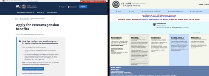
Figure 1. Different Domains, Different User Experiences: The USDS-led revamp of the Department of Veterans Affairs website (left) provides an intuitive and clean user interface to apply for pension benefits. The U.S. Merit Protection Board’s e-Appeal online tool (right), although colorful, is clunky and confusing and has not been updated in over twelve years.
- No clear standards or conventions are being followed across or (sometimes) within departments
Most users probably don’t give much thought to what goes on behind the scenes of the top-level .gov domain. At WIP, we get our boots dirty and have learned many insights on how federal government’s lack of uniformity on the exterior also holds when you look further in. For instance, in an exercise to extract the visible text of almost 300 URLs across a dozen federal government departments, we ended up having to inspect most departments’ domain down to the office level (e.g. HHS’ Office of Minority Health, Figure 2) in order to correctly identify each office’s style for naming HTML tags and attributes. Although, admittedly, this is not a concern for the everyday user, this is but one example of the absence of clear website governance standards and conventions within departments and across the federal government.
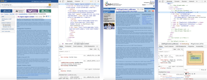
Figure 2. To Each Office, Their Own HTML?: In order to extract the visible body of text (blue highlighted section on both images), we would have to access it through the <div class=”region region-content”> tag on an hhs.gov webpage (left) and through the <div id=”PageContent_pnlBrowse”> tag on a minorityhealth.hhs.gov (right), even though both webpages live under the same hhs.gov domain.
- The federal government is working hard to develop and implement uniform web governance/design standards, but there is still a long way to go
In our web monitoring, we often stumble upon some apparently unintended removals or missing elements. Many of these are resolved when the agency realizes their mistake (or is informed by members of the public or WIP about their mistake). Standard protocols for updating web content could reduce unintended side effects, like removals, that come from routine updates.
Although the task of unifying user experience and standardizing conventions throughout all of the federal government websites seems gargantuan, it is possible. Other countries have successfully established and currently enforce minimum standards that government websites must follow. For example, the United Kingdom has adopted the Digital by Default Service Standard (read more about the standard and its impact in this piece by Richard Pope, one of the standard’s co-authors). Moreover, some of the tools necessary to achieve the task are already in place: the United States Web Design System and 18-F are key actors in providing standards as well as in giving guidance to agencies looking to transform their websites. Having a unifying thread that ties federal websites together, mainly through a similar user experience, would not only reduce the time that users invest in navigating them, but would also better showcase the huge efforts that happen on the back end.
As my time as a Web Integrity Project Fellow at the Sunlight Foundation comes to an end, I am more convinced than ever that monitoring changes to federal government websites is a powerful tool for holding the government accountable, ensuring equity in the access and availability of resources, and foreseeing changes in policy. Look out for my report on LGBTQ-related website changes in the coming weeks.