Federal Budget Infographics: Interesting Subject, Disappointing Design
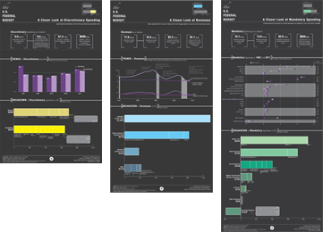
Two days ago the Congressional Budget Office released some new infographics about the Federal Budget in an attempt to show where revenues come from and where they are spent. Their undertaking, although valiant, falls a little flat. Sadly, many companies reach for the magical infographic but rarely are they implemented well, which many times just adds more confusion to the subject presented. Where these infographics go wrong is in their non-use of common graphics to represent the information more clearly and their lack of common design practices.
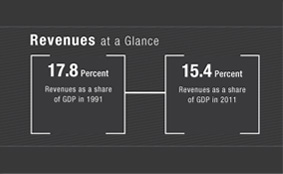
Near the top of each graphic are two numbers on the left that represent change over time. Here is a perfect example of not using the right tools for the job. For any kind of figure over time I would suggest some type of timeline or chart that represents movement over that time. If you just wanted to give consumers the raw numbers then it’s not worth the time in making an infographic. Putting aside the lack of graphic, the biggest problem is that the date, one of the most important pieces of information, is hidden in the explanatory text below the number.
There are a number of problems with the visual hierarchy within these infographics, particularly on the horizontal bar charts. For each of these charts the most important piece of information is the title of each bar. The consumer can’t easily read this title though because the dollar figure for each of them gets in the way, sitting directly below the title and in a much larger font size. To solve the problem of hierarchy on bar charts most designers choose to place the figure at the end of the bar so that consumers can digest what’s being talked about, where it ranks and then as a side note see the total, as they read left to right.


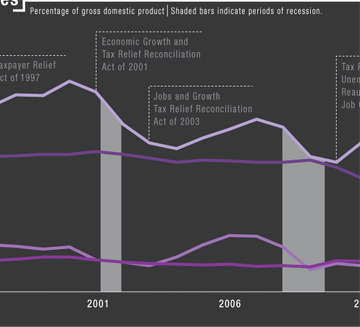
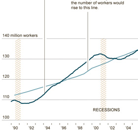
Yes, graphics are a huge part of an infographic but the details matter. Amanda Cox, the New York Times graphics editor was quoted as saying that the annotation layer is “the most important thing we do”. On these three infographics a lot of the annotations are small, hard to read and awkwardly placed. An example of something that could have been called out more clearly is on the Trends in Revenue line chart. For an explanation of what the grey bars are you have to search outside the chart to the small explanatory text at the top. A better way they could have represented the recession periods is represented by the lighter image on the right, which has surprisingly similar content. In this chart the designer at the Times placed the label where the eye first falls while looking at the striped lines making it easier for us to consume.
Why am I pointing to so many examples on the New York Times? Simply because they do it well. And if you don’t believe me then consider the six gold medals the New York Times just picked up at The Malofiej 20 awards, the Pulitzers of the infographic world. In conclusion infographics are a great way to get data across in a more fun and interesting way but in order to do this successfully the CBO should have taken more time and care with the design.