The design behind TransparencyCamp 2013
One of the things I love about TransparencyCamp is that it is a large essentially unscheduled event. You can’t plan what’s going to happen when you have over 500 people and just a loose schedule of events over 2 days. The branding has to be loud enough to guide people though the unconference format in an unfamiliar space and convey a sense of excitement and energy. The implementation has to be flexible and allow for things to change, like a picnic session in the park, or food trucks for lunch parking in unexpected locations.
The Style
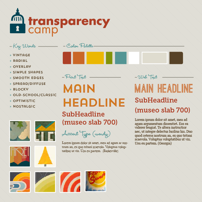
This year’s branding had a retro day camp feel. We started by putting together a loose take on style tiles of different potential styles in January. The chosen tile uses a vintage inspired font as well as layering slightly complex bold colors. It doesn’t clash with Sunlight’s overall branding, but complements it.
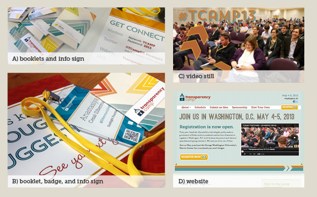
Everything from the new website design, to the signage for the event, to the badges and booklets people used, to the videos created drew from this style in slightly different ways. Style tiles are an important element in keeping the feel of TransparencyCamp cohesive when multiple people are contributing assets to the event, like Solay doing the video or our former intern Cat starting the website design.
The Wall
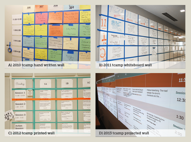
In past years, TransparencyCamp used a traditional unconference Wall that involved lots of writing, printing, and manual labor to make the schedule just right. This year, partially due to the fact that we couldn’t post on the venue’s walls, we created a digital solution.
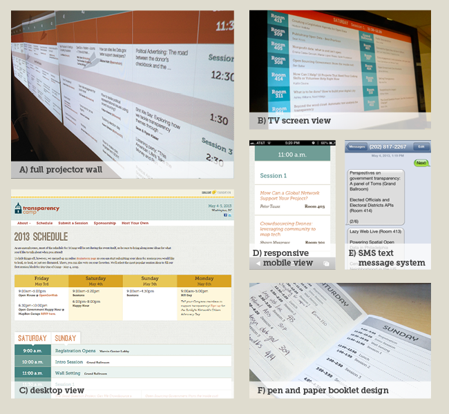
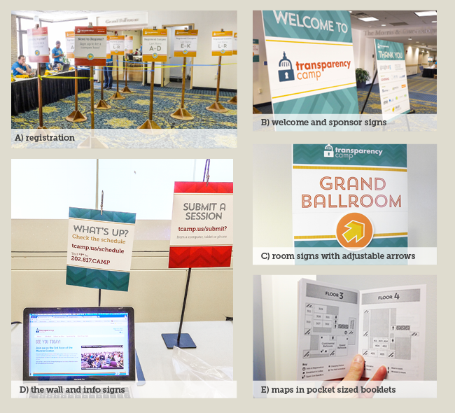
We took this new high tech version seriously and attempted to make sure it was accessible to everyone. The “Wall” was a web view of the schedule displayed across three short-throw projectors. The submit a session web form pulled inspiration from an actual written form with lines instead of boxes and custom radio buttons that used a hand drawn x. It could be accessed from any device including mobile, and we had computers available for people to help them submit sessions.
All of the different views each present their own unique challenges:
A) Projected wall 3 short throw projectors wide (3840 pixels) and high contrast
B) TV Screen High contrast and low resolution
C) Desktop Collapsed to keep each hour’s sessions at the top
D) Mobile Narrow width and minimal graphics for quick loading
E) SMS Using Twillio for people who didn’t want to use the mobile site
F) Pen and Paper 3.5×5 inches so it would fit in people’s pockets & badge holders, inside pages printed in black & white to keep it low cost
The Wayfinding
Another design challange we faced was how to make the conference look and feel like a friendly camp, without having complete control over the space. We used big bold swashes of color and made really large signs to help people find their way around. Velcro arrows allowed the signs to be flexible and relevant as the day progressed and things moved. There were also printed maps in the back of every booklet if campers wanted to plan ahead.
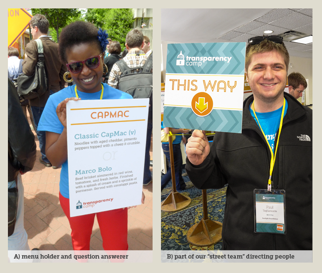
Human sign holders were a unique addition to TransparencyCamp. Volunteers holding signs verbally greeted campers and started off camp with a smile. They could answer questions, but can still be reconized at a glance if campers were in a rush or mid-conversation. We used this technique for sharing the different lunch menus, as well as directional signage to the event and to happy hour.
The design of TransparencyCamp has evolved a lot in the last few years, but each year we continue to improve on lessons learned from past camps. As the event grows, our design implementation will need to change with the venue and amount of campers. However, that doesn’t mean it will have to loose its fun and unique feel. We are looking forward to the evolution of the TransparencyCamp brand from 2013 to 2014!
