Here’s how a journalist in Atlanta mapped closed data for accountability
There’s an element of the Atlanta Journal-Constitution’s story about how the Atlanta Beltline broke its promise on affordable housing that shouldn’t go unremarked: an interactive map that informs that public about where housing was funded. That meta story is a reflection of how public access to data about public housing is limited in American communities, and what it takes for a young, determined journalist to use modern technology to inform the public about our own communities.
If you read AJC intern Stephanie Lamm’s tweet, below, you’ll get an inkling of what happened here.
City gov didn’t make the GIS files I needed public and prob thought I wouldn’t devote 15 hrs to recreating it by hand but jokes on them pic.twitter.com/fGNvLiDprU
— Stephanie Lamm (@stephanierlamm) July 11, 2017
For full context on what it took for Lamm to create the map using open source tools and the accountability journalism that her news app enhances, read our email interview with Lamm, below.
Where did the idea for the story come from?
I was approached by the Atlanta Journal-Constitution’s investigations editor, Ken Foskett, to work on a graphic to accompany a story on the Atlanta Beltline. Beltline is an ongoing development project that includes trails, a streetcar and parks. AJC reporter Willoughby Mariano, along with two of the AJC’s interns, Lindsey Conway and Ann Ondieki, had been working on this story for months, building off work done by students in the Georgia News Lab.
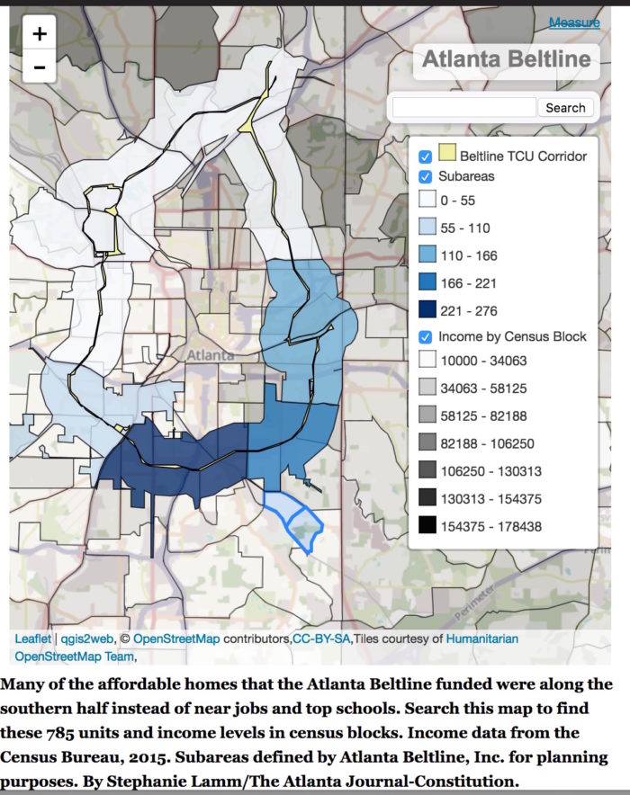
The reporters wanted a graphic that displayed where Atlanta Beltline Inc., the agency behind the project, had focused resources toward affordable housing and where affordable housing is needed most.
Naively, I said that would be an easy map to make.
How did you first approach gathering data and evidence to tell it?
The Georgia News Lab contacted Atlanta Beltline Inc. to find out how many affordable housing units had been built, funded or planned along the Beltline corridor, which basically loops around Atlanta. The agency cited privacy concerns with releasing the exact locations of the affordable units.
The best the team could get is the number of affordable units in each of the Beltline’s 10 subareas, which are districts drawn by the company to plan out the project’s development.
What challenges did you run into doing that investigation?
The Beltline’s 10 subareas do not match up with neighborhood lines, tax districts or census blocks. This made recreating these boundaries — and finding demographic information about the communities within the subareas – difficult.
Atlanta Beltline Inc. has a JPEG version of the map with subareas on its website, but it’s not drawn to scale. I emailed our contact at the agency asking for GIS data used to display the subareas. I searched the city’s online public GIS portal and couldn’t find anything on the subareas. An email to their GIS contact yielded no response.
What did you end up doing? How?
A few days later, with no response from the city or Atlanta Beltline Inc., I figured it was time to get creative.
I consulted Atlanta Beltline Inc.’s Google Map rendering of the subareas and began creating polygons in QGIS, a mapping software, to match what I saw on the map. I went street by street, estimating the boundaries to the best of my ability, for each of the 10 subareas.
A good thing about being young and inexperienced is that when faced with a seemingly impossible task, you keep plowing through because you think it’s expected of you. My team was out of the office for a meeting that day, so there was nobody to look over my shoulder and tell me I was crazy.
It took me a full day of just drawing, plus another day to touch it up, get the subareas into one layer and add the data on affordable housing units.
The reporters wanted to visualize income along the Beltline, so I threw in shapefiles of the 2015 Census blocks (available to the public online through the Atlanta Regional Commission) and filtered for median household income.
The next step was getting the map out of QGIS and into a format we could use on our website. Having never used QGIS, I consulted Google. I downloaded a plugin called qgis2web, which would convert my map into leaflet.js, which I had also never used before.
Once I exported the map in leaflet.js format, I hosted it on our newspaper’s server and used an iframe to embed it into the story page.
What did you learn about the challenges involved in reconstructing a data set like this?
Honestly, it doesn’t take a lot of skill to draw lines in QGIS. It doesn’t even take a lot of skill to install a plugin in QGIS, hit a button, and host the map on a server. So much of it is just being stubborn and persistent.
How would you approach this differently or the same in the future?
Given that I had never touched QGIS or Leaflet.js, I imagine a project like this will take much less time now that I have some experience. At each step of the process, I had to consult Google, read the documentation and use a lot of trial and error.
Given that the Beltline’s development is set to continue until 2030, I felt it was important for our reporters to have this map on hand. Much of the project’s resource allocation and planning traces back to these sub-areas. Though it took a lot of time and effort, I’m glad the newsroom has this map to reference for future projects.
I’d still like the city or Atlanta Beltline Inc. to send me those files, though.
What do you see changing in the communities you cover, with respect to data availability? What isn’t changing?
I’m still an intern, so I don’t know that I have the experience necessary to answer this. What I’ve been told by my mentor, AJC’s Jennifer Peebles, is that we now have a plethora of data available to us, and lots of it is bad. My generation of data journalists is tasked with sorting through that pile of data to find what’s usable.
Still, my colleagues and I spend a lot of time teaching public officials what records are public and what format is appropriate. In Georgia, you’re required to transfer records in electronic, machine-readable format, but plenty of government agencies send us PDFs, literally printed pages, and scanned, handwritten notes.