Who’s at the popular table? Our analysis found which open data the public likes.

In 2017, local and state governments in the United States publish open data on everything from animal licenses to zoning. What we don’t know is how residents use this huge variety of public information. As more state and local governments connect their residents to open data, what kind of open data releases should be a priority?
To start to answer these questions, we analyzed the text descriptions of open datasets from 141 cities and state governments across the country — a total of 21,000 individual open datasets — and scored them based on views and downloads to figure out which types of data are most popular.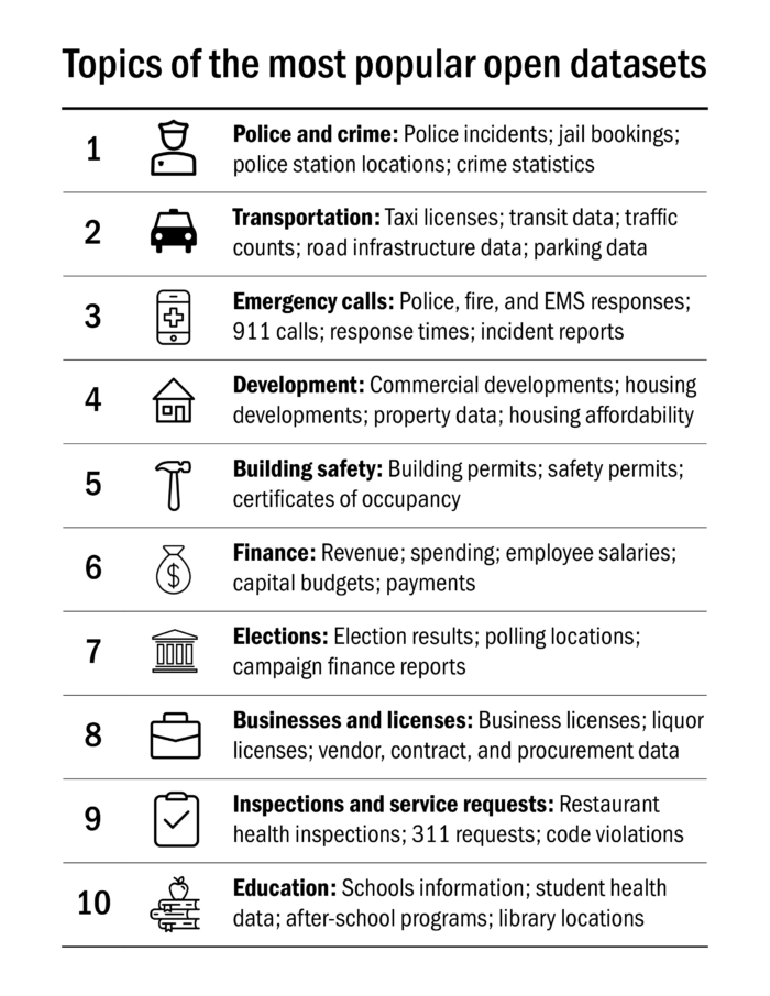 Based on our analysis, the 10 most popular open dataset topics are: 1. Police and crime; 2. Transportation; 3. Emergency calls; 4. Housing and economic development; 5. Building safety; 6. Government finances; 7. Campaigns and elections; 8. Business licenses and government procurement; 9. Services and inspections; 10. Schools and education.
Collecting data about open data
How could we tell what types of open data topped the list? Fortunately, data about open data is itself open! To collect information about open data use from as many cities and states as possible, we turned to Socrata, a leading vendor for online open data websites that provides public information about views, downloads, and text descriptions of thousands of open datasets across the country. We used Socrata’s Discovery API to access and aggregate metadata for cities, states, and local government agencies in the United States that host their open data on Socrata’s platform.
We limited our analysis to Socrata datasets due to time constraints and data availability. Sunlight and the What Works Cities program more broadly are vendor-neutral for open data platforms. This analysis should not be construed as expressing any preference for a vendor. In addition, Socrata is not the only platform that provides this type of information. However, it is the largest and most heavily used, hence our choosing it as the source of our raw data.
Cities use different words for the same data
It was easy enough to get the data in one place — but we quickly realized that cities use different descriptions for the same dataset. So, while one government might publish their annual budget with the name “Fiscal Year 2017,” another might call it “2017 Budget.” We knew we’d need a way to combine similar real-life topics with different descriptions under the same banner.
Our solution was to use a machine-learning algorithm to group words that appear together frequently into 52 topics. These topic groups collect words that are closely related but not identical — words like “fire,” “police,” and “emergency,” or “permits,” “building,” and “construction.” Our algorithm also allowed us to use an individual dataset’s text descriptions to determine what topic umbrella it matched best. We organized all 21,000+ individual data sets into these 52 major topics.
Understanding popularity
Once we had the data organized into coherent themes, we tried to calculate which themes were most popular.
Just counting total views and downloads, however, skewed results toward portals like New York City or Los Angeles that get more traffic overall. We controlled for big cities by using a popularity measure that combined all views and downloads of datasets on a given topic within a city, and then took the natural logarithm of that sum to “dampen” popularity from big cities or states. Then we then combined the log totals for each topic across all cities and states.
Our results
Once we had a way to combine datasets with slightly different names but similar contents and chose a useful popularity measure, we were ready to compare topics against one another. You can find the full list of dataset popularity score ranks in our GitHub repository.
Since our scoring system is artificial, we caution against making too much about a few points’ difference in popularity score. “Building permits and permitting” at 584 isn’t objectively more popular than “Annual Budget and Finances” at 582 or even “Campaigns and Elections” at 572. Rather, our ranks are more like groups or tranches; we can clearly see that “Crime reports” predominates while “Personal transportation” and “Public safety calls” are also popular.
That said, after trying several different scoring “settings,” we found that the popularity of public safety and transportation datasets is consistent.
Anyone interested in the intricacies of different scoring settings and fully documented code should view our Jupyter Notebook about this project.
Words of caution
Our findings come with several caveats:
- As noted previously, we only used data from datasets on Socrata. Including datasets from other vendors would potentially change our results.
- The algorithm we used to form topic groups is probabilistic. One run of our model will produce different topics than the next run. We had to save a version of our model for replicable analysis. These results are best viewed as the general structure of topics present in data that we accessed in August 2017, not scientific, unchanging categories. (We also encourage people to use and improve our model.)
- Our algorithm’s matching system isn’t perfect. Datasets often touch on multiple topics, and some words found in titles and descriptions (such as “government” or “case”) may be common across unrelated datasets and/or have different context-specific meanings. Some datasets are misclassified, but we believe the error is minimal.
- This data isn’t from a controlled experiment where residents are randomly asked what datasets they prefer. As a result, the number of views and downloads that a dataset gets will be influenced by open data website design and display decisions.
What does this mean for open data in local and state government?
There is no substitute for local knowledge for making decisions about open data. We found that the most popular datasets varied significantly based on location. Some of this variation is likely attributable to what data governments choose to display prominently, but we believe it may also expresses local preferences and needs. Cities and states looking to release open data should always consult with residents and community leaders.
We still hope this information is a useful guide for governments on what kinds of datasets to release first. Residents who find that their city’s new open data website has what they’re looking for will both be more likely to return to it and tell others. When a city beginning open data program gets its initial releases right, it will generate momentum and build an immediate constituency.
Additionally, even cities with mature, extensive open data programs are continually refining not only what data they offer but also how they offer it. We hope this analysis can inform local efforts to incorporate popular open data into open data access tools like chatbots.
Public disclosures of structured public information — open government data — are at their best when they reflect the needs and values of the residents of a community. Regardless of what stage a city government’s open data program is in, we hope our analysis can inform releases and inspire new tools.