Money in the House elections, in 8 charts
This post was prepared in collaboration with Alexander Furnas and Alex Engler.
With just over a month before the election, the general consensus is that Democrats will have a tough time picking up the 25 seats they need to win back the house, despite some protestations.
But when it comes to the money, Republicans appear to be in solid shape. Republicans have a fundraising lead in 57 of 90 races that the Cook Political Report has deemed “Toss-up”, “Lean”, or “Likely” races within the last month. Of these races, Republicans are the incumbent party in 54, and Democrats in 30. There are also six new districts in which it does not make sense to speak of an incumbent.
See also: Our analysis of fundraising in competitive Senate races.
This analysis is part one in our ongoing attempt to measure what impact all this money is having (if any). Over the next several weeks, we’re going to be looking more closely at money in these 90 races.
While political science literature is inconclusive on how much campaign money can affect election outcomes, few would argue that it is entirely irrelevant. In otherwise close elections, it can make a difference. Moreover, the possibility for large sums of outside money may change the dynamics of this election.
In this analysis we combine two measures of money into one amount that we use as the “total”: the itemized contribution data reported to the FEC through the end of the second quarter and independent expenditure data reported to the FEC through September 26. (Independent expenditures (IEs) are spending on political communications made completely independent of a candidate (no coordination) and can expressly advocate for a candidate. This cycle, the bulk of IEs have come from super PACs)
Obviously, this “total” is incomplete, especially with the potential for large amounts of dark money that we simply cannot track and under-$200 donations that are not itemized. We are also still waiting on third quarter reports. And of course, the outside money totals are very fluid, and constantly changing. (This Sunlight analysis of spending in Ohio highlights just some of the difficulties of pinpointing the moving target of campaign money.)
Still, what these charts do give is one vantage point on the current state of the money in the House. Even if they are only a partial snapshot, a partial snapshot is better than no snapshot.
The current state of play
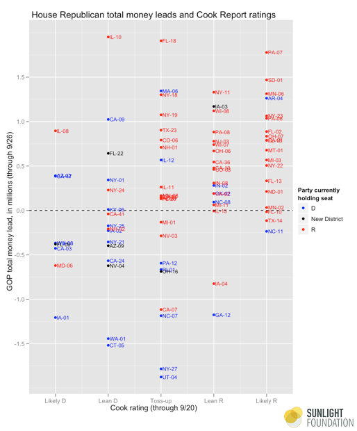
Let’s start with the big picture in Figure 1, which looks at the distribution of Republican money edge by Cook rating. One immediately notices that Republicans are doing much better in the seats in which they currently hold and the seats in which the Cook Report favors them. The Lean and Likely Democratic seats, meanwhile, are more evenly dispersed. Dems are doing better, though only slightly.
Figure 1.
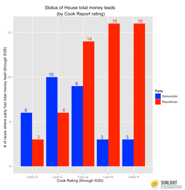
More specifically, Figure 2 breaks down the money edge by seat. Democrats have the fundraising advantage in 6 of 9 Likely Democratic seats, and 10 of 16 Lean Democratic seats. Republicans have the money advantage in 14 of 23 toss-up seats, 16 of 19 Likely Republican seats, and 16 of 19 Lean Republican seats. In general, Republicans appear to be in a stronger money position.
Figure 2.
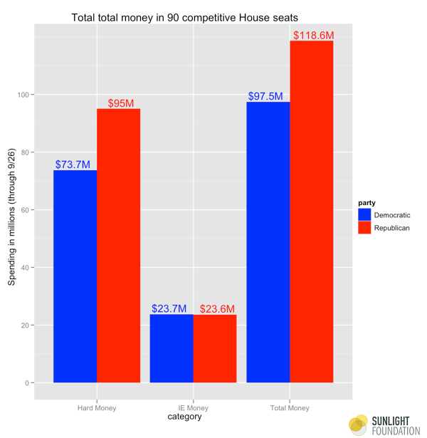
In terms of overall money in these 90 seats, Republicans are at $118.6 million, Democrats are at $97.5 million (Figure 3). Republicans have the lead in hard money ($95 million to $73.7 million). Independent expenditures are dead even, with Dems at $23.7 million to Republicans’ $23.6 million. However, it is important to note that this does not include so-called dark money groups that do not tend to show up in FEC data, and that most indications point to these groups strongly supporting Republicans.
Figure 3.
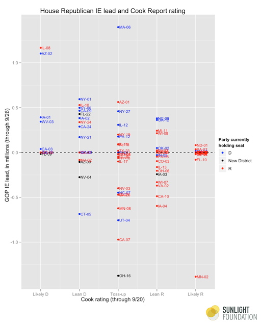
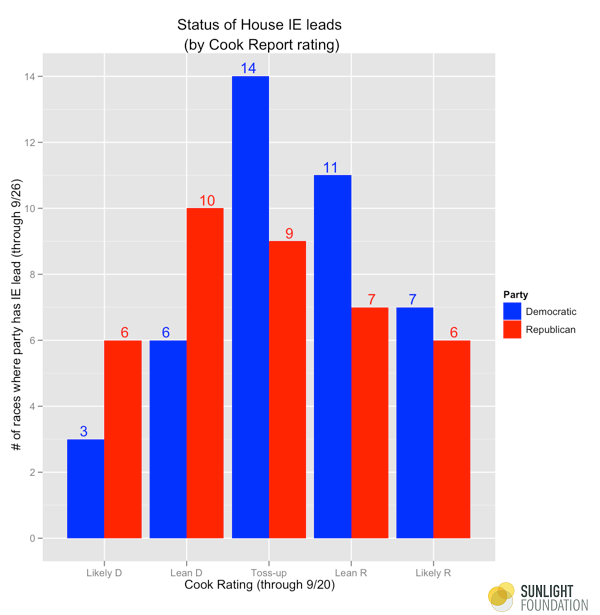
Looking just at the independent expenditure data (Figure 4), we notice an interesting trend. Candidates tend to have the bigger independent expenditures in the seats where they are behind and the other party is the incumbent. In particular, Democrats have independent expenditure advantages more often in seats that lean Republican with Republican incumbents. Republicans tend to be ahead independent expenditures in seats with Democratic incumbents that Cook puts in the D column. The most likely reason for this is that independent expenditures tend to support negative ads, and can be an effective way of tearing down a popular incumbent.
Figure 4.
One can see these patterns even more clearly in Figure 5. Republicans have the IE advantage in 6 of 9 Likely Democratic seats and 10 of 16 Lean Democratic Seats. Democrats have the IE advantage in 11 of 18 Lean Republican Seats and 7 of 13 Likely Republican Seats. Democrats are also doing better on independent expenditures in 14 of 23 toss-up races. Overall, Democrats are outspending Republicans in independent expenditures in 44 of 82 races where there have been some independent expenditures.
Figure 5.
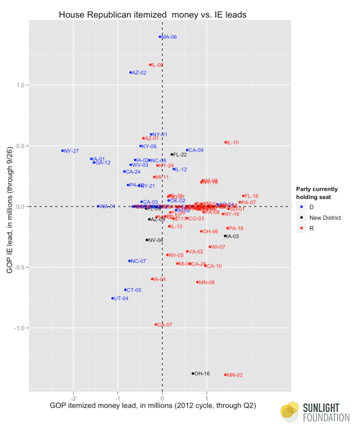
There is also an intriguing relationship between campaign money and outside money. Figure 6 plots the Republican advantage in itemized hard money contributions and independent expenditures by race. This clarifies what we saw in Figure 4: That there are more independent expenditures helping Republicans in seats with Democratic incumbents (who are more likely to have the hard money advantage that comes with incumbency). And there are more independent expenditures helping Democrats in seats with Republican incumbents (who are also more likely to have the incumbency advantage in raising hard money). This is most pronounced in MN-02, where Republicans have a more than $1 million hard money lead but Dems have a more than $1 million IE lead.
Figure 6.
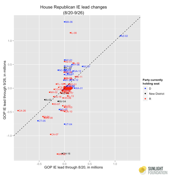
It is also interesting to note the changes in IE expenditures. Figure 8 plots the GOP IE edge as of 9/26 against the GOP IE edge as of 8/20. Seats to the upper-left of the diagonal line are those in which the GOP is gaining. Seats to the lower right of the diagonal line are those in which the Democrats are gaining, and seats along the line are those with no change. There are no major trends here. Most races were at zero in August.
Figure 7.
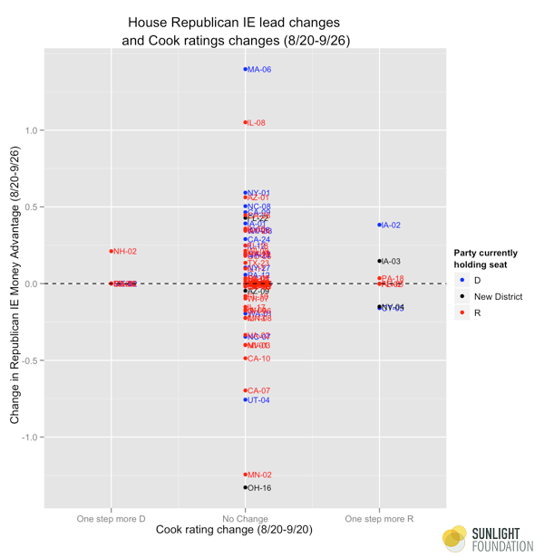
Finally, Figure 8 looks at whether there is any relationship between seats changing their Cook rating and their change in IE status over the last five weeks. Most seats have not changed their cook status, but a few have. This chart is not particularly revealing right now, but as races and money continue to shift, we may see more correlations between these changes and the money changes.
Figure 8.
In conclusion, these charts offer a series of admittedly incomplete snapshots of a process that is in rapid motion. We will continue to update as more data become available, and continue to investigate the extent to which changes in money are correlated with changes in race status and ultimately victory.
But at the very least, these charts do give some insight into the state of play in the House, and provide a baseline for the many changes to come in the next month or so. Right now, Democrats are not in great shape money-wise, but given the fluid nature of money, a lot can (and surely will) change over the next several weeks.
